compo 2 again week 3 when in doubt blacken it… or not?

compo 2 again week 3 when in doubt blacken it… or not?

No, no no no, really this working in deep black in realistic style (very realistic, I use reference, I can’t work from imagination and calculate the black zones yet) is not satisfying to me.

I already said that last week, but I had to insist, try again, see if I got the hang of it and if a full page of comic would help me find my rhythm.

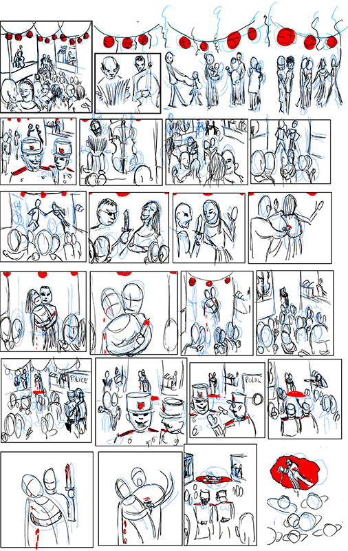
This week I did this:


compo2 week 3 marie codine one pic

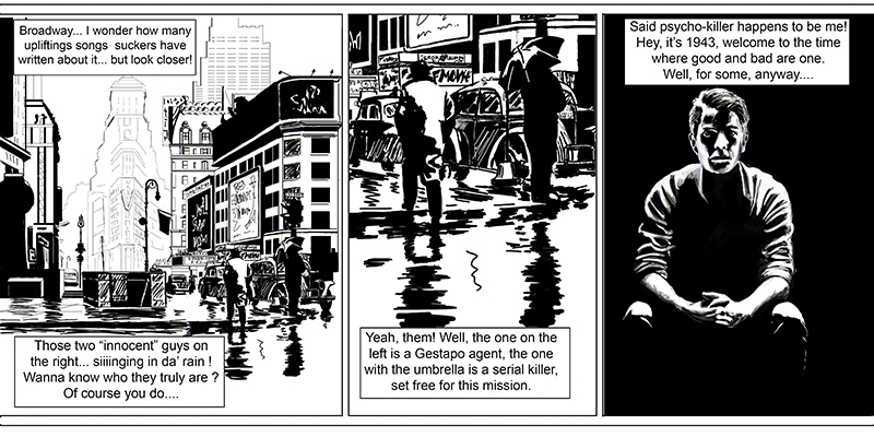
I’m rather happy with the minimal use of faces, the story you can deduce but that is not told, good story telling I think, but I’m not satisfied: this is not me, this is generic.

But let’s see what Glenn has to say: he likes it, likes the storytelling, says the drawing has some flaws (some shadows on the bodies in the first tier look like water and dont define the underlying form as well as they could, the city would be easier to read with some vertical luminous signs, the “pronto” girl has a very flat nose, the motorbike looks pasted on and should come towards us for better effect, etc) but all in all he says there are people out there who make a living doing worse art than this.

That’s good news, right?

Yes and no.

Yes because it means I begin to understand form and “feel” the shapes I draw so I can just “allude to them” instead of really drawing them in detail, while your eye knows what it is seeing. That is good for whatever style I draw in, it means progress.

And No because it means what I do here is interchangeable with any “noir” comic inker. (yes I know, it’s super to get to that stage but…. I am ambitious, I guess lol).

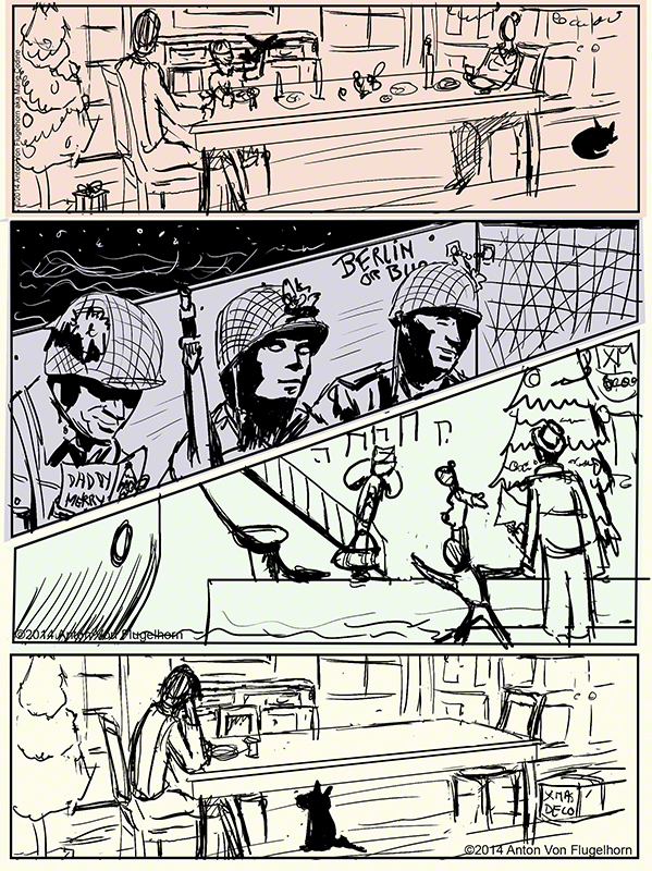
Realism is boring, better be a good photographer than a bad realistic draughstman. Using deep black, playing with not showing the faces, not showing much of the scenes while keeping them readable is a clever game I’m interested in, but….. ok let’s say the name: Mignola! if you have ever read his Batman comics or the Hellboys he drew himself (the case with the new “Hellboy in Hell” series currently on sale) you know what I mean: you see the corner of an image, just a bit, and you know it’s him, you know by the way he plays with shadows, angular shapes and non angular shapes. In a way when you look at even a neutral image drawn by him you already are in his power so to speak: his style is not so much a style but a technique of atmosphere creation, his view on his world, his characters, you know what he feels for his characters, it’s in the lines he draws them with.

OK, so I’m not Mike Mignola 😀 (my banker also wished I were, lol) and I will never be, and that is ok, cause I want to be “me”. So I’ve found my voice in cartoon style, I can now draw anything in that style, it’s silly idiotic, it’s me (meaning i’m silly and idiotic?…. ahum) many people draw in cartoon style, even in the french belgian style of cartoon (which my style is close to) but a page by me is totally different from a page by others. That is ok, I’m working on a webcomic in that style, no worries, no problems, I’m feeling home doing that.

But the “noir” style feels….. fake.

Now I know Glenn often reminds us that having too much of a personal style is a trap: you can’t work for someone else, I mean if Mickey Weekly looks for a penciller, they look for a penciller who can draw in Disney style. Plus illustrators with a very personal style go out of fashion (that was also true in the days of Leyendecker: average life span of an illustrator: 5 years, then people want novelty).

I don’t worry about this too much for two reasons: first, when you are a comic book artist or children book artist people buy “your” books, they don’t want you to change style! Second: if I can develop two deeply personal ways of drawing things, then it means I’ve got a good grasp of the basics of form and drawing, and I can, in theory, imitate any style, just give me a character sheet, they are made to be copied to imbibe the style.

So how do I develop that second style, that deep black style? Got to work on it a lot. It means I spend a lot of time each day trying out crazy stunts (deep black toons? hmmmmm perhaps no!) only to throw them away, but I guess I have to go through this. It feels like a waste of time but it’s a must-go-through. I try different medias: brushes, big pens, copics, you name it, even my fingers (it’s just an excuse, I love painting with my fingers lol).

At the moment I look at the image above and say “I can do this, good! But I dont want to do this, I want to do something else with what I’ve learned here”.

I know most people would just stick to the cartoon style I feel so at home in, but if I want to improve my drawing, including my cartoon style, I have to try other ways of describing form. Plus I love the idea of having two voices, I have ideas for stories that are totally unrelated, some of them for cartoon, other far more dark.

Basics, let’s stick to basics. That’s always the key. As soon as the weather gets better and people don’t look like shapeless parka-wearing yetis I’m going to sketch outside, and I know it’s going to be tough cause I haven’t done it for a while.

Somehow I have the strange feeling my black style will emerge when I don’t pay attention, when i’m not really looking, when I’m not trying so hard.

Back to staining paper! I think too much, I interfere with the process. Now, let’s work till my brain shuts off!

By next week I hope to have found some keys.

See you then, and draw draw draw!

composition 2 second time week 1 and 2 for the price of one

composition 2 second time week 1 and 2 for the price of one

Not good enough damn it not good enough! as captain Picard said in Startrek TNG.

If your remember well (and if you dont a reminder is coming up) during my second time doing composition one I had “found” my style: loony toony, very french-belgian comic in style (not a surprise as I’m french and grew up on them).

Glenn was super happy for me, he had given me hell during my first go at composition 1 and 2 (which was ok, I’m a big girl :-D) and it paid: during my second go at compo1 I decided to do only comic pages and  came my style, easy, fun to do, far from perfect but it’s “me” as Glenn put it.

You’ll see a spread of that style below but read this first: I love writing comedy, nonsense, Monty Python like stuff and Franquin (google the man!!!) style.

But even any improvement in my “more classical drawing styles” would of course improve my cartooning (my hands and feets are yuk). So this semester I took (again) figure drawing one, deciding to draw only clothed females as I am not good with drapery and I have problems drawing girls that dont look like third rate drag queens (no insult meant to any drag queens, most of you are more feminine than I’ll ever be and are dream models for sketching!). Like many other heterosexual female artists I have problems drawing anything that is not muscular squared-jawed… ok, I prefer to draw men, so I absolutely must draw female. So there I signed for figure one and composition 2 (“again” for both)

I started drawing draped girls during the recess week before the new semester. I was not sure what I’d do for compo 2, and then I noticed: heavy black/heavy white, no other color…. one of my girls was black and white, no borders… think Hugo Pratt (Corto Maltese) Frank Miller (Sin City) or even Eisner though he always used washes.

Two colors, zero or one, like in machine language, what goes black what goes white…. I took some model pictures in full light, full color, your normal pic, and tried to imagine: reducing to two colors while maintaining the “readability” of the image.

Useless to say it took me hours for each and gave me a headache each time, this is a maddening exercise! But the 5th one was a little bit easier than the first…. hmmm perhaps there is something there! So I sent some of my “heavy black” drawings as I call them to Glenn along with the rearrangement of the compo1 week ten assignment.

So here is my schizophrenic assignment sheet of week one:

assignment compo2 week 1 marie codineok, yeah I know there are “some greys” I could not decide for some zones if they should be white or black.

Glenn was very positive about both things (except the scenery in b&w in the middle that is unreadable) and told me to pursue that new style, it would improve my cartooning cause it would force me to have a better understanding of shapes.

At the moment, needless to say I cannot do this style from imagination, the cartoon-like one I can and very easily do. So let’s get to work.

Week two (hey I told ya: two weeks for the price of one! isn’t that a corny way of hiding i’m late by one week in my blog? lol)

I decided to see if I could do figures on a complex scenery and keep it all readable, make it something that is not a mess of black spots on white paper.

Broadway! Let’s do that, with the posters etc… except of course i’ve never been there, but I found a series of old colour daylight pics and got to work.

Hours! some bits took me hours. But let’s look at it so I can give you examples of how incredibly courageous I am in facing this ordeal (lol).


Untitled-1

I went the cheap way: panel three is stolen from last week, panel two is a close up of panel one.

Panel one was my hell on earth for a week!

Look at the second panel, you’ll see a better example. Ok two silhouettes: the guy with the hat – how do I make sure the hat doesn’t get mixed up with the theatre posters in the distance? there is black over there too! also, no border for his right shoulder: white on white, but it’s ok cause you know it’s a human so you read him as having a shoulder. The edge of his right arm… now that took me some time: at first I made the windows of the cab white with thin black reflection, as “should” be,  but who cares about “should”? I needed black to give that arm a contour, guess what? it works. But what doesn’t work and Glenn did not miss, are the white scratches-like things on the doors of the cab, too rough, don’t read. Also he told me the building in the distance (the V shaped one, is that an hotel of famous landmark?) could do with a bit more black or thicker lines.

The main thing is: forget about reality! fake it, cheat, but remain within the boundaries of the believable. For example did you notice that the light on the umbrella and on the man wearing coat are contradictory? Probably not, and that’s what you find in most “noir” comics: fake lights that you only notice if you are either an art teacher looking for errors or if the story is so boring that you start thinking while reading. It’s ok, it’s the way it’s done and has always been done…. and it’s freaking difficult! If it was all about copying reality it would be soooo cool, but it’s about reinventing it.

I type this in the middle of my third week and I am very dissatisfied with myself: ok it’s heavy black and readable and realistic… and realistic BORES me! I don’t mean I want cartoony stuff all the time, but some exaggeration, some caricature, amplification (Rembrandt did it so well: his portraits are NOT realistic, but you dont realise it when you look at them). I have to find….. something more. And right now it’s escaping me and I’m wasting my time throwing away brush work that looks like…. nothing! We’lI see what the near future brings, I’m sure Glenn will have the key to all of this for me, he already gave me a clue during the chat: more angle on men, less on women… hey, yeah that’s a good point for this style!

See you real soon!

Black is my favourite colour btw.

Anton

compo 1 week ten end of semester and cartoon fiesta

compo 1 week ten end of semester and cartoon fiesta

Last week of my second time doing composition 1 class, this time with only comics pages. Starting this coming week I’ll be redoing composition 2, again with only comics pages for submissions.

Time has come for a bit of reflection: my first go at compo 1&2 was tough, I really did not get what it was about, what I was supposed to do, and it showed :-c. This time I seem to have “gotten” it: composition is not an addon to drawing, composition is the final goal, art itself, and drawing is just very secondary (which doesn’t mean it gets easier, like Milt Kahl, the animator of Merlin, Bageerah and many other Disney characters used to say at the end of his career: “it does not get any easier!”. lol of course he had animation on top of drawing to worry about – but animation and drawing are tools to create composition which is the final art. Let’s just say that now I see why Glenn said several times that in other classes he was teaching us how to draw, in compo classes he teaches us how to be artists.

I never thought I could draw so much, have so many ideas on a regular basis (no waiting for the muse – get to work, the muse does not exist!).

The principal “click” quite obviously came for me when I stopped resisting my natural urge to cartoon, caricature and tell silly stories. I was holding myself back like I said in the past weeks. This doesn’t mean I’m not going to go on try and improve my drawing, next semester (coming week) on top of compo 2 I’ll be doing figure drawing 1 again (3rd time??4th??). The best my realistic drawing is, the best my cartooning will be. And the truth is cartooning is far more difficult than realistic drawing, you have to pay far more attention to gesture or everybody will find your drawing boring, you have to choose what to exaggerate, what shape to keep, what anatomical element to throw away and which to keep so that the characters still look real and have weight when they walk on the ground (yes I’m talking still drawing, not animation).

In a word I plan to learn to draw like the great masters (or close to that lol) in order to be a better cartoonist, and who knows, I may have a “serious” period in my artistic career, after all Dali did not draw melting clocks and giraffes on fire next to three legged men all of his life, he also did some amazing “classical” painting, re: his Christ on the cross seen from above done from imagination, google it you are in for a shock if you dont know that marvel!

So this week…. last week the only thing Glenn had to tell me that was negative about my page of compo was that it was a pity my characters looked so ruff when I could draw very clean neat characters as I did regularly in the head class (yes: unbeknownst to you I have been doing the head class for the 5th time alongside this compo1, and going toonish there too).

Ok, you want clean neat characters? let’s try it French-Belgian comic style (hands up all of you who were expecting “Gang Nam” style!)

here it the thing of the week, a spread, a comic page with one image taking all the space, probably the bleed too (meaning no border around it in a printed publication)

assignment comp1 week 10 marie codine 1 image only

If you are into French-Belgian comic you are probably laughing, thinking that I’ve read Franquin, Tillieux.

Those characters all have a name and occupation and will appear in my upcoming comic (insane comic, of course). Only 3 were developped in the head class (the card player, waiter and lady in pink). The others I developped for this and will reuse.

Glenn laughed, said it was great story telling and that it was definitely “me”, and that is what made me the most happy, it means I have found my style (one of them who knows, there may be others).

He said all the elements are there but I could make a far more useful use (odd sentence….) by making a clear foreground that would give depth to the rest of the image. Meaning: take the card player and waiter and make them much much bigger: foreground, so that all the rest seems to happen further back, creating space for the eye of the reader and for me to better position my character (there is a hole behind the pink lady that I was very unhappy with). This would also give a clear entry point to the eye of the reader who can, as it is now, enter the image from several points equally.

I type this two days before the new semester, we’ve had a week off during which…. I’ve slept! all night and almost all afternoon! I guess the efforts I did, the resistance to my obvious cartoonish tendencies (who started singing “I’m coming out”? I heard you! :-D) and the rest of life just took all of my energies.

My webcomic script is taking shape (and getting crazier by the day), Monday, new semester. Gambarimasu! I’ll do my best, O kage sama de! thanks to your support (rough translation)

see you very soon.

Ja ne, minna san!

ps: why the sudden Japanese at the end of this posting? Because it’s my blog and I do what I want! Oh, did I forget to mention: finding my style has made me feel more assertive. Now, you know 😀 lol only kidding  guys!

compo 1 week 9 how wacky can you get?

compo 1 week 9 how wacky can you get?

It’s decided: I’m going to let my true nature – whatever it is – out and let my assignment be what it wants to be.

I have to say I did not expect something so crazy to come out – and to come out ery very easily and naturally. Am I a Toon like some friends of mine say?

In any case, here is item A, your honour, as they say in court-room dramas:

andes final2


Yes I know: it’s insane, but it feels very natural to me, probably because I grew up on nonsensical humour from french-belgian comics, monty python and Goon shows (nothing to do with “the goon” radio show of the 50s, research it, you’ll go mad too and get pain in you stomach muscle laughing so hard)

Glenn found it clear and perfect in terms of story telling (I’m proud of the way the action starts in a world where things are different from ours, but I keep the reader up to date on what that universe is like in one dialogue in one panel).

The pacing is great (again I’m proud of the bit about the underside and upper side of the “andian overhang” it was not easy choosing which moments of the action to show to make it understandable)

Glenn had one thing to say that was negative: my characters (outside of the silouhete of our faceless hero) are drawn quickly and without care, something I can do and indeed do every week in the head class (in which I’ve also specialised lately in carefully rendered toonish heads)

If I can draw a cartoon cleanly I should do it in my comics too!

true and logical. I know what to do for next week.

And expect to see again those two flyboys and their rebel butterflies, I’m preparing a web comic and they will be part of the world I’m building (yes it will be totally insane yet logical in it’s own…. well, Shakespeare put it better than I could: there is method in my madness! 😀

Before the end of the week you’ll get the last installement of this ten week caurse, cause next week I start doing for the second time the part two of the composition class.

My first time around, compo 1 and 2 proved a nightmare, I did not get what it was about, and Glenn, knowing that I had a thick skin was merciless with me (I think his Finn ancestry makes him a bit “too the point”) but I have passed through the difficulty that I was creating myself by holding myself back: toon toon toon! ok baby you wanted to be a great painter? you can still be one, but your real call is cartoon.

Remember how Conan Doyle was annoyed that Sherlock Holmes took too much importance compared to his real litterary work. As the British library boss in charge of his work said: “WHAT real litterary work?”

see you in a day or two

compo1 week 8 soldiers, flyboys and film noir

compo1 week 8 soldiers, flyboys and film noir

OK, after some deep thought (42! private joke for the happy few) and ponderings I’ve decided to go with the flow and go as wacky and toonish as I want.

Surprisingly it seems I have a ton of wackiness within me – or perhaps I should say “surprising for me” as my friends and family have long told me I was a Toon more than a human being.

The topic of the week being mass and space I decided to tell a story that has no story but is a bit insane (wait for real insanity next week :-D).

Here we go:

boo


Glenn found the story telling to the point and good, but complained that my characters were too sketchy even for a ruff. It’s true I only thought of the expression, not of doing a clean drawing. In the same was my hand lettering is really “yuk!” and any font, even the infamous “comic sans” would improve the readability (my remark about comic sans, not Glenn’s LOL)

Another point: note to myself the bear….. please…. look at reference Bub!

Last week I tried to make a film noir like page with the light coming only from the top, but I placed the light and shadows all wrong on the faces of my characters relative to the light bulb. So I played around with a standard head in Zbrush, moved the light up and observed. I learned a lot and tried to do a new version more precise light wise:

ill do it


Nice try, but as Glenn spotted at once the number of values on the faces is too high, I should simplify more, concentrating on the structure of the face, start with a dark ball for the head and add white progressively, not noodle greys like I did. Also the character that moves away is not lit properly. Ooops. I must try the black ball white paint exercise, should be fun and interesting. i would love to be able to draw a bit in the sin city/corto maltese style 😀

Mass and space, I did another page on the week’s topic, but  again my character is not clean enough, same for lettering. more after the image:


mail copy

Glenn spotted at once two problem: the man get to the summit and…. goes up again, when does he go down? also, in the last rectangle the split in two images bar left down right up looks like it’s part of the scenery and it’s not.

Not clear enough.

Redo

and let yourself be yourself.

Now….you know what? I think I will!

expect an update in a day or two!

compo 1 week 7 inhibitions and childhood mourning

compo 1 week 7 inhibitions and childhood mourning

The Charlie Hebdo massacre – wont go into the political importance of it here, this is all about drawing. Like all French people (and most Belgians) I knew and regularly read in several papers the drawings of the killed artists.

One of them was particularly  dear to my generation: Cabu, we saw his drawing every week in several papers since we were kids. He was over 70 when they shot him in the head with a kalashnikov, but to us he’ll always be the tall lanky gently older brother who drew on tv shows for kids when we were little. Strangely he had kept his kiddish looks till the end. Imagine Shaggy from Scooby-doo with round glasses.

Like most french people it took me a week to get out of that horrible feeling of “they killed mickey mouse” (or they killed Mad magazine artists plus mickey). I was unable to concentrate or talk about anything else for most of the week, like all my french speaking artist colleagues online. One by one they all did their homage drawing to Charlie (as we came to call the whole lot of victims). Took me a week to get to a point when in under two minutes I did this, and I dont know where it came from, felt like throwing up more than composing a comic page if you know what I mean:


heaven n earth


I had lost so much time  repeating to myself “they shot Cabu?” that I included this page in my composition assignment that I sent to Glenn.

What he had to say was interesting considering the “vomiting” or “no thinking” aspect of how the page came to be: he found it clear, direct, nothing to say about it but good thing – and trust me: Glenn is not one to go easy on you because you are in shock or any other reason, he says what he sees and how to fix it.

But more about this a little below.

I wanted to do something very dark, one light from above, a Mignola or Sin city style page, so I tried and did this:


ill do it


The light is all wrong and so is the perspective! There: see what I mean about Glenn telling you what is wrong no matter what 😀 During the live chat and in the critic video he did several demonstrations to me of how the light should work in this setting, so I knew how to redo the page, which I will in the next episode!

Back to not thinking and throwing up drawings.

Space and mass, the topic of the week – frankly I worked on the following while the little voice “they shot Cabu?” went on in my head, and I was not quite there while drawing this – again another thrown up drawing (done before I was strong enough to do the Charlie homage above).  What was I going to draw? oh WTF!

Somehow I found myself with the following, crazy story, crazy character, crazy faces:

liliputian


the floor lines lack convergence – argggh! I should have seen it, of course Glenn did not miss it. But outside of that he found it was direct clear story telling again, and told me to persevere in this. He also loved the strange face of the main guy.

Now this leads to a question: does madness aka insanity aka wacky humour aka monty python and co suit me?

I’ve taken a good look in the mirror and have to accept the fact: for sometime, and increasingly I’ve been resisting what was happening: as Glenn had told me I was beginning to find my style – and I resisted it, to put it simply I wanted to be in the Laurence Olivier category and I suddenly found out I was meant to be Buster Keaton category, and I was wondering if people would take me as seriously? Of course I’m cheating a bit here by choosing Keaton, he is recognised as a genius by many, perhaps I should say the Monty Python, they’ll be recognised as genius in about 30 years only.

Food for thought. not surprising considering my interests in humour, drawing styles and which european comics I copied when I was a kid, day after day (Franquin, Eisner…. ) but even if it’s not a real surprise it’s a bit of a shock.

I think I’m going to go with the flow, I’ve spent the last few days before writing this doodling insane heads (more about that next time) and I’ve never had such fun! Who wants to draw like Rubens? I do! But to draw in another style than his!

see you soon for more about all this.

cheerio!!

compo1 week 6: long sleep, add some terrorism, art and stir!

compo1 week 6: long sleep, add some terrorism, art and stir!

Happy new year to all first of all!

the vilppuacademy was on holiday (very rare) for three weeks,what did I do during that time? My assignment (see below) and I…… slept! I was more exhausted than I thought.

I came back to Paris  in time to learn my favourite cartoonists (since childhood, they were now 70 or 80) had been killed one by one at Charlie Hebdo, and then that the supermarket ten minutes from my place was under siege with all of its clients hostage…. I’m still in shock and in a very bad mood like the whole of France.

Back to art!

These drawings and the critics of them and online chat with Glenn date back to a few days before all this horror happen so I was in a rather light lazy mood.

Do you remember that comic I id last time and that looked like it was about a man touching a pie or plate and getting electrocuted?

My red button (not a pie!) was totally unreadable, I redid it and here is the result:

bouton


Glenn was very happy with the change, this is clear, simple gag drawing with a **clear** readable button and pannel above it.

The only thing he said I could work on is the dead body at the end that looks a bit disjointed.

I did not feel like working on dead bodies even cartoony one this week so I think this is the end of this comic page.

The other comic page I had problems with was about christmas, soldiers, coming home etc. The big problem was that one of the 4 images depicting four key moments of the story was far more realistic than the other (the middle one, did not touch it). It had heavy shadows and I thought: oh I’m going to go heavy blacks….. here it is, sorry:


war and peace2


Glenn did put it in one word:scratchboard. I’d put it in another word: inverted black and white!

The last but one image (with the boat) is unreadable at the level of the characters (the soldier is coming back, his wife is pregnant, his son is holding hands with another man, ok he got a “dear John” letter but that does not read at all!)

Plus the white of the edges of say the table are not realistic if they are supposed to be made by light reflection.

Now here is where having a weekly two hours live chat with Glenn comes in so useful: I asked him to show me (us! we were 16 students) how he would draw with heavy black, thing Corto Maltese, Sin City, even Hell Boy.

Glenn did a three quarters of an hour drawing in that style for us (me lol) explaining each and every decision he took, what other choices he could

do, his drawing was amazing! and we asked questions while he drew. This is really like being in the classroom The rest of the chat was spent on other people’s questions. A fantastic chat, not to say they are not always great. I have watched it several time again (it(s recorded and on the site for the students) and I feel I have gotten something, now, can I do it, we’ll see!

Last but not least the topic of the week was (in my words) “crowd but on couple stand out due to composition”.

And before you say anything : yes, I notice I have a lot of dead people in my comics, I have wondered why, I think it’s because for a one page comic it make a clear final ending – either that or I’m going soon to stab people in their showers…. no, no, then I would have to clear up the mess… I prefer digital murder LOL (insert Vincent Price like laughter)

Here is my couple in the crowd submission:

balle4


Mais oui: it is ze french oulala ball ! hey, let’s make the most of the stereotypes about my country! (accordion is NOT a french instrument, ask any Russian or Ukranian and you’ll see!)

I think Glenn rather liked it, but clearly he found it too long. One thing that does not come out, and that is very clear is that I wanted the murderer holding the dead girl to look like an echo of the dancers holding each other, that was the main idea of my page – failure. What works is the compo leads you to the couple (why do I think Simone Signoret and Jean Gabin in the 30s? they did a movie a bit like this, with blood at the end and a lot of dancing)

I clearly have to work more clearly – the fact I “‘read” a picture doesnt mean other people will “read” it too. I spent some time redoing the “danger do not press this button” pannel and it worked. I should have spend more time making my holding the dead girl/holding your sweetie while you dance much clearer.

I’m going to work on that.

See you in a few days, as school is back to normal!

Peace to you all and your loved ones, where ever you are in the world (or on the ISS around it)

Compo1 again week 5 the electrifying tale of a button and an apple pie

Compo1 again week 5 the electrifying tale of a button and an apple pie


Last week we dwelt with different point in time, this time we deal with an action about to be done. I would add: that is quite obviously going to be done, if or buts about it. The beautiful paintings of masters that Glenn showed and analysed for us are for the most part about Saints getting their heads cuts by bad guys and other charming things.

Let’s not forget that until the renaissance the Catholic church was the main all encompassing client for artists, the super Major of its days. I guess that after painting your 23 crucifixion you must be a bit fed up with the topic, and, even if you are a deeply religious artist you must die to paint something else, another scene from the life of Christ or from the life of a saint: like a saint having his insides torn out (like in Braveheart), killed with arrows, having his tongue pulled out…. yes I know, you stopped eating while reading this. In short most of the early renaissance paintings  (my point of view) is about tortures, and after that about ancient greek Gods that never existed (ever heard of the inquisition?) but come with a lot of new stories: rape, battles, monsters, torture and…. ok just forget what I said: torture paintings sell, it seems. lol

The problem I’ve had with this temporal friendly topic should not be a problem: this time I’m doing a comic page, a sequential art (temporal!) so it should be easy-peasy. But doing a whole page about something that only happens in the last panels but that the reader sees coming from the very start is not easy: the danger is falling into clichés like:Wiley Coyote is about to cross the road, no cars, he carefully looks left, carefully looks right, no cars, he takes one little step and VROOOOOM a big truck coming out of nowhere flattens him. It’s fun because we see it coming but it’s been done so many times in animation and by people who are geniuses compared to me…. what was I to do?

Before answering this question (change of topic to maintain tension, made popular by Lucas in the first Starwars movie – yes I’m doing my homework about image and story!)  let’s see what I did with the two works I kept on the drawing board from last week and the week before.

First my salute to Eisner “it’s the Ghost!” “yeah and by Anton Von Flugelhorn” shame me 😀 Glenn told me to use more alternances of clear and dark, and to put the figures not all as the same distance from each other (which is a drawing killer).

I came up with this:


ghost eisner test2

Much better according to Glenn, clearer too in the body language but….. I did it again: most of my characters are at equal distances from each other. Insert curse words of your choice here. Glenn told me and….. I thought I was doing what he was saying while doing the contrary again!

Ok, I know what to do next time….. I hope.

My other “old” work to improve was my 4 panels soldier story. Glenn found it too flat, horizontal, hard to read.

Redid it all:

war and peace2


My table is now giving a sense of depth ti the image, the images are clearer but…..  last image: the dog is under the table but his ears are in front of it, make up your mind Anton! I did not see that and of course Glenn did not miss it (he misses nothing!)

Another thing that worries him is the realistic developped quality of panel two compared to the rough (this is a rough) quality of the rest of the page.

The truth is: I started drawing the helmets and “saw” at once what the shadow would look like on the soldiers faces. But I did not consider the relation of that panel style to the rest of the page. Could have done it on purpose (in japanese manga you often get cartoony heros  in the middle of a realistic scenery etc. But here it’s not a planned thing and frankly does not work. I know what to do next time!

Now, back to our first action (swipe-fadeout of the image in your mind, a trick remade popular by mr Kirshner in the second Starwars movie… did I’m mention I’m a total Trekkie? anyway…)

It’s about to happen and nothing will stop it.

For once let me tell you my plan, then show you the comic page then tell you what Glenn (like other people) who did not know what the story was read in this said comic page.

I decided to do a “I cant resist pressing that button precisely because there is a panel about it saying “dont press the button” I’m too curious”.

Now, here is what I did with it (sorry for the yellowish tone, my digimarc would not work on a white backgroud)


bouton copy


Is it funny? Does it make sense? I guess it might if you know it’s about a button but Glenn (and others, I tested scientifically this page on innocent subject) did not know that round thing in the wall was a button and the “closeup” of the button and panel about it mentioning that it is indeed a button is too small to be read or to be noticed (which is far more serious).

Glenn read the button as a pie that the guy put the finger in (a french person read it as a camembert the the guy put his finger in…. that still does not explain his being electrocuted. lol

The panel with the close up is the thing! (to paraphrase Hamlet – what is Shakespeare doing here? no idea) I have to make it unmissable, clear, probably make the button smaller (it *does* look like one big apple pie)

To sum up this week I’ve learned to always be on my toes: how is my panel working in relation to the others, ok I think I’m being clear about something, or putting people at different distances from each other, guess what:  what I think I do and what I do are two different things! What is important is what happens in the mind of the reader, this means testing your page or your drawing on someone who knows nothing about it before hand.

A good week of learning!

We are on vacation in that week six assignments will be due on the 4th of january, see you then, and until then let it draw let it draw let it draw !

A.

compo 1 again week 4 characters who had it coming!

compo 1 again week 4 characters who had it coming!

The topic of the week being: (my wording) you see it coming a mile away, I decided to have some fun.

Not that I never have fun while drawing but, if you’ll remember, last week, I feared this current week a lot, I had just taken a step forward (in the right direction, not off the cliff thank you lol) and was afraid of taking two steps back this week, thereby reinventing the tango.

Doing something fun was the safest route.

And as all my drawings of last week were ok, I decided to do 3 versions of this week’s topic instead on working one last week and the week before and this week…. you get the picture (pun intended).

I decided to throw caution to the wind and salute my comicbook idol mr Eisner by doing a shameful Eisnerish first page, here it is, and i do apologise to Mr Eisner’s spirit (pun again, intended):

ghost eisner testw


the second one is a classic story, but I had some fun with the panels:


tresor huntr copy


the third is an exercise in “few panels, lots of time”:


war and pieces


Glenn’s happy with me: my work doesn’t look like a “catalogue” anymore, but he had a few things to say: my return from war for xmas is, like the rest of my work very horizontal, the table in the first and last panels is…. placed plainly. The second panel (it’s supposed to be soldiers in a landing barge) reads poorly.

The fake Eisner would benefit of more delicate care, and light and dark work (Glenn advises me to study the work of my comicbook heros the same way I study the great master of the renaissance).

The treasure hunter tragedy (they all die of stupidity, a sad death!) is fine and he loved the way I used the vertical depth (hey, I can use verticals!!!) in the first line (can’t call it panel).

I’m relieved and happy that like Glenn told me I’m beginning to find my own style even if it is sometimes by making mistakes. That’s part of the game.

I also notice one thing: during first week it took me hour to create the panels that I would fill (following my thumbnailing of course). Now this is a no brainer and takes no time at all. Interesting, it seems I’m getting the comic format too.

I’m going to dig out (they re not far) my Eisner and Mignola and other comic masters and look at them attentively instead of just reading them with joy.

Next week I’ll rework on the fake Eisner and the war story, I dont think I can add much to the treasure hunt page.

see you next week with more hard work and superb mentorship – all the progress I make, I only make because Glenn points me in the right direction each and every turn of the road!

compo 1 again week 3 I finally seem to get it!

I added 2 updates in the few days before this one, so if you were not around, check them out to get what I’m talking about!!

Without claiming, like Eddie Izzard, does that “I have a common point with Leornardo da Vinci” (which, in his case is: like da Vinci he has designed a helicopter that doesn’t work – impressive I must say!) I would like to rejoice publicly that it SEEMS I finally begin to understand what this is all about! (“all” being composition and not helicopters that dont work).

Last week my work was boring, plain, meh, and any other expression that might express the fact that what I did was not exciting, did not cause curiosity or even amusement, and that the world would not see any difference if it did not exist, even on the micro level.

Well, it seems that I’ve taken a step forward: “enormous progress” dixit Glenn Vilppu – yeah! my helicopter doesn’t work any better that Leo’s: at long last my compo begins having some meaning and do it’s rightful job!

here are the things:

testfancy copy copyxs

punk 3 copy copydfg

desert2 copycev


Ive added depth in the sea story, panels of an odd size or angle and or placement to give some interest to the page as a whole and reflect the state of mind of the character. in the desert scene the mountains behind lead the eye to the characters. The punk versus old fat ladies I redid completely, trying to make a movie out of it, you even get a panel in which there are two of the same character as she (the pink lady) ducks under the window to observe her nemesis.

Glenn liked it al!  desert was in it’s last week of work so it’s over for that one, he thought it was a big improvement on the previous version.

The ladies versus punk made him laugh (the “rat” panel I think :-D) and he did not find anything to change in it (WTF!!!!! yeah!) I asked if I was suppose to rework on it – answer: no. As for the sea story he suggested perhaps a more pointy shape for the panel introducing the place, and perhaps a closeup on one of the dead guys but he did not seem adamant about it. (one man’s opinion he called it) he loved the angles, the depth, the page and compo.

Oh my Dog I’m progressing at long last! 3 comic pages, 3 “OK”s from Glenn, can’t tell how much I’m happy, seems all my hard work and studying storyboards finally paid.  (‘comics’ structure are too dependent on their genre to be easy to study – you dont build a super hero page of the golden age the way you build a modern superhero or Maus or Sin City, I do study Eisner who is my idol but I dont feel like imitating him, just wish I could, his style is his, and any imitation would immediately be just that: a cheap imitation).

Next week I’m going to be very attentive: in the theatre business it is said that after a successful premiere the second night is the most dangerous.

And I’m exhausted, so I must keep my attention sharp and no fall back to old bad habits!

Wish me luck, next week the theme (I know cause this is my second time taking this class) is going to be “time”….. which proved to be a major problem in an illustration but should be a piece of cake in a comic….  meaning beware: here begins the Moria! (LOTR allusion, and if you dont know what LOTR means here another puzzle to occupy you till the next entry in this blog: that laser sword with the laser hilt is stupid!)

See you next week, must no let my guard down!