sketching week 3 depth (and unprocessed food on top!)

Foreground, middle ground, background, mean depth in a picture, it’s the very magic of drawing: a flat piece of paper looking like it’s got depth! Making that guy look like he is further away that this guy in the drawing, when in fact both are stains on a flat piece of paper!

That’s our topic  and quite a topic it is! Glenn prepared for us, as usual, a lot of video material, not just course but also demos, explaining each of his choices, each of his decisions while he draws and watercolours – 2 hours of video. Someone once said nothing is as boring as watching paint dry, well when Glenn draws or paints even the drying time become a highlight of your day!

I watched the video several times (in part for the sheer pleasure, in part to “get” the depth thing). We are in sketching class, so we are not trying to do anything smooth looking and finished, so rough and fast is ok. (which doesn’t mean sloppy and rushed!!!)

Copic markers had been good to me last week, so I stuck with them (and wore clothes with more pockets :-D).

I decided to be brave and go where I dared not go last week: where things move all the time, namely: the traditional bi-weekly street market. Want unprocessed food? Want hand-picked mushrooms from the woods when its the season? Farmers products? Sketching while going mad ‘cause that guy moved right when I was….. oh yes: I know it’s part of the game and art of sketching, but sometimes, you really feel like screaming “will you stop the hell moving all the time! stand still! stop breathing! and that goes for the wind too – stop blowing, you are shaking the trees!”

Of course you can’t say anything, being stealth is important or some people will turn away if they realise you are drawing them (in France anyway, I can’t understand why, as they pose very willingly for pictures, when asked by cute Japanese female tourists – ok, I don’t look cute, I get it – plus I look fat with all those Copics in my pockets!)

Here is the “thing”, as I keep on calling my assignments:


assignment sketching week 3 marie codine


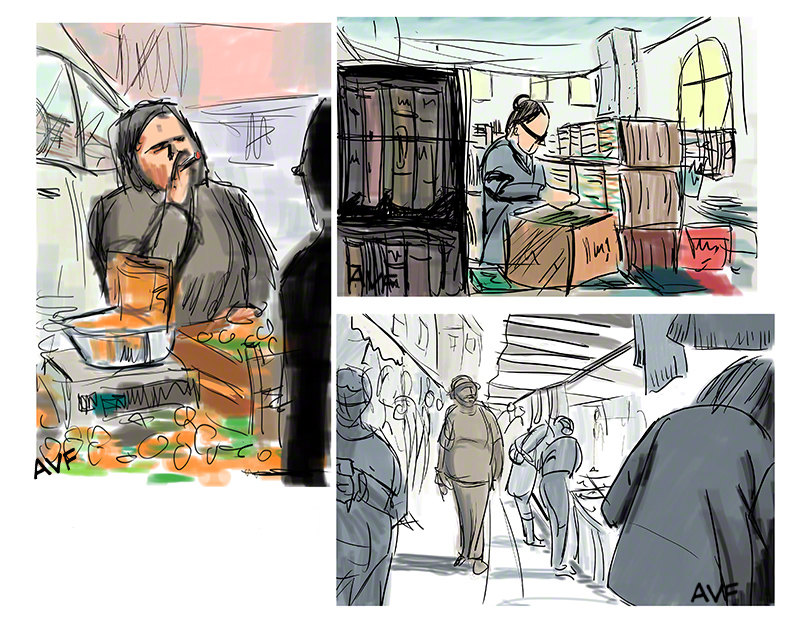
The one of the lower right is directly inspired by Glenn instructions of using alternating light and dark zones to get depth, I also played with warm and cool (it worked last week).

Glenn liked it, particularly the one I just mentioned. And interestingly, I realised part of me thought: “Oh com’on all is cool grey except the guy who is the main character, who is warm grey… how quaint can you get? This is SO last year”. Well, it’s not, I may know exactly what I did: cool, warm blabla, but a standard viewer will just get his eyes caught by the warm guy without knowing why.

I am beginning to get why Hitchcock said making pictures (he was a draughtsman by trade before they invented talking movies) was “manipulating” the audience. And there is nothing wrong with that, when you go see the Sixtine Chapel you are more than willing to get you mind blown off, when you go see Alien (the original one) you are more than willing to be scared to death and fascinated by the images.

Glenn often talks about going further, exaggerating, reminding us that even classic old masters did not do realistic portraiture, they exaggerated some features.

In love, war, and art is all fair? It would seem so. We tend to forget that, spending our days with fellow artists, reading about art, working on art, eating art, dreaming art, we know all the tricks of the trade, whether we can use them or still need to work at some of them. But the audience doesn’t know all that, has a more innocent eye and is saying to us “please trick me, please fool me and tell me a great story!” they don’t want to know how we pull the rabbit out of the hat, they are fine just marvelling “oh look: a rabbit out of a hat!”.

One student once asked Glenn during our fantastic two hour weekly video chat-drawing session: “I always draw the heads too big, what can I do” Glenn answered: “just draw the heads smaller!”

He then laughed but there is a lot of truth and depth there: we see and create complications where there are none.

We don’t trust in our art enough, we have to learn that trust. And it’s not just a drawing/painting thing. I chanced not long ago on youtube on an interview of Beatrice Arthur, in which she gave the following advice to young actors (outside of “never give up”): go further, far, far further than you think acceptable – you play a deadpan cynical woman? Make her more deadpan than anything you’ve ever seen. It’s a character for a comedy? Think Chekov! Be a Chekov character in that comedy, it will be a start. And that doesn’t mean hamming it up, hamming is faking, sincerity is the key in all arts.

Gosh I use big words these days!

Now go back to your drawings and have fun!

Sketching Week 2 Four Ways To Shrink A Medieval Castle

Thumbnails – small rough images used to test a composition…. in short, the making of the painting is done at this stage, the rest is almost painting by numbers!

Glenn told us of one of his students who got a job with Chuck Jones (if my memory serves me well) just by showing him thumbnails he had done!

Thumbnails are the topic of the week in this sketching class, and I have decided I’m going to make things easy for myself by choosing a subject that…. does not move! No skateboarders for me this week, thumbnails are too difficult for that.

The most static, unmoving thing in my vicinity is a castle half medieval half…. something else, that’s been there for centuries and is quite unlikely to go gallivanting around while I draw it. (it’s a castle that is painful to Shakespeare fans like me: ah, Henry the Fifth, medieval knight, young, proud, romantic, invading France on some tennis rules fuss – I swear, read the play….  well,not so romantic: he died of disentry in this castle, and since they wanted to bury him in London, like the king he was, they found a clever way to preserve the body for the long chariot trip: they boiled him in good British cooking tradition! In fact you can see the huge pot they used for it when you visit the castle. It ruined Henry the Fifth for me forever, but I digress)

The day was grey, the sky boring, and it was a good thing for it allowed me to judge values: the roofs of the castle towers and thingamajigs are almost black, the stones of the walls are yellow/white. One thing I would not have noticed, if it hadn’t been for the neutral sky, was that the central tower was warmer in tone than the rest (who said “warm? That’s where they boiled Henry!”? shhh!). Also at one point, they lit some light inside the courtyard, probably testing for a show, and I decided to use that light too (and make the sky be whatever I found best to put my castle in a good surrounding)

Here is the thing:

Screen Shot 2014-05-20 at 7.37.15 PM


I worked directly using Copic markers. Those are convenient as they come in sets of warm grey, cool grey and neutral grey. Markers values are calibrated, making it easy to clarify your ideas.

The warm/cool play is particularly easy to see in the top right one.

Funny, all this  playing with tones and warmth comes to me naturally now, Glenn taught us to use them without us even noticing, while he was teaching “bigger” things. I’m always surprised at the amount I’ve learnt is so little time thanks to him.

Glenn found these “strong”. I was worried he would find the small round tower in the top right one a bit metallic looking (how the hell did that happen? could be useful for other things!) but it did not bother him, as this is a study.

He told me that markers were a good idea (for the reasons mentionned above: calibration of values – no need to fight to make the right shade with your 2B pencil), and I think I’m going to go on using Copics for those sketching assignments – ok, it means having my pockets full (army trousers with thigh pockets, cool greys in the left one, warm greys in the right one…. you get the picture). By the way, some of these Copic I bought ten years ago, barely used, and they are still like new.

I’m feeling surer of myself, thumbnails scared me, particularly colored thumbnails, but it seems Glenn painlessly taught me more than I thought!

See you next time for more surprises!

And now for something completely different!

And now for something completely different!

New semester!

Glenn has been busy preparing two new courses for us online (the man is supposed to be retired????). Those new courses are: Sketching (in the street if possible – taking notes of moving people and things for future paintings, or making small casual works) and Anatomy – but anatomy taught differently from the usual way: most, if not all anatomy teachers teach you what the body is made of, and as a result if someone was to give you a human body in kit form (yuk!) with no manual, you’d have no problem constructing the body, knowing where to plug which muscle, how etc. Glenn is teaching anatomy used as a tool in a drawing – a drawing that is not an écorché diagram. Personally I think he should call this class Applied Anatomy.

Which one am I taking? Both, of course lol! Which one am I going to tell you about in this blog? (as I’ve received quite a few PMs here and on FB asking for a continuation). Well I’m going to talk about Sketching. Why? Well, picture this (if I may quote Sofia from the Golden girls): you are in the street, you notice a fleeting expression on a kid’s face when he sees the ice creams sold in a shop – but you can’t draw it, it’s already too late: the kid has rushed into the ice cream shop! So how do you draw that expression? …. out of memory? Impression? THAT is sketching, that’s the essence of gesture and drawing and I know i’m going to learn a ton through it! Plus Glenn Vilppu is The Master Sketcher: he draws all the time, and I mean ALL the time: during lunch break, classes, chatting with family – I’m ready to bet he draws while taking a bath! lol.

But don’t worry, I’ll also report about anatomy if there is something interesting happening to me, learning-wise 😀

This first sketching week, Glenn has us working in “point to point”, meaning “where is what” in relation to the rest: start drawing the ear of a person sitting in front of you in the bus and, by looking where  his seat is compared to his ear (two ears length below?) you can draw the whole scene just with a self-referenced first line.

Of course…. plan ahead or you’ll end up with an ear on a page and no more space to draw the rest of the bus as planned. 😀

This first week took place as I was away in the south of France, in the middle of nowhere (and I mean it). This was a problem, as in our street, when someone walks by, it’s an event! People come out of their house to say hello and….. chat (this is France!). So I could not stand in the street with a notebook and draw passers-by, first because there were no passers-by and second because after five minutes I would have had at least two elderly neighbours looking over my shoulder and yammering “blablablabla” but not letting me draw them.

I decided to draw some knick-knack that’s on the mantelpiece in the house of my in-laws, and I have to say “point to point” works wonderfully for little cups etc, each of the drawing of the thingies took me one minute or less.

The little landscape I did from the garden, in digital – the wacom companion is ok to draw in the sun, but for colours you can’t trust what your eyes see on the screen. Drawing on the companion is a piece of cake on the other hand.

But I had to draw some people…. I faked it (and told Glenn of course, he would have known anyway). I looked at some pictures on the net (apologies to the photographers, I did not jot down their names and I modified their work a LOT). What I did was this: look at the picture for a minute and a half (watch in hand) then close the page (and lose the name of the photographer…. silly me) and then draw what I remembered, imagining the rest – thus simulating what happens in the street when people pass you by quickly.

Here is the thing:


assignment sketching wek 1 marie codine copyGlenn’s first reaction was that the green hedge in my little scenery was far too green – beware of green, it’s a tricky colour, particularly in digital, but also in traditional paint.

His second comment was about the cop and fat guy on his left. Glenn had a problem with the way I had “noodled” on the cop and fat guy, in the shadows. The problem was that I remembered mainly the shadows, and so drew them and filled them with pen before going to colour. The result – coloured shadow plus zigzag in black pen, is too much.

He liked the rest, especially the housewives (he spotted at once the fake digital watercolour on them cause the colours were “computer colours” – what an eye he has, lol!)

Just for the record, in Applied Anatomy week one (the head and neck) I seem to be, just as several of my classmates, in a “D’OH” mode, better explained by the sentence: “what the hell does he want?” I felt that the first time I did Composition One and Two, while when I redid the two classes I did a big leap forward, so I’m not worried, plus the two hour chat (weekly) allowed us “Homers”, to ask Glenn to show us what he wanted and what he doesn’t want. He did several demos, patiently answered our questions…. I’m not sure I could put it into words, but I think I understand better. Understanding the application of anatomy on a drawing that is NOT an anatomical diagram is going to be the topic of the whole class for me, and already know I’ll retake it, and I’ll, probably, make a big jump forward again 😀

I am lucky to have a patient teacher who takes the time to tell us to hang in there, that those difficult moments are good things and mean the brain is absorbing new stuff.

Next week more sketching – back in Paris!

compo2 week 10 grand final with chorus, elephants and… ok no elephants!

compo2 week 10 grand final with chorus, elephants and… ok no elephants!

Last week of the compo 2 course, and it’s the second time I take it (first time was not an easy run for me, but Glenn pushed me to hold on, and was right, as now I’m getting some results!!)

I’ve already said how all the class has progressed, and in this final assignment, we can see that we have all reached a  point of equilibrium: we’ve reached a place that is home, easy, simple, sustainable (nothing worse that being able to do a drawing one week and unable to do the next one in the same style the following week!). We have all reached a point where we can and should (must?) do something out of what we have developped: illustrations, paintings, comics, you name it. There is much to learn by working day after day on a project (while doing other things like courses, other projects etc), it teaches you to relax and trust yourself and find the right pace for you.

The next session of the Vilppu Academy online classes starts on the 11 of may (we are in 2015 as I type this!) and two new classes have just been added (meaning Glenn had to create syllabuses, videos etc. for each) both are ten week long I think: applied anatomy and sketching (outdoor preferably). There are still some (not many, hurry) spaces left if you are interested (and there are payment plans of course). (vilppuacademy.com don’t hesitate to email them with questions!)

Personally, I’m going to take both anatomy and sketching at the same time (the weather is getting better so that is good for outdoor sketching), and I shall also work on developing and publishing something with my mice and bulldozers night world (I think we are aiming for a webcomic, I wanted to do a webcomic before, but this world is so comfortable to work in for me that I have no excuse).

This week I decided to “start” something. You may remember my comic page from some months ago about a pilot being stranded with the mail in the Andes by his giant butterfly (his ride) who had decided to go on strike. It was silly, surrealistic and had strange animals interacting with humans – this was already a part of the world of sentient animals and machines I am currently developing (re: this week and the past ones). Could I easily link the two “units”? Could my butterfly-less pilot meet my boy and dog and mice and skunk and bulldozer? Would it work?

I arranged a meeting between them (of course our main mouse knows the pilot and is trying to remember his name – only a few humans know of sentient animals and machines.)

Here is the result:


assignment compo2 week 10 marie codine 1 pic

I’m quite proud of my idea of the sleeping traffic lights with eyes half closed (registered the image like the others from this universe at the Library of Congress).

Glenn has one technicality to point out: the back leg of the pilot was too dark and difficult to see against the background (this is the corrected version). The rest of what he had to say was about the coherence, the storytelling, and the fact that I’ve reached (at long last! says I) a style/universe/tone/topic that is totally me, and is as a consequence clear, simple, and to the point, and…. professionally useable! (same for my classmates! as one of them commented on our student group on facebook “we break for nobody!”).

Got the names, the domains, the (R) for my webcomic site, I’m studying SEO (search engine optimisation), google analytics (statistics about who read you)  google ads, web marketing and social media use for info circulation about my work,  and WordPress (which I hate, but is home to a wonderful theme written by a webcomicer for webcomicers: an easy one to add daily strips, keep archives, manage comments, etc. I’m also learning to use Indesign (got to plan the strips for future possible book publication. Don’t thing all this has gotten to my head, but most people think “oh, I’ll never print anything!” and bitterly regret that attitude when, a year later, they have to redraw all their strips because the dpi and or lpi were wrong for printing! I also start working with Montage, a script-writing software that works also for comics.

Yes I know: being an artist is not just about drawing – you have to be able to do more than draw or come up with fun stories.

But trust me: if you start believing in a project, all the boring stuff (SEO is the most boring topic in the known universe) become “just this thing” you do because you have to, and it’s ok.

This is the start of something, but the studies go on (and will forever). Considering that this blog is getting more readers by the week (I echo it on several forums and in one of them I’m reaching 3000 readers) and so that it seems of some interest to some people (I think a blog or text about art is useful for an artist: even if you disagree with it… why do you disagree? It spurs you to think about it) I shall go on with this blog, this time on the sketching class. I already know it will be totally new for me, so it should be fun!

So join me, and if you are on Facebook follow me to see more of my work: Anton Von Flugelhorn  (and don’t hesitate to pm me)

Draw, never give up, reread my depressing first time at compo 1 and see where I stand now…. I’m not particularly gifted, just very lucky to have a great teacher, and I’m very very single minded!

See you next week! back to work!

AVF

comp2 week 9 painting mice and character placement

comp2 week 9 painting mice and character placement

Another busy week, my fault again.

I started by correcting my flying draughtsmen, repositioning the drone (putting it in front of the crane’s cable seemed to me a good way to add depth to the picture: “this is in front of that” = depth!

I also arranged the paper flows as told by Glenn and added a correction of my own: I took all the characters except the crane, the boy and dog, and made them bigger (ah, the joy of working in layers in photoshop: in traditional media I would have had to redo the whole painting/drawing). I wanted them to be more clear, ok probably most people won’t deduce that that yellow bulldozer (don’t ask me how he got on a building’s roof, I’m only the artist here!) is remote controlling the drone used by the painting mouse at the top right, but “I” know I wanted that ‘dozer to be clearer hence bigger. I also wanted the rat seen in profile erasing his drawing (next to our beret-wearing mouse) to be better seen – I was happy with his expression of dissatisfaction about his art (even his tail expresses that).

Here we go:

compo 2 week 9 marie codine 2 of 2


And yes I forgot to add the (R) after the Interstitial Comics name in the copyright branding … ooops, must get used to doing this!

This week, the composition lesson (last-but-one week!) was much centered around modern artists, Lempicka etc. A really fascinating course as, like most of my classmates, I looked at modern art with the same expression you might have while examining the content of your plate in a very very bad highway diner. Glenn analysed modern works and explained what the author meant to do, pointing out who had influenced him or her.

Now, some of us still don’t like modern art, some love it, but in both cases our opinion/feeling is based on analysis and observation, not ignorance, unfamiliarity and hearsay as it was before (for me anyway).

My current view: there is some very interesting stuff in modern art, lots to be learned (and stolen :-D) from it. I’m not sure I’d hang all of them in my flat – but then again I would not hang some classic paintings in my flat either (Poussin is a genius for composition but his subject matters and even colors bore me to death – you can send me flames on this thread, no problem).

We (the class… not “we the people”) got much richer artistically this week.

Being in a cartoon mood, having to think deeply about modern art, and having to go on exploring my strange mice world, I decided to have some fun. (who would have guessed?)

I’m beginning to have backstories for the characters come naturally in my head: their names, why they dress like that, etc, this universe is building itself quite naturally in my head – good fertile toon land, probably lol.

I decided to laugh a bit at both modern art and it’s audience and detactors (no risk for me was involved: Glenn said “I dont know where you come from” to me while watching one of my works…. it means he can’t kick me back home: he doesn’t know where my home is – only kidding of course).

I decided my beret-wearing (no, he’s not French)  artist mouse was having an exhibition, and here is the result:


compo 2 week 9 marie codine 1 of 2

I’m not sure there is any need for comment here.

Glenn remarked on the fact that this was simple, clear, and really confirmed I had found my niche.

He also commented on the fact that, once more, I put the characters in the “audience” at equal distance from each other (this is a curse! I pay attention to it but I do it anyway!!) and that the yellow ‘dozer at left was only seen upon second “reading” of the picture – now THAT made me happy, as I had done it totally on purpose with that goal in mind (and I have a backstory for this yellow guy too!)

On an aside: several of my classmates commented on my finding my natural environement in a French-Belgian clear-line like style – ligne claire in French – a style formed under the influence of ukyo-e – japanese print – ligne claire most typical example is Hergé’s Tintin, but Asterix and other French-Belgian (so called because since half of Belgium speaks French and had super art schools it was often impossible to tell if a French language, ligne claire comic was french or Belgian, so “franco-belgian” became the name for them).

Now, being french, I grew up on Tintin, Asterix and the lot – ligne claire! I also grew up on Will Eisner whose old Spirit stories were republished in a magazine I read . To think I imagined him to be a young French or Belgian artist publishing these for the first time 😀 anyway, my mom still have the booklets I made out of the pages cut from the magazine – yes I kept the Spirits stories to read them again and again – they were so modern and crazy and inventive – but not ligne claire.

I always thought that I would never be able to draw in ligne claire style: too “out there”, no way to hide any imprecision or mistake, my plan was to never even try drawing like that – guess what came out when Glenn gently pushed me to follow my instinct (or subconscious mind?) It’s ligne claire that came out, I could not be more surprised!

I know I want to work on other styles, and you saw my attempts at dark heavy black Mignola or Sin City like styles – but these did not come naturally, I really had to struggle. And I plan to go on working on them, if only to improve my ligne claire (well… “almost” claire lol)

Next week is final week, let’s see what happens!

Back to work for me… and you’d better do the same!

compo2 week 8 revisiting an old image

compo2 week 8 revisiting an old image

I confess last week and it’s 7 images in one exhausted me (don’t forget I also do a figure drawing class at the same time!).

So, this week, I decided to  be a smart ass and do something far far less time consuming…. still my mice and bulldozers wacky universe, but less work…….

I suddenly remembered an image I drew the first time I did compo 1&2 (at the time I was lost, unsure I even understood what as expected of me, but Glenn patiently guided me – composition is not an easy topic, it’s so vast).

You can see the original image in this thread is you go back in time, and here is the new version:


flying draughtmen

Now I keep joking about how crazy I’m, but seriously…. I’m an idiot!

The original drawing was clumsy, the buildings horrible (I remember Glenn saying at the time something about beating a dead horse… about improving the city’s buildings that really were yukky) and there were only two characters –  a man and a woman flying while drawing.

Count the characters in this image….. 13! a “light work thing”? I’m an idiot. Also my pride (which is a bad thing for an artist to have) pushed me to try and a do super city made of super buildings, just to show Glenn how much I had progressed (as if he needed to be “shown”, the man can see your level in the tiniest doodle!)

I spent hours working on the perspective, drawing the building, the windows (I now HATE windows!!!!!), making each building different, all by hand.

As an interesting turn of fate, Glenn thought I had done the city with CGI! (I told him that I did it by hand, and he was impressed… oh sweet feeling :-D)

I am an idiot, because I could have done what every professional does in comic books and elsewhere: build a city in 5 minutes in sketchup pro (free software) and trace it. In war, love and art-with-deadline, everything is fair. Except I am an idiot and exhausted myself again working overtime on that freaking city. I could slap myself! But as Glenn says: doing this work by hand taught me something, I can be sure of it (outside of my hating windows). And he’s probably right – he always is.

He had quite a few things to say about my compo: the mouse on the drone at the right is placed in a way that really says “I had an empty space so I filled it”, the characters with their backs to us are at equal distances again, the paper flows could meet lower that the plank holding our painters in the air – that would help understand what is where, and possibly could point to the top left bird a bit more with one flying paper.

On a lighter touch (or more legal?) I had just completed the registration of this drawing on the online Library of Congress system, when I received a letter containing my trademark certificate: Interstitial Comics is now a publishing name that legally belongs to me, I can add (R) after it, instead of ™  – by the way anyone can add ™, but if you add (r) and are not really registered you are in for biiig  trouble (we talking jail). And as a good news never come alone, I also am now legally Anton Von Flugelhorn, it’s my legal pseudonym.

Back to the compo course: next week I’ll have to do the week’s assignment, as always, plus have correct the picture here above.

I’m considering cloning myself – but knowing myself I guess my clone, instead of doing half the work for me would get in an argument with me and vice-versa and we would slam the door on each other… cloning is no solution!

Back to hard work.

You too! draw! see you next week

compo2 week 7 weirder than this is illegal?

compo2 week 7 weirder than this is illegal?

Last week I had my main character discover a secret night civilisation, and encouraged by Glenn who found that it was obvious I was having fun doing such drawings, I decided to stick with the topic. Glenn is always there to help us express our real style and self – if you could see the works of my classmates, you’d realise we are all getting stronger and stronger in our personalities and more secure in expressing them – thanks Glenn for that, he gives us the tools, we build what we want, he helps us do our sh*t, to use a familiar expression that always

makes me laugh.

“Do more, explore this!” he told me (apart of technical advices that allow me to move forward artistically).

OK, so what have I got? A boy and his dog…. not a very original idea, bulldozers, mice, skunks and other beasties being friends and having their own civilisation…hmmm better, but the real topic or genre of my work from last week was surreal cartoon or wacky insanity. I wanted to see how further into madness I could push.

I had an idea about all those machines and beasts having human like interests like sports: what if they organised a competition?

The possibilities were many, and my mind went on a roll: hopscotch for jackhammers, tennis for dustbins with pivoting top lid, etc, etc, the more ridiculous the better. Which one to choose, knowing that I would have to draw an audience for the scene?

I decided to be really insane and not just mad, and did a poster will all my ideas – that’s 4 competitions and 3 complementary images…. 7 images in all! As Dracula always says: I’ll sleep in my coffin :-D. That was indeed an allnighter job.

If this was going to be a poster-like work I needed (I decided) a border of some type to give it a touch of “the official photo set”.

With seven drawings and lots of characters – many in action poses – I did not have the time to draw the art déco border I wanted (it meant hours in illustrator) so I just went to creativemarket.com and bought the commercial and personal right to use one made by a designer. Yes, deadlines do influence an artist’s workflow. If Michelangelo lived today, he would work on a 27” cintiq (paid for by the Pope of course) to have access to Photoshop and it’s layers and control-z!

Here is the “thing”. I did not count the number of characters, but I think there are as many as in the School of Athens by Raphael, which I copied in markers a while ago.


secret night olympics

While we are talking about the legal side of things, the fonts here are legally used and so are the ornaments around the text (commercial license). It’s too easy to forget such things, but if I want to have a right to get angry is someone steals an image from me, I have to be a customer of fontmakers, not a thief (fonts often are free for personal use only, beware and read the licenses).

I registered this work at the Library of Congress, it’s worth it, it wont protect you from theft, but it means immense damages for the thief to pay…. which should make them think twice.

Glenn’s reaction upon seeing this set of images was rather interesting: he laughed for about five minutes (particularly at the jackhammers doing hopscotch).

He had a few things to say about people and things in my audience being too at equal distance from each other, and a few other technicalities, but the main thing to me was he said that this was crazy (good!) that it was really me (the man knows me, lol) and that I should make a book or something out of it.

That got my brain gears working.

Glenn doesn’t know where I come from, well I don’t know where I’m going, but I do know that I’m having lots of fun, my crazy ideas come easily by the dozen, and the drawing style is super easy to me.

A book, hey?….. see you next week while I ponder!

compo 2 week 6 “you’re weird!” yes I am, and I plan to make a living out of it! :-D

compo 2 week 6 “you’re weird!” yes I am, and I plan to make a living out of it! 😀

If you read last week’s entry you know that I used, in a drawing, a strange vision I had had about a lamp post.

Considering Glenn’s very positive reaction and his laughing, I started digging mentally into my “ideas stock” (all in my head – I don’t jot down ideas, if they are good I’ll remember them, if I forget them it means they were not that good, works for me).

I remembered an old concept from years ago: why aren’t traffic lights made more useful? When there are no cars around, they could be used as a source of color, for example, a 3 color palette. But who would use these palettes, and to do what (…when there are no cars around… night time?) ? A bit more thinking later (if you can call it that, some would call it delirium), I created this rather strange image:


retouched for printmice6

I also registered it at the Library of Congress and will put it up for print on demand (let’s face, it I’m writing a children’s book here – see in the coming weeks – and yes, you guessed it, I’m late in my blog so I “know the future”! The short term one, anyway).

This version is the “corrected” one, done after listening to Glenn’s crit. He laughed, liked it, but was confused by the shadows of the traffic light posts that in the original were much longer, they looked a bit like legs. Also the dog was standing right on the bottom of the image, killing any illusion of 3D (something I had not seen at all until he said it, it then became the only thing I could see in my work, that’s what great teachers do: they zero in on the errors you did or weaknesses you did not notice – after that it’s up to you to work on it). So I moved the dog up a bit, making sure he was still looking like he was staring at the scene in front of him, I finished his legs ands paws, and for good measure I added a tiny bit of space to the picture, right under the dog.

The most difficult thing in making this image was the color (and yes I know: it looks childlike, and believe me, it’s tougher to do than an academic drawing….  plus you don’t need “ideas” in academic drawings). I did not want to go complex with the color, my idea was to stay close to “cell shading” style, the type of simple color used in animation. I had to have the side of the yellow machines in shade for example, so it really looks like night/early morning, but without gradient. Took me a while to find the right color.

In the same idea, I wanted the mice to stand out, but they are grey, the ground is grey, the skyline is grey, just using “another shade of grey” was not enough to make them feel alive and not part of the concrete world around them. Here I used a trick Glenn taught us and pointed out many times in old masters paintings: warm versus cold. A grey with a touch (you can’t really see it but you feel it) of red is warm, a grey with no colour inside is neutral, with a bit of blue inside – cold grey (if you want to explore the idea look at the Copic marker list of colors, they have 3 lines of greys, both in real marker and in sketchbook pro where they have their swatch). Neutral grey scenery, warm grey beasties. I have to say I felt deep satisfaction having solutions to my problems: we never specifically worked on cold versus warm, but Glenn points out again and again tons of such things that stick in your mind, and I found after chatting with my classmates that they too felt they had tools at their disposal, ideas to use, “tricks” to put to work. Most teachers teach you how to “paint a lilac flower on a sunny day” ok, what do you do if you wanna paint a rose at sunrise? How do the colors work??? Same for drawing. Give a man a fish…. teach a man to fish… you all know the story. Glenn teaches us to fish and further than that: to live off the land – by that I mean he teaches us to see, and gives us tools that will be useful to us if we start painting or sculpting (he’s a *drawing* instructor in theory, but he is much more than that – the only thing I disagree with him about, apart from his love of coffee and my hatred of it, is that he says that color is not really his thing, so he’s not teaching it….. wrong! it is one of his many “things” and he is teaching it to us, unseen, stealth, without us noticing.

Yea yea, I’ve got a bad case of hero worship (like every student of his) but it’s normal: before working with Glenn (B.G.V. aka “before Glenn Vilppu” as I like to say) I used to have ideas, but each time I took a pen I could only *hope* that drawing would go ok. Would it? Sometimes yes, generally no – not good for self confidence, not surprising so many young artists give up.

With Glenn’s teaching and most important, his critics, in which he shows you what you should work on and how. You only have to work and you progress and reach a point when you “know” what you are doing. If the drawing goes wrong, no big deal, you see why, you correct it, or even better you redo it. You have a problem with hands? Fill a sketchbook with nothing but hands – go for the non-comfort zone and work on your weaknesses.

I’ve just done something I never would have had the guts to do a year ago: as an exercise I did an inking (comicbook  terminology, never mind) of a Dave Finch pencilling. I posted it on Facebook in a group led by professional inkers, and asked: “hey guys: tell me what is crappy in this, it’s my first, what is the most shocking to you?” A year ago, I would have feared the response, probably felt hurt by the answers (mainly: “your lines are wobbly” – a cardinal sin in inking) Now I thank the guys and as soon as I have the time I will indeed work on my lines (we are talking free hand lines and circles here): I’m happy I know how to improve.

This psychological evolution is very important, it changes you, it makes you consider yourself as a work in progress, you are not anymore an ego that gets hurt by anything that is not a stellar compliment (and compliments… are they real compliments huh? paranoïa goes hand in hand with self doubt).

So, back to work! the more I draw, the more I learn, and frankly the harder I work, the more fun I have!

See you next week and draw every day!!

compo2 week 5 where does this come from?

compo2 week 5 where does this come from?

During one of the chats, Glenn mentioned once more he did not want to make “mini me” versions of himself, he wanted us to follow our own personalities and styles, which is happening in composition class: we are all soooooo different, and getting more different each week, that’s the nice thing with Glenn (*one* of the nice things, lol) he pushes you to go further along YOUR own road, no matter if he’s interested in it as a member of the audience or not, he gives us the tools to become ourselves.

While discussing this, he mentioned that being Botticelli was not the absolute goal: Dr Seuss’s drawings “work”, the Simpsons or Sponge Bob graphically “work”, same for Bugs Bunny and co, because they are consistent and expressive (my formula).

And I remembered an image I had seen about a year ago: I was in a street in the south of France, one street post lit up (night was coming) and I saw there were thousand of dead bugs (om mane padme om) in the lower part of the transparent globe containing the bulb itself. The kid in me saw an eye’s pupil there, and I could imagine the lamp post bending down toward me to better see who I was.

I get a ton of “images” like that from daily things, I store them in my brain for later use.

In any case, for some reason, it came back to me this week, and I did this:

Anton Von Flugelhorn Marie-Catherinecodine lampost


It looks out of a children’s book, and some more “children’s book” ideas came back to me (see next week lol).

The main construction problem was using and magnifying the height: ok the kid is tiny and sitting, the eye of the lamp is just above him, but the drawing only has a meaning if it’s clear the lamp first stood tall and then bent down to read the comic with him.

So I did a long body for the lamp, but it looked….. lonely as a snake.

As I had drawn the background green (to better make the orange hair of the kid stand out and give a sensation of depth behind him) I remembered another forest scene: in the movie “Totoro” the meeting between Totoro and the older sister at the bus stop, by night, with the umbrella (see that movie if you haven’t!)

Yes: a bus stop! And this also explained what that kid was doing by night in front of a forest: he’s waiting for the bus! So I made a big tall red bus sign (should have written “bus” by hand instead of using a font, it would have better matched the rest of the image). That gave some upward space to the image by attracting the eye of the viewer: the lamp post had some space to stand tall before bending down!

Glenn loved it and laughed a lot (and noticed my use of the red sign 😀 smug mode engaged…..)

I got very positive reaction from several fellow artists: ok this was not the School of Athens (re last week) but it was far more fun and interesting!

Glenn has always pushed us to go “out there”, to have our work, failures and all on display, get some flamings, make friends, be an artist, not a closeted one who only shows his work to his mom who knows nothing about art (I got a lot of useful feedback from other artists on facebook!)

This blog is part of my effort to be “out there”: I’m not perfect, I’m learning, working hard, making the most of my having such a great teacher – some people wont like my stuff (and might be right!) it’s ok, I’m working on it!

I decided it was time to take a further step with this drawing: I registered it at the Library of Congress and European equivalent (reproduce it without my permission and you’ll have to face Wolverine and pay for all legal costs on top on what you’ll pay me buwahahahahaha!) and I then put the image in large size for print on demand at society6.com (under the name Anton Von Flugelhorn in case you want to buy one) The goal is not to make money, or sell a lot, but just to be “out there”.

I ordered a print of it myself, it’s giclée and it’s amazing quality, I was afraid the night scene quality was going to be killed by the printing – oh no! it’s superb museum quality print. Stunning work, society6!

I’m working on other images in the same style (got a lot of weird ideas in store).

Perhaps I’ll make a children’s book if I get enough ideas (I generally have too many :c)

None of this would have happened without Glenn kicking my ass (via internet lol). I’ve now been for two years studying with him and I see the result: did I even wonder how to draw the folds on the kid’s clothes or the kid’s cartoony face? Nope, I just did it – good or bad *I did it*! That is the result of hard work with a great teacher to guide you. and studying the old masters is a must-do when aiming to draw cartoons (cartooning is tougher than realism, but don’t tell anyone!)

Now…. to make even better drawings…. and have even crazier ideas! I rush back to my pens!!!

See you next week, draw draw draw and be free!

compo 2 week 4 why tentacles and Raphael?

This week actually lasted two week, due to Glenn being away teaching in Florida.

I confess I had great plan for the week off: I would work on my comic, and do everything I always want to do and never have time to do….. and of course, I did not do anything of all that, cause I started to have health problem on day one!

Now, what do you do with rare free time on your hands, a brain that cannot do anything brainy (line analysing something or having an idea)? Answer: you make the most of it, at least I tried: what can I do, being brain dead, that I would not do “normally” and that would benefit my art? It would have to be something that is better done when not thinking.

Being unable to think finding an answer obviously it took me a while, but I found the solution: copy a biiiiiiig thing!

I choose Raphael’s School of Athens (not one of my favourite painters, I personally prefer Pre-Raphaelites like Leonardo or Michelangelo… sorry, very bad joke, but I could not resist – and yes: I’m feeling much better :-D). I decided to copy the whole 55 characters and their draperies, but as right now it’s values that interest me the most, I took that painting (got a great good copy of it), copied it in shades of grey (get your mind out of that dirty book) and exaggerated the contrast. I used copic markers and….. copied away.

Here is my version of the beast, click on it to get a larger version.

athen signé

This is not an assignment for my compo class, but I showed it to Glenn anyway.

His reaction (short – as it was not an assignment) holds in two expressions: number one: “you are crazy: this was supposed to be a week off!” and number two “you are right you must have learned something from copying all this”.

Grouping figure, doing folds etc, yes I learned something. Since then I have a different attitude to folds in clothes, I am not scared of them anymore – mind you, I still do them wrong too often, but I’m not scared!

As scientists say in Japanese Gojira movies (the only ones worth watching): “let this be a lesson for mankind!” I’d also add that I’m also far calmer when faced with many many figures. Grouping shapes is ok: I’ve done it before!

55 figures in this painting, including a woman who is supposed to be an egyptian philosopher that the client for the painting did not like (she opposed the christian church) but Raphael painted her anyway, made her look like the favourite nephew of the patron (clever!). Also Raphael did a self-portrait in the painting (easy to recognise by the clothing), added old Diogenes on the steps as an after-thought which was a stroke of genius and made the composition work. And exclusive news:  there is an extra foot in this painting! I know I copied it all. Yes a leg that cannot belong to anyone in the crowd! It seems that Raphael, like his fellow mutated turtles had a sense of humour (if you don’t get the turtle joke, or if it makes you mad, email me, I can help) and like them loved hiding easter-eggs in his work.

Meanwhile, at the ranch – or should I say meanwhile, while sick, I still had to do my assignment for compo 2, the topic of the week being “subjective frontals” (and for the second time please take your mind out of the gutter!)

I have been in the Vilppu academy for two years now, and I have never seen anyone draw or paint a tentacle. As in compo 2 we can choose our topics freely, and I wanted to do something not too heavy but fun, I choose a spread, like a final page for a comic. Topic: old Cthlhu.

Here is he result of my work:

compo2 week4 marie codine 1 image


That’s a lot of tentacles, right? Takoyaki anyone? I found out they are very convenient (tentacles, not takoyaki) for composition, they can come and go which ever direction you want – cool and convenient!.

I was hoping to tell a story by showing only the end image.

Something very odd happened: for two years, not a tentacle in sight in any class, as I said. When I got  Glenn critic for this week there were…. 3 other students who had included tentacles in their work!

Either Cthulu is coming back and sending us mental messages or we all saw something about Lovecraft’s birthday online…. in any case….

Glenn’s critic was meeeeeeeeeeh (facebook expression meaning: “so so”): is this happening in a cave or tanker, the rock they stand on look like a tree trunk, the water looks solid, and my plan (which I described in the accompanying email) of having a yellow light come as main light from the right (possibly from under water – the eyes of the creature, of course) and a blue rim light coming from up left (night light) was…. a tall order: it would mean each tentacle would cast several shadows on the shapes below them – let’s face it:  I have created myself a hell of a job to do for next week, Glenn obviously felt sorry for me.

Shall I persevere of do something else? Well, my health will answer that. In anycase Glenn did a lengthy demo of how he would tackle the lights problem by drawing over my drawing (I love it when he does that, it makes things so clear) and indeed….. I agree, Glenn: I’m crazy! I caught and understood a few ideas about lights during this demo that are going to be very useful to me in the future, whatever I choose to do with this piece, and that is perhaps the main thing.

We’ll see next week what happens in my mind (for the moment I have a picture of 4 ninja turtles jumping into an image to beat the crap out of the guy in 50 shades of whatever…. that is not an helpful idea as both franchises are trademarked lol)

See you next week with an answer, and no cowabungas or I’ll loose my classic art loving readers!

And draw a lot ! At least once everyday!!!!