figure 1 week 4 squish squosh squash! (ouch, my back!)

“For every action there is a reaction” said a science guy, a long time ago in our galaxy – and it’s true: when a samurai bows down to his shogun (I know, I’m should stop watching Kurosawa movies), the back of this kimono stretches to the point of pulling his belt up, while the front of this kimono becomes all wrinkled. Same for his body I guess, but we rarely see topless samurai – so look at the Sixtine Chapel (all nudes): Adam stretches reeeeeeeaaaaal hard his arm towards God, and as a result his torso becomes compressed.

In a word: if you have something stretching in a “thing” you’re drawing, you must have something on the opposite side of the stretching part of the “thing” squashing!
And while you are at it, you’d better exagerate it, and this even if you are doing a realistic drawing. Reality is not just what we see, but what we feel. You might say that the Sixtine Chapel’s ceiling is realistic (ok – muscular women, I know….. other topic). Take five minutes the next time you want to make a fool of yourself (I often do, it’s as relaxing as stretching), and try to take the positions of the characters on that ceiling. The *exact* position, and you’ll find: it’s impossible!, Just like David, the statue by the same Michelangelo – unless you are suffering from severe spine and pelvis problems you won’t be able to take that pose. Why? the stretch and squash are exagerated every bit as much as in a roadrunner Vs. coyote cartoons. Why do we feel David is realistic when he’s not (by the way his head his way too big for his body, that was done on purpose to compensate for the fact that the statue would be viewed from below, google a picture of that statue taken from midheight and you’ll be freaked out!). That is because the stretch is exagerated but *feels* ok as an expression of effort: Adam is, like I said: reeeeeeeaaaaallly (think effort, all powerful need and want) stretching towards God, which was part of the message that a painting in a church was supposed to give. (I’ll take this opportunity to remind everybody: the Sixtine chapel’s ceiling is high, very high, higher than you think, standing in the chapel you can hide this Adam and God scene with your thumb, hence the exageration too, and it also explains the big eyes on some of the characters (they look like normal eyes from the floor, and the women look normal, not super muscular when seen from where they were meant to be seen – modern close up “from up there” photographs of that work are totally betraying the work of the artist.

Here is my submission for this week:

04

I dont like it much. Glenn helped me see what was wrong in it (even though it’s not the worse drawing I’ve done). the critic and his draw-over and the two-hour chat were as usual very helpful.
He took the time to redo almost completely the main character, and I can see better, not only that his version is better than mine (lol), but also why: each line he draws has a part to play, a precise one, in describing the form. As a result, he uses less lines than i do. I “noodle” like crazy trying to get a shape to appear, he does a minimum of well-calculated lines and gets the result I always miss.

Also my values are messy – meaning some parts are too dark – or not enough. But that is probably a result of my “linear impediment” (the politically correct way of saying: “my freaking noodling!” lol)

I feel stronger, now I see the direction to take and where my weak point is (my main weak point, I’ve got others!)

See you next week
keep drawing!!
A.

Two points for the shy and self-doubting artist (all of us in fact)

Two points for the shy and self-doubting artist (all of us in fact)

figure drawing week 3

I’m dead and buried – and unburied – every morning, nothing new here, health problems – let’s just say my current normal look is that of a freshly dug-up zombie (“grrrrrain!!!!!” as the vegetarian zombie would say, I know, sigh).

This week is just a little harder energywise than usual, and frankly doing my assignment was far beyond my strength, I therefore did it but in a cartoony, quickly done way, still showing the box-and-sphere ideas a bit as requested, but mainly showing that I did not have the strength to do a properly rendered drawing or drawings.

Glenn Vilppu keeps saying, but many don’t listen, that he prefers to get an assignment that is a doodle, a sketch, rather than nothing – because that way he can still help you – even a quick sketch is a dead giveaway of your main difficulties – at least for someone of his experience – and wasting one crit is such a shame. It’s not the first time I submit a half-baked submission, and he never ever treated my work any differently (even if you dont send a note saying “I am sick” or “I have lots of work and my family blablabla”), he knows. He has a life too. Whether you are a working professional in a studio or a student – there are moments when you simply can’t find the time or energy to do a nice assignment.

And frankly, between you and me: “nice assignment” that is a silly concept! I mean we all tend to want approval from our mentor so we go for assignments that look like classical drawings, the kind of art that our mum likes, the kind we were showed at school. But let’s face it: if you are yourself, however crazy, weird, novel, silly, your work will be far more interesting, and Glenn’s crit will help you find your style, progress faster and go straight to the goal.

I remember the two times I did composition one and two. These are courses meant by Glenn for advanced people,so that they suddenly have to face the fact that drawing is….. really not the problem or goal or art. Two classmates I knew well were with me and we all three went totally nuts: the workload of the first course being insane, on purpose. We were not sure what we were supposed to do, and at one point, exhausted, nerves wrecked, we all three said “what the hell!” and sent in for assignment one of those artworks we would do for ourselves: free direct, no respect for the masters and their classical style, a lot of F words said while in the rendering department – if you see what I mean…… and if I may sum up in one sentence Glenn’s reaction it was: “at long last! Now we can start really working!”.

The three of us totally thrived under Glenn’s guidance in that course. I’m pretty sure he was not in love with all 3 of our 3 styles, but do you think artists who work on Samurai jack (saturday morning cartoon – is it still on?) or the Batman Chronicles (comics) do paint/draw in that style when they do personal work? We are here talking professional work, and also deeply personal work, this means “nice drawing” is totally irrelevant. Personality, yours, or that of the franchise you work on (if you are a pro) IS relevant.

So stop trying to be the new Rubens, new Poussin or new Leonardo – be YOU! if you work for someone else you’ll have to fake being them (more or less) so at least know who you are!.

At the end of that composition course one and two (which we all 3 did twice) we had diverged amazingly, each of us had totally a personal style that could not be mistaken for anyone’s else, Glenn had helped us become ourselves. Imagine three students starting all with pale imitations of Raphael and ending up doing respectively something akin to a sunny Hellboy, a dashing action Pixar mix, and  European comic with some Krazy Kat in it (boo! that would be me!). I’m caricaturing and i’m going to get flamed by my two classmates  “I am NOT drawing in a sunny Hellboy style!”  lol but you get the idea.

So just remember this: when you send an assignment to a master like Glenn, send something you would draw just because you feel like it, and not the drawing you’d do as a birthday gift for your mum!

(of course study the old masters … in order to make your own style stronger!)

Here’s is my half-baked assignment, you can tell I did it fast and without much energy (disregard the “rom memory” doodles of a boy and his tiger and a page boy by Franquin – I was testing my memory  to wake up my brain – or what was left of it). The rest is mine, good or bad, direct.

03

The lowerest (is that a word?) left side guy in profile is…. what I do when I’m tired, when I’m not paying attention, when I’m not censoring myself. It’s good or bad, but it’s me. All I have to do is take care of it to make it better, but I’m not going to transform him into a Raphael because however hard I try I’ll never do as well as Raphael, because I am far from sure Raphael could draw cartoon-style (not everybody has the degenerated brain needed for it lol) and because considering I’m into comics, I’m more likely to get fame, money, success and the rest by drawing this way than by drawing like Raphael! (I also paint in a more traditional way, but even there I cant help being caricatural a bit, people are so boring when represented as average faces, ’cause nobody has an average face, look around you in the street, everybody is a caricature, even pretty girls and macho men – especially macho men but that is another story lol).

So draw a lot and draw free! If you are really shy, get one of those “my lovely secrets in pink” horrendous looking sketchbooks for little girls for their private journal – there is a key lock on those, that way you’ll be sure no one but you will see what you draw in that sketchbook, explore yourself! you’ll be surprised. and you’ll be even more surprised when you show the results to colleagues, for they will find that your secret work is real good, but a bit tame.

Your are never too daring!

see you next week !

Figure 1 week 2: I see bubbles everywhere.

Week two of Figure one is about spheres, seeing spheres in what we draw, seeing lines going around the object we draw, even imagining they are made of glass and we can see the wireframe of the object like in a 3D software.

Indulge me a second while I talk about me – which is not the topic of this blog (the topic is learning to draw with Glenn!).

Having done this course 4 times already, I was approaching this week without fretting: I planned on making studies of my favourite “old” master Franquin (european comicbook artist, genius, left us around 1990). Also, I had been studying, copying him for ages now, and I was planning on a routine week with a little bit of improvement ahead, but nothing to write home about.

I started working and… after two days I had the most amazing dream at night: the world around me was entirely made of balloons, like those balloon dogs clowns make for kids. In fact my dog, my house, everything in the street was made of balloons but one piece baloons, without the twisted knot-like bits that make the clowns’ work hold together.

Was my subconscious mind seeing something new?

The last time I had a dream related to my drawing studies, I had the same dream for 3 nights in a row: I was arranging giant lines of pencils so they would be where they should, I had to hand push them into place, and they were big and heavy above me.  The “big line” dream had coincided with a big progress in my understanding of lines.

Would my balloon dream be a good sign too?

Well, before I go into detail about what I understood (’cause yes, I made progress!) here is my submission :

assignment figure 1 week 2 jan16 MARIE

What did I finally get? Well Glenn found that I had incredibly improved the quality of my lines (oddly lol) and that I had the spheresso much better now – a real jump forward!

Now if you look at any of these studies of Franquin (several albums of Gaston Lagaffe, can’t remember which ones as I have them all piled on my desk) and if you concentrate on the sleeves of the characters, you’ll see that all the lines describing the pull on the cloth, the fold, the tension, all of them also describe….. sphericity! it’s very subtle, but look at the end of the sleeves, at the bottom of the sweaters and jackets: all lines end in such a way that they let you know they carry on to the other side of the character in a curvy way! That is enough to tell the viewer’s mind that this shape, I.e. the arm or the torso, is spherical, is 3D and not a flat collection of flat stains on a flat paper.

Look now at the hands!!!! Only some of the fingers have a nail on them. Why? Well first of all the brain knows hands have nails, so there is no point drawing them all, also nails follow the curvature of the finger. Franquin, genius that he was, added a nail only on fingers that were not easy to read due to their foreshortened position, thus indicating a circle around the finger (ok: part of a circle) and making the form of the finger perfectly readable (and making obvious the character had perfectly normal nails ).

Glenn did demonstrated both in the draw-over crit and in the two hour chat the way Leonardo da Vinci often sketched by drawing a long spring-like spiral for the arm or legs of a character. The axis of the circles making the spiral and their changes indicated clearly the direction and changes of directions of the arm or leg.

Of course that is a fast sketching method, but it works, and when you do more refined work (cleaning your sketch) you can use just a few bits of spheres).

This all proves that by working again and again on a way to see or to do things, you assimilate the technique.

Next week: boxes! the opposite of seeing the figure as made of spheres, is to see it as made of boxes – what can we learn from those two opposite ways of thinking of the same thing?

Read all about it next week, but meanwhile: go and draw!

have fun !

Anton

Figure one week one – comicbook style

Figure one week one – comicbook style

Back to school! And back to this blog!

This semester, I’m studying with Glenn Vilppu in two classes (I’ll sleep in my grave): figure one, which I have already done several times (this is – I think – my fifth time) and the special one-on-one class which will be about making my comicbook.

In this blog I’m going to cover the figure class. I think that will be the most interesting of the two (strangely).

Figure one is in fact learning the very basis of drawing, as distilled by Glenn Vilppu in his “Drawing Manual” book (vilppustore.com – do yourself a favour: get the book!).

Why “figure” if it’s about the general basis of drawing? well, for one, figure is a challenge (if you can draw a ballet dancer dancing without a model, from imagination, you can draw anything!) plus it’s the subject of most art you’ll have to draw during your professional life as an artist: cartoon, animation, cereal boxes, logos for fashion stores, comicbooks, fine art painting, sculpting, all have a common point: figures – almost all drawings these days include people. So why not start with that dastardedly complex and mindboglingly simple object: the human form? (plus if you can draw the figure, you are three questers of the way to drawing all animals just as well!)

But why take the same class over and over? Well, I’m really a kid in this game, I know some working pros who have been studying after their day’s work for 25 years with Glenn, the same set of courses (plus any new way of presenting things that he regularly finds – for example, we get new videos courses added to the class all the time, so it’s never exactly the same class).

The answer is simple: each time you learn something new, you evolve and he next time you take the class, you hear not another new thing, but something you had not noticed – or even known the existence of.

This week’s topic is gesture, the energy line of the mouvement of the figure – one line of pencil and that’s enough. And if you get that first step wrong, no fine rendering, finishing, glazing, fussing over your drawing, will make it right. Gesture is the make or brake or a drawing. And guess what: it looks super easy – NAAAAAAH! it’s the hardest, freakingly most difficult step of all forms of visual art! Some people never get it, most people fill sketchbooks with better and better gesture work – that progression is sped up of course when you have feedback on your work by a master like Glenn (his “crits” are long draw-over-you  videos in which he explain what can be improved and how to proceed.

“Improved”doesn’t mean “made perfect”. Get rid of one problem, you’ll surely find out another, and Glenn will tell you what to do about it. I do believe that this is the key to the fast progression of all of the students in the online vilppuacademy.com : Glenn’s feedback.

I remember the second time I did the head class. My first time had been frustrating, I fancied myself a good portrait draughtsman, and while I have vastly improved at the end of the class, I had also learned that my fantasies and reality were separated by one big chasm: hard work. But that chasm could be crossed: hard work a bit everyday and you get to the other side.

I took head class again soon after that. I still remembered clearly the course videos (I watched them daily during the first go at the class). I told myself “oh ok, I’ll watch them again but I know them by heart I guess”.

I swear to you I wrote to Glenn thanking him for posting new video material to the course page and asking him: “where is the old stuff, I’d like to watch it again”. His answer was: “there is only the old stuff on the page, I’ll be adding new videos in a few days.”

I had been watching the same vids I knew by heart and suddenly I did not hear the same content: the video talked about a topic that I did not know existed before!

This to say: if you learn and grow, you see and hear things differently.

To come back to this course, my 5th “figure one” course, I just had the same experience with week one (plus, there was indeed some new material – lots of videos, great).

To me, gesture so far, was all about arms and fingers pointing, legs moving, gesture was laying a map of movements. Guess what: gesture is 3D! if you incorporate a bit of curves to let guess depth, it can be a fold on a sleeve, half a fold, a touch is enough if well placed, and your gesture takes life. The paper is no longer flat, the gesture also shows the energy movement – or whatever you want to call it – in the depth (Z axis) direction.

As I’m super concentrating on my comic, I decided to make this go at figure all about cartoony characters.

If you look at the left side middle portion of the sheet, you’ll see a blue dot, it is to point out a figure that IS 3D next to one that is NOT.

And if you think you recognise an André Franquin influence in my work, well, you are, as we say in French, bursting open a gaping door 😀

Here is my submission:

assignment figure1 week1marie

Glenn’s comment were that indeed some were 3D some were not. And he discussed at length and again during our two hours weekly chat the way to trick the eye into seeing depth (“trick” yes, drawing is creating an illusion: these are stains on a flat piece of paper, but that can make you see vast landscapes, oceans without end, streets filled with people from under you nose to far, far away from you – we are illusionists!)

Next week will be about spheres, which is perfect as it means I’m going to discover something new about the tool – spheres or circles bits) that can be used to help give depth.

This is going to be an interesting 5th time!!

Draw everyday!

(ps: The planet Earth is blue and there is nothing I can do.)

(pps: did you know Alan Rickman’s first profesion was as a graphic designer and that he himself came up with the look of Snape in the movies? He should have been given a prize for the acting and one for the designing)

Two blog entries for the price of one!

I’m going on vacation so here are the entries for week 9 and 10, if you want info about joining the class look at the end of this post.

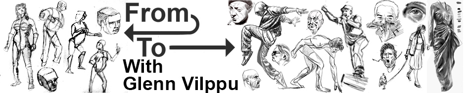
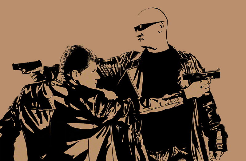
week9 This is it: A full body pose in a head class! I have been working like crazy on this style (full black or full white) for a while now, and it’s very time-consuming but I’m begining to be happy about what I’m doing.

And guess what: so is Glenn Vilppu! Wooah ! (insert snoopy dance animation here).

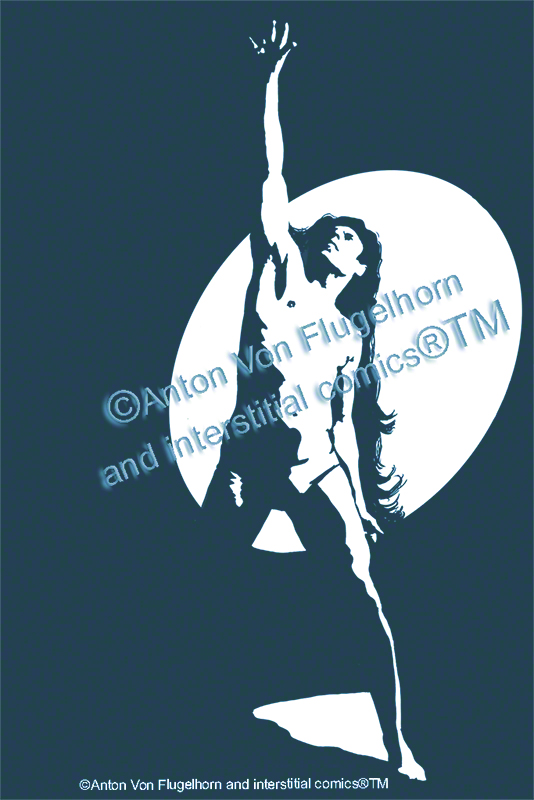
So for a change here is the drawing I made. Apologies for the tinge (digimark problem again) and for the © notice across it, but I have my reasons you’ll see if you read on.

upcopyrighted

The first thing Glenn told me in the crit is that he’s amazed at the difference between this style and the style I’m using on my comics. I am indeed doing another class than “head drawing” with him, that is the special personal project class, in which I work on my comicbook. I dont show it to you because it’s not ready. The style of it is very European comics, somewhere between Asterix and something totally crazy. Indeed, the total opposite of the drawing you see here above. I plan to use my black and white style in a comic too (another comic, obviously) and on design works (hence the © now that I’m getting somewhere – by the way if some of you are interested in knowing how to trademark something let me know – you can add TM to anything that is yours, but (R) is only for what has been legally registered, a long process, don’t use (r) next to something without first registering and getting your (r) certificate, using (r) without the proper legal work can end you in jail!).

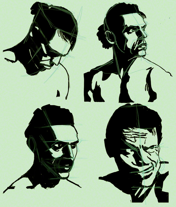
Glenn went on “nitpicking” as he said about small details, and here we are entering into the real work, the work a designer will spend hours and days on, and that Glenn advises me to spend the next week on).


My model’s body goes up on the left and rather down on the other side – I can – believe it or not, (I did not until Glenn did a demo to show it’s possible) accentuate that. First: the hair, it’s falling rather meaninglessly (like real hair in real life, which is not what I’m representing here) could expand, or even contradict the movements. The light on the left leg, too complex, is not descriptive enough. Same thing for the ribs (that, considering the position, will stick out – if you cant guess where, review your anatomy at once!). The stomach area could also be made to show move movement or more 3D.

‘Cause the trick here is: you can see it’s a guy lifting his arm up, so it’s 3D, but at the same time it’s just very defined black spots, which are 2D. The “spots” characteristic is great for reproduction, you can easily use it on posters t-shirts, tags, you name it. And as I’m beginning to produce here something that is “saleable” I’m protecting myself and I’m a lucky artist: like the big majors I have a copyright lawyer working for me (if needed) all year round (a family member who likes me a lot). I confess it’s comfortable to know that, with my copyright and registered trademark and my lawyer I can attack, free of charge for me, any thief or self-styled “borrower” in any country. Now, I’m not saying: marry a copyright lawyer or push your sister to get married with one, but…. well, lawyers are not all bad (as the dino who ate one in Jurassic Park proved – thanks Weird Al for this joke). But what I’m saying is: protect your work! Legally, but only through a government site, dont use a go-between site, you can register and trademark things yourself as long as you have a brain and a cup of coffee. (pet peeves alert) AND if you work digitally or if you scan your work (you must!!!) make *remote* backups on dropbox or other (remote because if your house burns the original and the scan are both gone and you’ll feel like a fool). Yes, I know, dropbox is said to be visited by the CIA, but I doubt their bots are programmed to steal art! lol. You can also send a copy of your work to a trustworthy friend who will keep it in his/her archive (and you can do the same for him/her). Or leave a hard disk with your scans on it at you mamma’s place, she’ll be happy to help and wont have any idea how to try and look at what’s on the hard drive, so even if you do erotica you are safe!

I’m going to spend the final week of this head class working of details of this full body pose. I’m also going to continue working on this style next semester and on my cartoony comics. After all, no one says you should have only one style. Moebius (The Incal) and Jean Giraud (Blueberry, etc.) were two totally different artists, yet they were….  the same person!

Draw in any style, but draw and be daring! Explore new ways of drawing!

now week ten!:

Week ten – Hair (not the musical)

Week ten – Hair (not the musical). I would have loved to start this last entry of the head class blog with a quote from a song from Hair, but I just realized I’ve never seen that musical – or the movie, “let the sun shine in”… is that in Hair?

In any case, this is the last week  of my taking for the fifth time the head class with Glenn Vilppu.

I really obsessed a lot this time on my black – white – no-grey style, but as it’s totally entwined with  an understanding (or not in case of failure) of the planes of the head, it’s been hard work and I’m very happy with all I have learned.

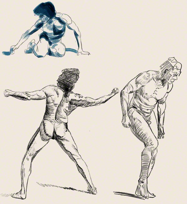
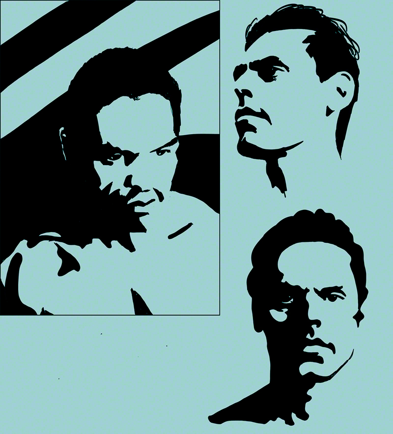
Last week I drew a head to foot Tarzan-like fellow (to test on the rest of the body my new style in the works as ordered by Glenn).

It was ok but there was some improvements to make. I did rework it, and here is the result:

up2 copy

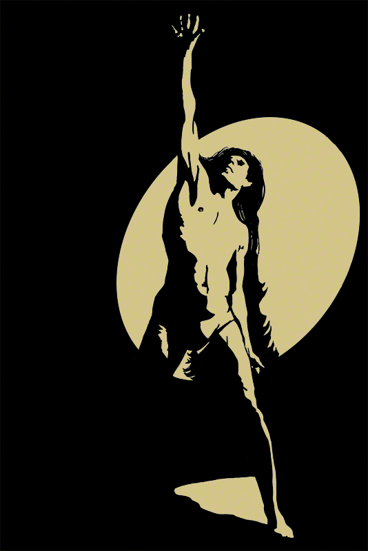
First, let me tell you that I positively HATE that hair! I love the idea of this guy having super long hair (doesn’t make any sense for Tarzan or Conan to have super-long hair, but who cares?). But the rework of it here is…. awful in my opinion.

At first I had added long hair only to separate the light from the white of the arm on the right. But thinking about it, he should have some unkempt hair, and some hair dangling between his legs (which is totally ridiculous in my drawing here!! thanks for not commenting on that :-D)

I was at a loss, but as usual Glenn found the solution in one second: wind! (well *I* call it like that), mass and movement!

If the hair is taking more space on the right instead of dropping dead right down, it looks more alive (pun), the hair between the legs is not useful, just add some hair on the left side on the body, just a lock, our brain will get that, of course, this guy’s hair is all around his back!

Glenn even suggested that I try making the white ellipse around the body smaller, so some of the arm on the right side (our right side) will have lost edges – like the arm pointing forward, since that leaves me more choice as to what to do with the hair..

Obvious, simple, easy solution… when you have been an artist and a teacher for 50 years! Well, I haven’t, and I saw nothing of this solution before Glenn spoke! I was totally blocked, angry at myself because it looked “somehow wrong”, I sent it anyway with a note saying “I hate that hair!” and bingo, he told me what to do – the advantage of having a Master’s feedback.

The next set of courses starts on the fourth of January, so if you want to join me/us (a happy bunch of happy, fast-progressing artists) go to vilppuacademy.com and sign up (yes there are payement facilities for penniless artists like you, me, and everyone else).

The fourth of January, I shall take figure one for the fifth time – still with a black and white approach – and an accent on the female body, which is so difficult for me, and also the mentoring class on my comic book (going very nicely, thanks).

Until then, I’m going to go for a change, cause a change is as good as a rest: I’m going to do something I’ve never ever done before: painting landscapes! In digital (the advantage of having a Wacom Companion is you can go around in the countryside with it) well…. in truth, digital cause I’ll be staying at my in-laws’s house and if they find out I brought a tube of oil paint (even water-based) in the house they are going to kill me! In any case,  what I want to study is atmospheric influence on colors, distances in colors, it’s the same in paint or digital, though in one case you press tubes, go crazy, whereas in the other case you play around with the color wheel, crash Windows, go crazy and start all over again. No big difference if you ask me.

See you in January then, see you next year in fact, and so Happy Whatever to you! Please remplace “Whatever” by the name of what your are celebrating this season, if your dont celebrate anything replace by “vacations”!

Best wishes to you all, and sketch a lot during the break !

Cheers,

Anton


Week 8 – simplifying clothes

“Week 8 – simplifying clothes” is a strange title for a blog currently about a course treating of the head. But I have my orders: Glenn Vilppu seems to think I have most (not all) of the planes of the face figures out (except the part under the nose, read my previous two entries) and he is interested in seeing how this hard black and white style would do on the whole body (next week, a guy in bathing suit!) and the clothes. In fact, he wants me (I guess) to show if I have understood form well enough to simplify clothes to only two values. If I haven’t he will tell me how to do it, and that will solve my problem with the under-the-nose area.

Clothes are a mess, so many folds, so many textures… A T-shirt and a leather shirt (does that even exist?) in the same position might – might with a very low percentage of might in it – make the same type of fold, yet you can see in a good drawing if the shirt is thin cotton or thick leather. And then there is texture (scratchy looking wool, soft looking silk) and pattern (try drawing a Scotsman in a tartan kilt and you’ll know what I mean).

I tried to do my assignment using different models – even myself in a mirror (I wear cotton all the time) and I confess I threw away a number of bad drawings (I had never noticed how much I move when breathing and drawing, and the folds change when you move – or perhaps it’s the mirror’s fault… hmmm)

I finally took a stock photo (paid for and no royalties, so I’m perfectly respecting the rights of the photographer and models). Two guys in black leather, black – ah, things are already easier. Leather – ah, things are well defined and there are less folds. Photo – ah, the models dont freaking breath all the time!

This said, it was a lot of work a lot of squinting and a lot of simplifying, and all of this from inside my poor little head.

But first here is my assignment, as usual the paper color is because digimarc wont work on white, sorry.

8

It looks like a complicated pattern of folds. But in fact the real folds on the photo were about 10 times more numerous and intricate, I had to analyse each point of tension, find what it did, analyse if it was important enough to keep or if erasing it would make the image less dynamic.

Let’s be frank: the bit I loved best was the black T-shirt 😀

Now what had Glenn Vilppu to say about this ?

Well, for a start he agreed with the contour around the head of the tall guy and the hands: they are placemarkers for a scenery behind them that would, if done correctly, allow you to read the form of the said head and hands.

The collar and flap of the jacket of the tall guy just dont read, you have to think a second before going “oh yeah, it’s the flap of the jacket” which means it’s bad drawing, whereas good drawing should be  instantly “readable”. (a key concept for ad panels on the highway).

Heads are ok. As for the rest of the folds, they are in the right direction but……. could be simplified so much more!

As I watched my critic (20 minutes of Glenn Vilppu drawing over my work and commenting, yeah!) I reacted to this: Simplify *more*? Cannot be done! Of course Glenn immediately did a demonstration – yes it *can* be done and now I know how, thanks to his demo just for me and my questions which he answered at length during the two hours chat a few days later.

I know what to work on, one more time. Each time we get a bit that was wrong  to get right permanently – I understand more each time, and each time I add one item to the list of what I can do. It’s just a question of me keeping working hard on what Glenn tells me to.

Work hard too, and seek knowledgeable feedback! (not your mom’s, I mean). Never give up, and see you next week for a guy in a bathing suit! (not a girl sorry, I dont feel ready for that, which is why next semester i’ll be doing the figure one class – again – and I’ll concentrate on girls. always concentrate on your weaknesses until they are not weaknesses anymore!)

Cheers

Anton

It’s girls but not as we know them, Jim.

It’s girls but not as we know them, Jim.

“It’s girls but not as we know them, Jim.” Sorry for the bad Star Trek catch-phrase reuse (I’m a trekkie). But this week, I’m still working on my black and white, and not a bit of grey or any other value or color are applied to girls’ faces.

First of all, if you look at all the games, comics, tv animations et al. you quickly realise that the artists are working with particular attention to making the girl sexy, or at least attractive, perhaps a character you can identify with if you are a girl. Sadly, in many cases, that ends up with babes in combat bikins,i when everyone knows that girls in commando-like teams wear the same outfit as the guys in their team – logical, they are there to do their job, not be shot, and not to have people notice how thin with big boobs they are.

But fiction being fiction, Hollywood being what it is, we get men in full armour, sweaty, bloody (considered sexy for men) and their female fellow fighters are in combat bikinis (an expression invented by the japanese animation series Dirty Pair) with makeup carefully applied, (WTF?)  just a flesh wound if any, no trace of sweat and perhaps one strand of hair displaced. Not fair. Not realistic.

In any case, in any art form and since the beginning of times it seems, girls have to be…….. special. The problem being of course that it’s not always easy to render a face in a rough way (like I’m trying to do here) and keep the “feminine” look.

I always found ridiculous the fact that Dumbo’s mom had long eyelashes to mark she is a female…. er, women have long eyelashes because they put on mascara! Now I would really love to see Dumbo’s mom putting mascara on!!!

Women who do not modify their appearance with makeup can be identified as female, in theory, because they have a rounder smaller chin, larger eyes, thinner eyebrows, longer hair (but that one is not a reliable point, many manly looky guys have long hair), smaller nose.

Well….. at least if we talk about youg-ish preti-ish girls. if we were to take and represent the whole of what a woman can be (the way we do with men with old guys, fat guys, silly drunk guys, etc) we’d find it’s even more complex than that.

Let’s face it: in the vast majority of work of all types of art, there are young men, old men, the fat guy that hides a poo-poo the painter did while trying to paint another character, ridiculous guys…. and only pretty girls with sometimes, rarely, the token mother or crone (apologies to all mothers and crones).

This means an artist has to master drawing girly girls. Without makeup on – let’s not cheat. Let me wish you good luck! It’s not easy. And it has nothing to do with the tastes of the artist: the difficulty is the same if the painter (in our case) is female, male, hetero, bi, or gay or even from planet Mars! There is no magic shortcut: mileage is, once more, the only thing that will lead you to success.

Did you notice that I rarely draw girls? I’m a coward, I take the easy road. And I’m paying the price this week.

OK, so here is my try at my black/white style with girly girls with no makeup on. Once more sorry for the paper being brown, blame it on Digimarc.

girl 1

This drove me nuts! I tried from live models, from photos, it did not work. I eventually settled on these three and did them over and over.

What did Glenn Vilppu have to say about them ? That they dont particularly look like girls, except the top left one (but perhaps he recognised the actress whose photo I squinted at – I’ll have to ask him during the next live 2 hour video chat we have each week).

Again, he found that the black under the nose did not describe the mouth barrel intelligently – arrrrrgh, as Frankenstein used to say: “failed again!” I’ll keep the fight and try again until I get it right!

As for the lost edges (in the top row right image) ok, but if this was a comic book (I’m working in that direction) there would be a background, then what would happen to the lost edge (which is a bit big btw!)

About the one on the second line, he – again – found that my neck rendering is…. not good, arrrrg again, paste / insert the above sentence here, never give up, it’s not my kind.

I was worried about the line on the nose of the same girl: was it ok, should I erase it and make a lost edge letting the brain of the viewer drew the nose for me? Glenn found that, considering were the light came from, it was quite justifiable to put a line on the nose as I did.

Looking at these now (a few days after toiling on them) I realise that the two three-quarter poses show very mascara-heavy eyelashes….. I could slap myself. If they don’t look particularly like girls with these on (I did not realise I was making them so) what would they look like without them? the Hulk and Thor?

Back to the drawing board, Anton! But this time for another challenge: Glenn would like to see how I manage with the whole figure, clothes etc in this style (I suspect the solution to my nose / mouth / neck problem could be solved while working on the whole body).

So see you next week and draw I lot, I know I will, and never ever give up!

Cheers,

Anton

6th week, and I’ve got something there (not on my nose)

6th week, and I’ve got something there (not on my nose)

Squint! Do it, I mean it, and look around you.

Harder… no, of course not to the point that you can’t read me anymore – very funny, ahum – but enough that you see the world vaguely through your eyelashes (and guys do have eyelashes like girls, so no excuse!)

What do you see? Answer: not much! And that is perfect!

You probably see less colors, but you can tell shadows and non-shadows, and this allows you to guess shapes.

Shadows and “non-shadows”? what are we talking about? We are talking about values. If you want to see pure values, look at a black and white photo (a photo in shades of grey  – and I dont mean from the stupid book/movie).

Every color around you (you can open your eyes now) is made of several elements, one of which is value: in other words: is this color rather like a highlight or a shadow (even regardless of the other colors around it). That is it’s “value”.

Some colors are annoying. You can make a bright light highlight-like blue AND next to it a dark shadowy blue.

Try that with yellow – bright highlight-like is the natural condition of yellow, but how do you make a yellow shadow??? Well, you can desaturate (meaning make more grey) the yellow, there are other ways that we’ll discuss later. For the moment what we want to do is simplify what we see by squinting, and grouping shadows together and the non shadows (midtones and highlights) together in another group.

Look at somone’s face, for some zones it’s going to be obvious: if the person is lit from above: shadow under the nose and in the eye sockets, ok, the high part of the forehead is non-shadow, right… but the chin, and the cheeks…. errrrrr….. difficult to choose between the 2 possibilities.

This is where knowing your planes of the head helps!

Cheeks: if you know your planes, you’ll know which part is facing up to the light and which one is perpendicular to it, and you can through your imagination exaggerate that tendency, and group the zone with either shadow or non-shadows.

I won’t go into reflected light here, as my work/assignment is not there yet, and might in fact ignore reflected light (hey, it’s my styl,e I do what I want!)

Talking of assignment, here is mine for the week, once more I apologize for the white of the paper being an odd color but digimarc watermarking doesn’t like white (if you know how to solve this, let me know by all means!!)

week6

Took me a while… in fact to be honest took me a freaking while, in order to decide what goes black what goes white.

I tried playing with some background on the left to help read the form of the head, but on the top right I left a lot of lost edges, his nose and forehead outer edge are NOT defined by a line, but your brain reads it right, not an easy trick to pull, but I love the result 😀

Now for the real topic of this blog entry: what Glenn Vilppu had to say about this.

Well, like I said in the title he thinks I’ve got something there. By that he means a way of describing form, I’m not the first artist to use this method, far from it, but the most interesting thing is it proves that I have made mine the planes of the head. Wahoo, finally I do feel at ease with the topic, it’s true, and all thanks to Glenn’s patience and guidance.

The shadow shapes under the noses are not right, he told me, and now that he told me I see it: it’s wrong, too massive, not descriptive enough of the rounded form of the mouth barrel.

Also the black supposed to describe the neck and upper part of the shoulders is not satisfactory, it doesn’t describe (like last time grrrrrrr) the real planes. Interesting: I have to work on the planes of the neck and torso, or I have to be more single-minded, I have a nasty suspicion that once I finally finished the faces I added a bit of neck and shoulders quickly and carelessly, thinking “oh whatever, close enough” which is NOT acceptable.

So my work is clear for next week: barrel of the mouth and nose shadow – let’s be precise on that, also let’s make the neck and shoulders as “nice” as the head. That’s the great thing with having feedback from a master: he tells you what to work on, and you just have to do it, instead of spending hours pondering “something is wrong but what?”

Which leads me to a terrible question: what about applying this style to female faces?

Read next week and find out why I’m shaking just thinking about it!

Draw a lot, and see you next week

Anton

Big Masses (and I’m not talking about a diet)

Big Masses (and I’m not talking about a diet)

If there is one thing I learned last week, it’s that when you are drawing using only the blackest ink on the whitest paper, you need to have a perfect underlying construction, particularly if you are drawing a head.

Also, lonely little black spots are a distraction, better have ink masses, or spots linked to each other by the construction of the head.

But first, here is what I did this week (things will be easier to explain if you have this in front of you)

assignment head week 5 marie codine nov15

Once more I apologise for the white paper being a funny color but digimarc refuses to watermark my work on white paper (big big failure there digimarc guys!).

I decided to do and overdo construction this week, and because I’m really not good at all at drawing lightly on paper (I’m a brute) I went digital – this allowing me first to have as many layers of construction as I want, and make them disappear if I want, and also to have one or two layers on top of the ink (else they would be hidden by the ink) so that Glenn can see my construction, what went right and what went wrong.

Now that I look at it I wonder: is this drawing or painting? Is this design? A valid question, the simplification plays with 2D as well as 3D illusion – this is (let’s pretend I’ve printed it for you) a sheet of paper, flat as can be, with stains on it, also flat. Yet you see a head. That means 3d but at the same time it’s very 2D, the roundness of the head, the front/side opposition is reduced to it’s minimum, this could be a graffiti done on a wall with a stencil.

In short: stylistically, it’s a strange place to be. And I love it. I’m looking for a very black/white graphic, no greys, no-frills style (for a comic with a story in the same style). I find it’s forcing me to review my construction, my shapes, my 3D – even if the result is going to be very 2D.

Let me share three personal keys to drawing a head, especially in perspective:

A/ In perspective, the eyes, bottom of nose, mouth and bottom of chin are parallel – sometimes converging a bit,  but only if you are toying with fisheye effects, a head is too small to really show convergence clearly most of the time.

B/ The front of the face is not flat, whack your face against a wall (no, don’t!!!) and you’ll get a broken nose, plus big bruises on the middle of your forehead but nothing above the outer extremities of your eyebrows – this explains why, in profile, you see the nose so well, as well as the middle of the forehead: it’s further forward than the rest, including the eyes! Think about it and the placement of the eye in profile)

C/ If for fun or exercise your think of the head as a box, be sure where the angles are: temples? too large, be more precise! and what about the cheek level? be sure to get that right.

End of my smart-ass know-it-all moment. And let’s see what someone who really knows has to say about my work for the week: Glenn Vilppu’s crit!

Glenn was very happy with what I did, perhaps the guy making a grimace is too complex, I could simplify more (aspirin please!).

The three others suffer from the same two problems: the black describing the neck and top of torso don’t really describe anything real, there is no construction there (I confess, I did not construct those bits, I was head-obsessed – my fault), and the shadow under the nose or even around the mouth is not completely satisfactory: realistic perhaps, but not legible – sacrifice realism to get legibility. The chances that someone will reconstruct the lighting and make a friend pose in order to check if the light “really” does “that” are slim (and if someone does, he/she is probably mad, so who cares). Once more: if you know your construction inside-out, you know how far from the real you can go, and still look believable (while gaining clarity).

In short: I’ve learned this week to be even more analytical, and to apply the same treatment to all parts of what i’m drawing (lazy me!)

See you next week, and draw everyday!!!!

Stay safe too…

Anton.

Nothing but ink stains (carefully done) on white paper

Nothing but ink stains (carefully done) on white paper

Have you ever seen those ads for Photoshop plugins that “turn your picture into a hand-drawn work of art”? (add a choir singing Hallelujah in the background and a “before / after” picture and pseudo-sketch made by the plugin).

Have you ever tried the demo version of any of those thingies? You probably did, like me, out of curiosity.

Two things are immediately obvious once you use it on a photo of yours: first of all, it doesn’t work the same as it did on *their* picture in the ad, and second, even my great-grand-mother (insert time machine use here), who never heard the word “computer”, would spot the resulting so called sketch as abnormal, she’d feel that something was wrong.

Why is this happening? Well, first of all, they obviously tried their plugins on many photos and showed the best one in the ad. But why that feeling that “this is wrong”, that there is something not human about the result, and for us who know about computers and Photoshop…. how is it that we can spot at once it’s a sketch done with a plugin?

Decisions.

When looking at a move model or photo or whatever, you get a tons of information: light, colour, tone, gesture, expression, perspective, shadows, shade, light quality, reflected light or absence of, anatomy, foreshortening… It can be too much, and as a matter of fact it is always too much, even the most hyper-realist have to choose, decide what to keep and what to throw away, what to use to express this or that – and by that I mean: Shall I use shadows to express the angry expression of the model, or shall I use the shadows to express the perspective of the model, angry and in a dynamic pose with foreshortening? Or shall I do that playing with the opposition between warm and cool colors?

As Glenn Vilppu says: drawing is the top activity when it comes to  multiprocessing. Proof of that: drawing is an exhausting activity when you start, then like a muscle that gets stronger, you brain adapts (this is why you should draw a bit every day even 5 minutes, to create the connections in the brain).

Decisions. A computer, a plugin filter in Photoshop, however powerful, can’t look at a picture and choose what to keep what to throw away. OK, soon I guess a computer will be able to look at a picture and say if it’s a portrait or a scenery (it already does to some point with face recognition) and will apply the filter specially made for faces or scenery. But that’s it. No “hmmm, this old house looks nice in the sunlight, but if I made the shadows different to make it look like it’s sunset, it would look spooky and cool”. Nope a computer sees a house as it sees it, and makes the picture into a series of spots based on levels and other not-at-all-subjective data. And art is all about subjective – yes even hyper-realist art.

This week I wanted to try and use only black ink on the white paper (the paper looks yellow here, sorry but digimarc watermarks dont seem to work on white background so I colored the paper in photoshop, apologies).

I took a book about Repin (if you dont know that Russian painter, rush and google him and be in for a shock!) chose some paintings (complex colors and shadows, play of cold and warm colors in the midtones – lots of stuff happening there) and tried to simplify it to just black spots. I’m sure a computer could do that. But let me tell you: when a guy in a painting has his face fully in the light with just a bit of shade above the eyes and under the nose, the question arises: what am I supposed to do with the rest: leave it in white or paint it black? It’s a very very difficult game.

Here is the result of my efforts:

04

The first thing Glenn told me about this in my crit is that the small black shapes not linked to big ones (like the one on the top of the hat of the guy in the middle top) look messy, and make him think of the plugins I was laughing at five minutes ago. That’s a point I’m going to work on: big blocks of white and big blocks of black… ok, even more decisions, I’ll need some aspirin!

He also commented about the white around the head of the guy in the lower right. ok, he can have some reflected, like on the chin (though if he did not it would make a nice lost edge, the eye could guess where his black chin ends against the black background, I might even help with a little clue in my black or white). But the top of the head: why the black line, white line then black background? white against black is clear enough!

The second thing I learned from his critic and from the following live chat was that really, as long as you know the planes of the head inside-out, you can do whatever you want, you can add light where there would be none, and as long as the eye of the beholder can read the drawing, no-one is going to come and say (whining voice) there’s a light on the cheek that could not be there technically!”.

Rembrandt did it all the time in his paintings and got away with it, comic artists do it all the time (particularly inkers) and get away with it. I can get away with it if I dare do it.

Shall I dare? Shall you dare?

See you next week for more black stains on white paper, and if you need inspiration, read comics by Mike Mignola!

Draw every day and be safe!

Anton