“Week 8 – simplifying clothes” is a strange title for a blog currently about a course treating of the head. But I have my orders: Glenn Vilppu seems to think I have most (not all) of the planes of the face figures out (except the part under the nose, read my previous two entries) and he is interested in seeing how this hard black and white style would do on the whole body (next week, a guy in bathing suit!) and the clothes. In fact, he wants me (I guess) to show if I have understood form well enough to simplify clothes to only two values. If I haven’t he will tell me how to do it, and that will solve my problem with the under-the-nose area.
Clothes are a mess, so many folds, so many textures… A T-shirt and a leather shirt (does that even exist?) in the same position might – might with a very low percentage of might in it – make the same type of fold, yet you can see in a good drawing if the shirt is thin cotton or thick leather. And then there is texture (scratchy looking wool, soft looking silk) and pattern (try drawing a Scotsman in a tartan kilt and you’ll know what I mean).
I tried to do my assignment using different models – even myself in a mirror (I wear cotton all the time) and I confess I threw away a number of bad drawings (I had never noticed how much I move when breathing and drawing, and the folds change when you move – or perhaps it’s the mirror’s fault… hmmm)
I finally took a stock photo (paid for and no royalties, so I’m perfectly respecting the rights of the photographer and models). Two guys in black leather, black – ah, things are already easier. Leather – ah, things are well defined and there are less folds. Photo – ah, the models dont freaking breath all the time!
This said, it was a lot of work a lot of squinting and a lot of simplifying, and all of this from inside my poor little head.
But first here is my assignment, as usual the paper color is because digimarc wont work on white, sorry.
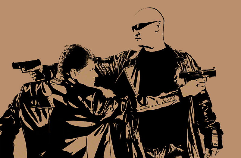
It looks like a complicated pattern of folds. But in fact the real folds on the photo were about 10 times more numerous and intricate, I had to analyse each point of tension, find what it did, analyse if it was important enough to keep or if erasing it would make the image less dynamic.
Let’s be frank: the bit I loved best was the black T-shirt 😀
Now what had Glenn Vilppu to say about this ?
Well, for a start he agreed with the contour around the head of the tall guy and the hands: they are placemarkers for a scenery behind them that would, if done correctly, allow you to read the form of the said head and hands.
The collar and flap of the jacket of the tall guy just dont read, you have to think a second before going “oh yeah, it’s the flap of the jacket” which means it’s bad drawing, whereas good drawing should be instantly “readable”. (a key concept for ad panels on the highway).
Heads are ok. As for the rest of the folds, they are in the right direction but……. could be simplified so much more!
As I watched my critic (20 minutes of Glenn Vilppu drawing over my work and commenting, yeah!) I reacted to this: Simplify *more*? Cannot be done! Of course Glenn immediately did a demonstration – yes it *can* be done and now I know how, thanks to his demo just for me and my questions which he answered at length during the two hours chat a few days later.
I know what to work on, one more time. Each time we get a bit that was wrong to get right permanently – I understand more each time, and each time I add one item to the list of what I can do. It’s just a question of me keeping working hard on what Glenn tells me to.
Work hard too, and seek knowledgeable feedback! (not your mom’s, I mean). Never give up, and see you next week for a guy in a bathing suit! (not a girl sorry, I dont feel ready for that, which is why next semester i’ll be doing the figure one class – again – and I’ll concentrate on girls. always concentrate on your weaknesses until they are not weaknesses anymore!)
Cheers
Anton