compo2 week2:not a week for sissy girls

If you wonder what I mean by “sissy girl” in the title of this week and if you are considering writing me a flaming letter about women’s rights and strengthes, may I first remember for those who may have forgotten that my screen name Anton stands for Antonia my 4th given name (yes 4th! I’m french, if I had been born Spanish like a friend of mine I would have 6 or 7 of them!). So I am a girl, and when I talk about sissy girls I mean: girls who scream when they see a mouse, wait for prince charming to come and rescue them instead of rescuing themselves, and also girls who consider that cutting up a roasted chicken is “man’s job” (actually having some knowledge in artistic anatomy helps in that task, so I cut up burned corpses of birds served in pretty large plates much better than any man in the family).
But why is this week not for sissy girls? Remember last week how Glenn told me he would give me hell with the nitty gritty?
OK, HE HAS, and you know what….. he’s right….. AGAIN!

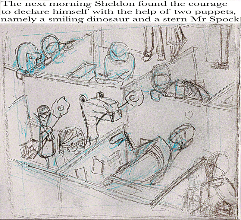
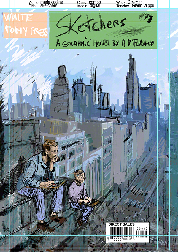
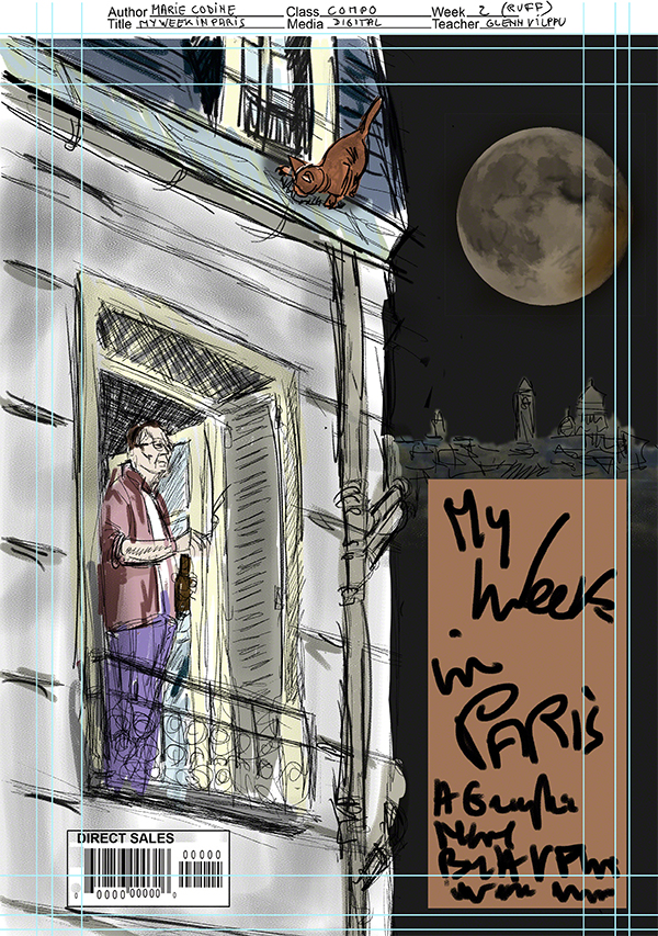
Here is what I sent in for assignment: two ruffs and a comp (comp= almost finished piece) all in one jpg as they dont deserve a digimark protection number each!

wpid-assignmentcompo2week2mariecodine-2014-09-14-20-55.jpg

This said I love them even if I mistreated them this week, so they are digimarcked, and I am not a sissy girl as established up above, so dont use without permission or I’ll come and make your worse karma come true.

Why “week not for sissy girls” What Glenn told me during the critic of these images was that the comp (bottom one) was sort of ok but the drawing could be improved in many places, and as for the two others they were flattened by the colors (what do colours have to do in a rough?) the line weight was the same everywhere, all this making them unreadable composition-wise.

Glenn knows me well enough to know that I can take the heat – I’m the kind of person to say: “oh look a torpedo, full speed ahead let’s see what happens!”.

But still not for sissy girls.
Between the moment I heard the critic and the moment I could talk to him during the live chat a strange little duo appeared in my mind: one was agitated and claiming it was a scandal being told things so directly and truthfully and critically, while the other whined on and on about how I’m no good and I should never have imagined I could do anything artistic. This may sound funny or idiotic but two days with those voices made it exhausting just living (for my husband too!). I tried to tell those voices that I was here to learn, and that you can only learn from your mistakes, plus I’ve got the best teacher to help me – so shut up. But it was not a thing for sissy girls indeed.
The chat finally came and I could talk to Glenn, as usual he took the time needed to show me the way and analyse the problem (I think he was expecting it – that man sees more than he says) His diagnosis: I need to work with value, depth, more details, more care – in fact what he had told me last week but I had not understood or listen or been able to do it. My fault, lesson understood this time I hope, if not I’ll work on it again! Not “sissy” but definitely “boneheaded”, that I am, mate!
Now I know exactly what to do: pen, paper, think every line but don’t loose spontaneity – something I’m not sure I could have attempted earlier. Ok let’s do it! we’ll see if I got it write this time!
See you next week folks
Anton

Composition 2 New class Week 1

Return of the revenge of Compo1: here is Composition 2, aka compo2 for close friends.
I’m in it, and I feel I might be starting to understand what composition is – about time too, LOL. Actually Glenn says I’m taking the normal amount of time to learn things, and truly that reassures me, compo is so complex and important. It’s nice to get to the point when it becomes….. fun!
As O’Shaughnessy wrote: “We are the music-makers, and we are the dreamers of dreams” (thanks to old Robert Hale for quoting this poem in his anatomy classes or I would have missed it).
And yes, I did look up the right spelling for “O’Shaughnessy”.
So let’s dream some new dreams!
I’m working on my webcomic, which is another story and is a lot of work. I’m also, alongside compo2 taking for the third time the “head drawing” class which I love – third time and I’m still hearing new things, discovering, understanding new concepts in what Glenn tells us (plus he adds new videos to the course all the time!).
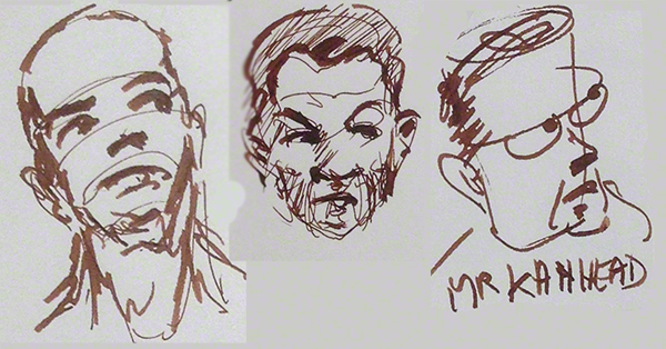
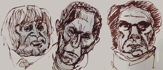
So, for no reason at all, here are some heads I drew vaguely after Daumier:
wpid-head-2014-09-5-20-05.jpg

thick/thin japanese fountain pen and choco brown from diamine as usual.

Compo2 is different in one respect from compo1: we work on 2 projects at the same time instead of 3. At first, during the first weeks of compo 1, I thought 3 were too much, but very quickly I realised that Glenn’s plan was to push us to think less and draw more. I have never produced so many drawings (most of which I’ve shown no one, and certainly not here). I cannot believe how this has changed me: drawing is a *tool*, art or story telling is the goal – before that I thought drawing was the goal. It’s a game-changer, another one, concocted purposefully by Mr Glenn Vilppu for our good…. and he knew exactly how we would react and change under his carefully calculated pressure – do remember: this was the first time he did compo1, we were the first batch of students, and yet he knew what would happen! I confess I’m in awe at the man’s knowledge and experience.
The first week of compo 2 – what do we hand in for assignment? Well, Glenn wanted us to go on working on our last assignment from compo 1.
This week is about “timing” in composition.
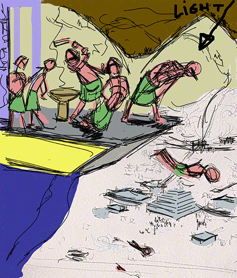
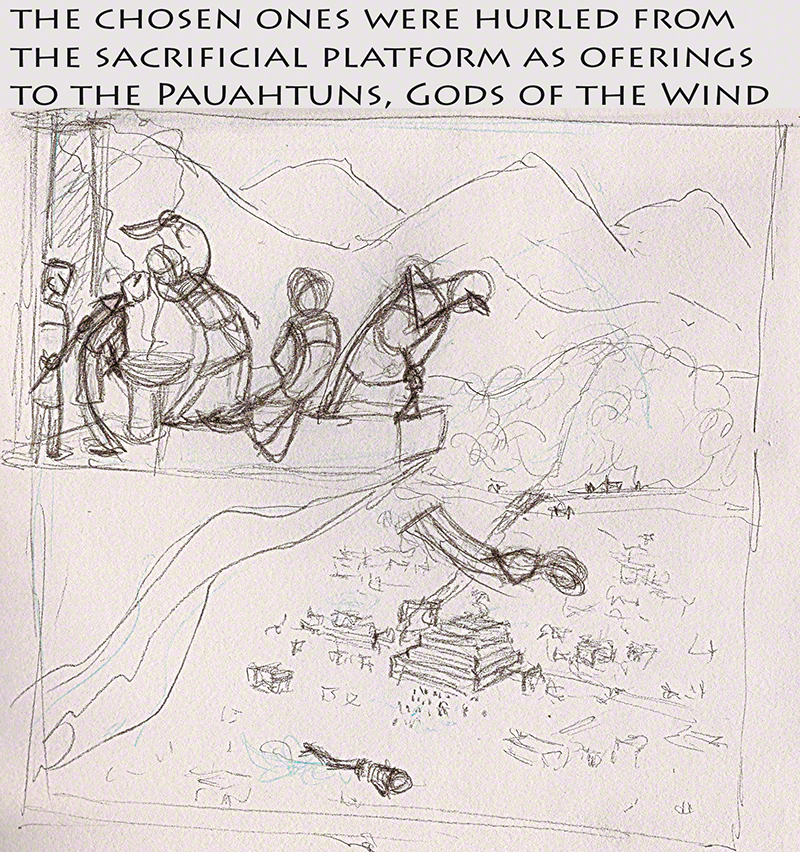
Here is another version of my “office” scene and my “Mayan” scene as I think of them. Again I worked in pencil and paper, Glenn thinks it helps me (and I don’t question his opinion anymore!), I only went to photoshop for some coloring in the Mayan scene (to make things *clearer*…. ok, I know I should have guessed that if I needed to make things clearer it meant they were NOT clear, silly me!)

wpid-Office-2014-09-5-20-05.jpg

wpid-Maya2-2014-09-5-20-05.jpg

Glenn found the “office” much much better, I’m to sort of finalise it for next week (as extra work, meh….), he also found that some things were better and some worse in my Mayan scene, but….. he has decided to be far more “tough”, nitty-gritty-wise with me than before – look at that temple in the valley below the falling Mayans…. the vertical edges are not even drawn! They could be (or not be) part of the composition, but they *should* participate like all the rest of the details I have so far half-drawn in a “oh, it’s close enough, it’s just about the compo” stupid attitude of mine.
In short: Glenn’s going to give me hell 😀 and I’m delighted! It means he thinks I can stand the pressure, the fact this happens just after he told me to start a comic is logical and goes in the same direction. Now all I have to do (*all* I have to do? Insert insane laughter here) is work hard even more, and move to the next level! Level up time, no more “close enough”, we are getting pro here!
I’m going to do my very best, work more, not just time-wise but quality-wise. I’ll also try and generate new ideas, not only for my comic but also for the compo2 course. Indeed, we are now to choose the topic of the drawing/painting ourself, we are given a specific point of composition and must apply it to…. whatever we want.
May the “Luna Park” that my husband claims exist in my brain be set free! Let it goooo…. sorry, sorry, ahum….. drawing never bothered me anyway! (to be sung to the tune of “let it go, the cold never bothered me anyway”….sorry again, next time, a quote from a Train your Dragon movie, I promise!)
Now where did I put my vitamine C supplements?

🙂 see you next week with some new ideas and better drawings I hope
Anton

week 10 grand final with sequel to follow

        Week ten and end of compo 1! Time flies like an arrow (which translated by Bing or Google translate into French gives something like: “time loves flies (insect) an arrow”).
        Comic-wise, I don’t know if I’ve out come of WTF mode: I have realised how much work is ahead of me and I’m working hard on it – the comic, the character, wordpress security, webcomics must-dos and must-not-dos, you name it… And of course right now is the time my brain chooses for another helping of “I can’t draw at all anymore”. Well I don’t have time for this shit: I’ve got work to do! So I’m currently designing the faces of my characters in zbrush – realistic style – I’ll caricature them later.
        I’ll blog about that when I start my webcomic, so enough about this.
        Anyway, week ten. I went on using only pencil and paper.
        Glenn, as usual, gave me a thorough and very useful critic on my three pieces:

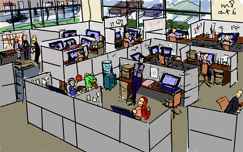
        First, the office scene. Last week he asked me to zoom in on the real action and lower the camera (I’m translating in movie language, apologies). Here is what I’ve done:

wpid-Office-2014-08-22-18-38.jpg

        Glenn’s comments could be summed up by “almost there, exaggerate the movement even more”, it’s true the puppets could accompany the movement of the swooning girl, the character on the right of her is useless, and the unhappy guy on the second row and his neighbours could have move movement, expressing better what they feel, and making the action of the main characters more obvious.
        The legs in the background are… to my surprise, an excellent idea: the world does not end at the border of the image!!!

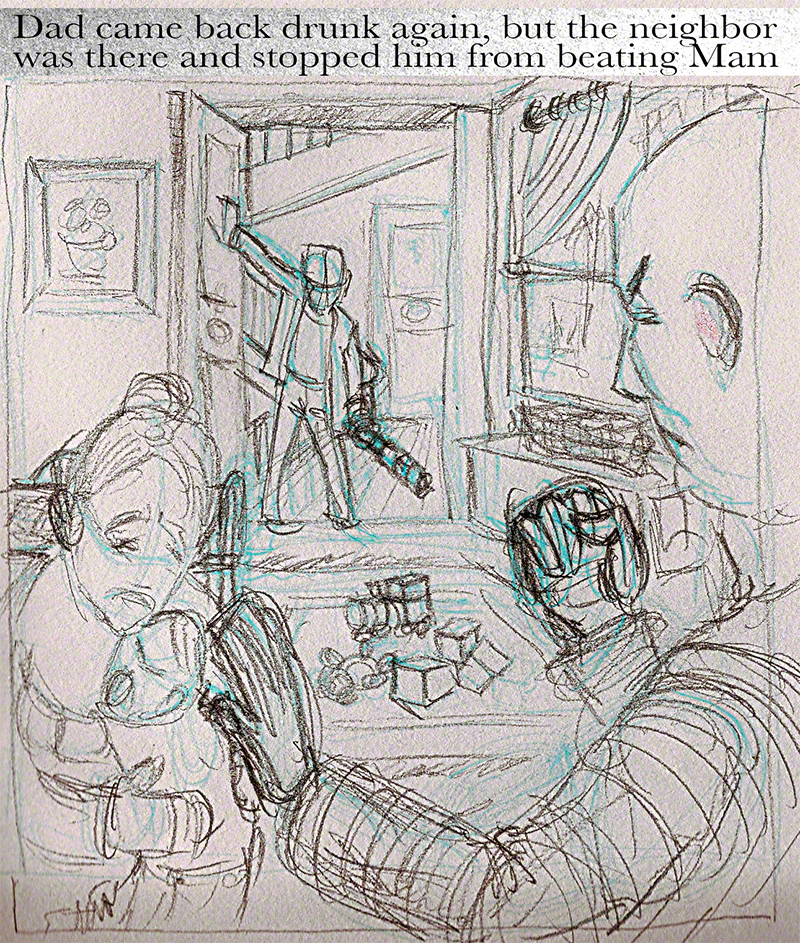
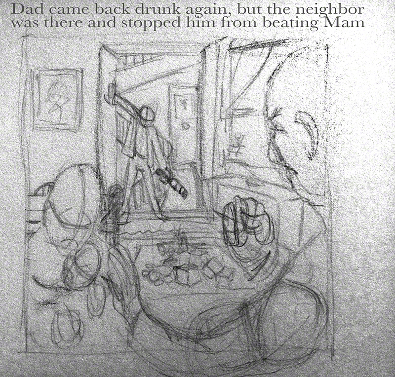
        My other work in progress was the coming home of the drunk father and the protective good guy being….er…. protective of mama and baby, all this with the emphasis on diagramming space.
        I followed last week’s comments to the best of my abilities (and added thickness to doors and windows…… grrrrr … I’m so stupid sometimes). Here is the scene’s new version:

wpid-Drunk-2014-08-22-18-38.jpg

        OK, let’s tell it like it is: it now looks like mr good guy is threatening mama and child, and drunk dad is coming home either to hit her… or save her from the good guy! LOL, talk about a drawing that reads backwards!!! Imagine Michelangelo drawing a crucifixion scene in which Mary looks like she holding her son in position while they are brutally nailing His hands to the cross…. no, no, no! Must redo this for compo 2 (and the office scene too, cause it’s nearly ok… which is a more flattering reason, I confess :-D)

        As for the topic of the week, it’s a biggie: rhythm and timing!
        As a famous computer would have said: “…hmmm, tricky!”
        After much thinking I went the Mayan way (remember the Mayans? Their huge and blood soaked empire got over-taken by 200 sick and hungry Spaniards on tired horses, but today some people still read and believe their prophecies. Go figure.)
        Here is my pseudo Maya scene (and don’t email me about the historical exactitude of this sacrifice scene, or I make them into Mayans from another planet and then I have them do whatever I want!).

wpid-Maya2-2014-08-22-18-38.jpg

        Glenn spent quite some time on this one, talking to me about the big things: perspective should be different for the sacrifice rock (and the corpse at the bottom), why so many mountains when one would suffice to emphasis the chasm, also the right side of the image (beyond the head of the plummeting guy) is frankly useless.
        We’ll work again on this one and the attached topic during week one of compo two.

        Composition two start this coming week, the chat is at an unusual time due to Glenn being in Japan – in the afternoon for the US….. at 6am for Europe.
        I’ll be there, and I’ll be here too, blogging about it all. If you feel like dropping me a line, get in touch on Facebook with Anton von Flugelhorn, I’ll be happy to make new pals!

        One week-end is all I’ve got to work “only” on my comic. Next week, madness strikes again, LOL!
        I haven’t had the time to really finish any drawing during this compo 1 class, but I do feel like it has completely changed my approach to drawing: drawing is only part of a larger process, don’t make such a fuss over it, shut and draw, if the result is bad, throw it away, do another one, a hundred other ones, after all, it’s only drawing.
        I think it’s significant that the other day, I thought to myself: “hum, that kind of building seen from above…. let’s build a rough of in sketchup to see what it’s like, and where to put the camera” and my next thought was “naaaah…. it’s faster drawing it!”
        I would never ever have thought *that* only a month ago.
        The class has changed me deeply, but then it’s logical: compo is the favourite topic of the greatest drawing teacher of the planet – if you add to it my working hard, and doing what he says (he’s always right even when I don’t understand why… very unnerving at times LOL) a winning combination I guess.

        See you next week my friends, draw! draw! draw! and have fun!!

Anton aka Marie

9th week, where Gandalf entrust the ring to our hero

9th week, how time flies! one more week and end of compo1, a week of vacation (that I’ll spend finalising the so-called “final” versions of my work) and then composition 2 – YES! a new class, the continuation of compo one, tougher, funnier, interestinger….. and yes, I know “interestinger” is not a word, but who cares!
Compo 2 will be fantastic, and due to all the positive feedback from my blog and forums I’ll go on blogging about it!!!

Just like that, here is a little bonus, a few heads I did with a thick pen (Glenn’s idea, and of course it worked wonders for me – the man is amazing)

wpid-qlqtetes-2014-08-15-18-37.jpg

in case you wonder, the ink is chocolate brown from diamine.

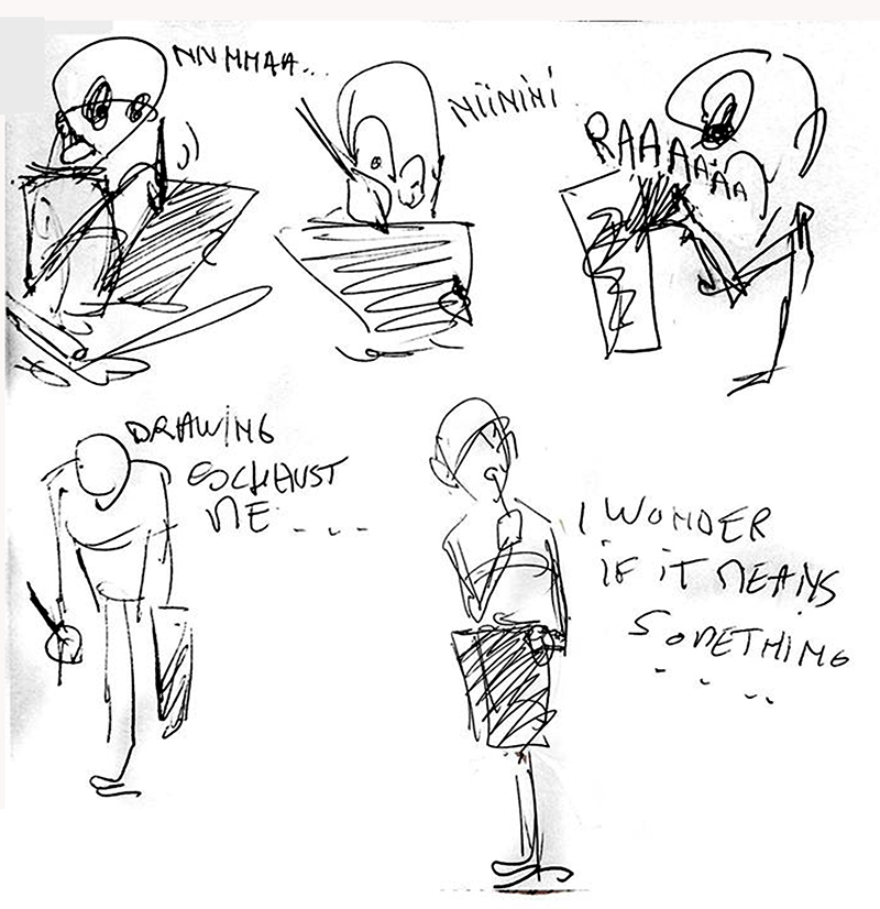
        Now something very unexpected happened, I had already added some 4 image funnies to my assignments just for fun and to comment on the tough life of the art student. This week I added this:

wpid-exhaustingfun-2014-08-15-18-37.jpg

        During the critic of my work, Glenn literally ROTFLed at that last “funny”, which made me happy: “it’s really funny” I thought, then he became dead serious and told me I had a jewel-like (his words) talent for fast simple drawings that read immediately and I should now start working on creating a comic or strip and get it published.
        Now, according to my husband (for those who forgot I’m female even though Anton is my screen name) I spent the rest of the day with on my face the same expression our dog had the day she found herself face to face with the hedgehog in my in-laws’ garden and the hedgehog *sniffed* her! “WTF” or rather “what just happened? Is this the right reality or am I still in bed dreaming?”. Took a while to sink in that I was considered marketable by someone like Glenn whose experience, honesty and knowledge of the market is considered by all to be perfect, up to date and totally trustworthy.
        Ok, I’ll be really honest: I am writing this 5 days later and it still hasn’t sunk in even if i’m beginning to get to work on “it”.
        Funny but people who know me and are themselves artists are not surprised at all, I’m apparently the only one in WTF mode 😀 makes sense!
        More about all this later, I must chew on this before talking further about it.

        This week, Glenn was teaching in Japan, but he made the impossible possible: he found a time slot that was compatible with both US and Europeans students. he combined the compo chat and the “all the rest” chat together and we got a magnificent 2 hours drawing with comments, questions. Like I said to my classmates: it really made waking up at 6AM while on vacation totally worthwhile for me, a great great demo by a master!

        The critics: this week, as per order of the Master I did my assignments on paper with pencil (why do I imagine Yoda saying: “ in paper and pencil the Force will gather Hummmm no cintiq thou shall use, young Padawan!”) LOL

        Assignment one was about mass and space, and number two about diagraming space, here they are – considering they were illustrations for imaginary books, I wrote the sentences they were supposed to illustrate. Apologies for the bad scan quality, next week will be better.
        Here are the two new version of those beasts:

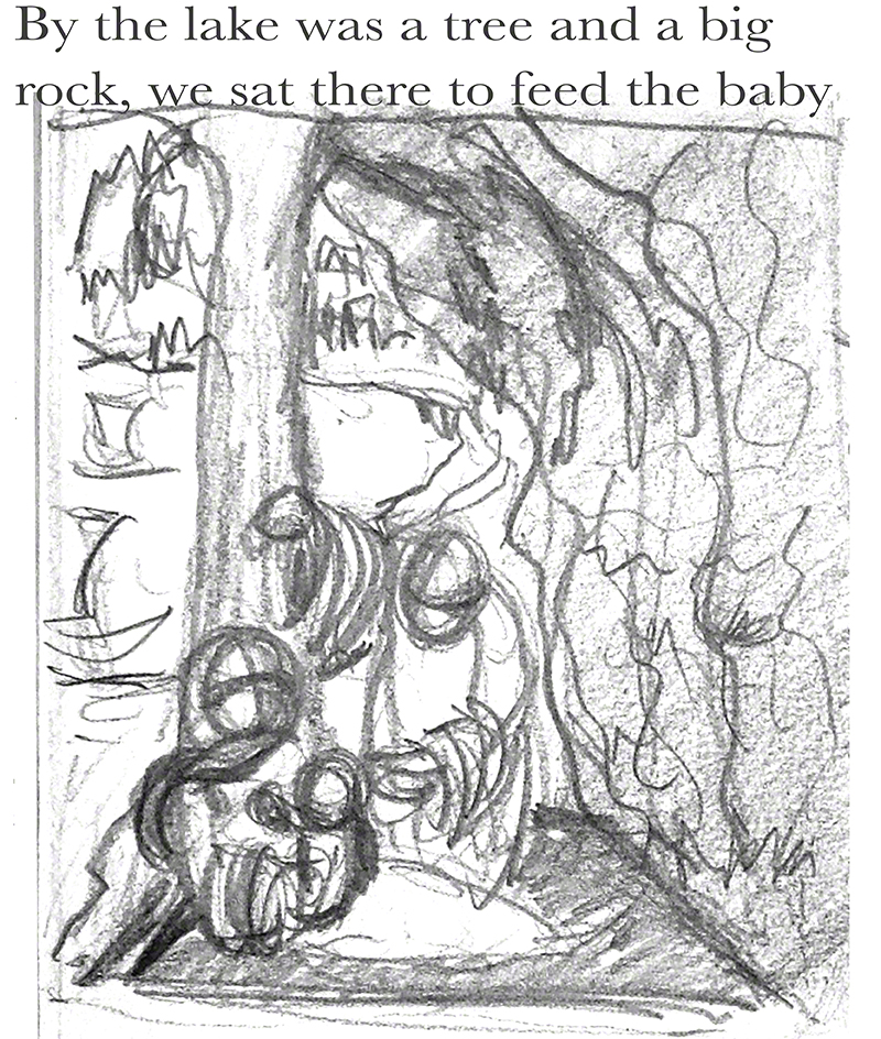
wpid-baby-2014-08-15-18-37.jpg

wpid-bureau-2014-08-15-18-37.jpg

        (((aside: Why did I call the geek Sheldon….no idea (cynical grin, ask Mr Spock – he knows).)))

        Glenn found both to be big improvements on the previous versions – pencil is good for me (I did about 20 different versions on paper of both of these).
        The family sitting under the tree read great, the mass of the rock is rrrrreally a contrast to the space behind the family, that’s finally good! I could work the big rock on the right so that the lines, lumps and veins of it add to the compo by repeating (or not) the figures on the left. One annoying little thing: the bit of lake shore on the left of the tree and Mama is not quite well related to the rest of the lake. grrrr.

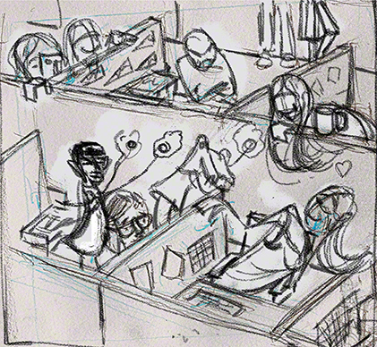
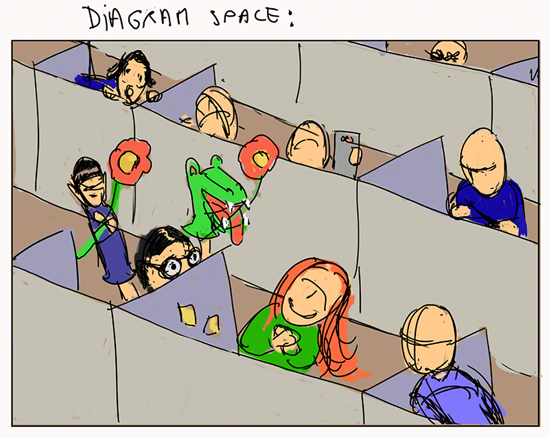
        The office scene READS too!!! loud and clear at long last! Glenn think I could concentrate all the good things in it by making it a narrower drawing (less characters, less cubicles) and having the “camera” move lower to that effect.

        The new topic of the week was… diagramming space 2 (the revenge of the sequel of diagramming space from last week which was “1” but we did not know then). It’s an important and very difficult topic. Here is what my pencil came up with:

wpid-drunk-2014-08-15-18-37.jpg

        Glenn likes it: the eye goes around from arm against door to bottle; to fist and face of good guy, to his arm protecting the mom and babe. Also the floor, walls, and landing behind the dad are creating lots of space.
        Two little things: the door and window have no thickness! (not such a tiny thing: do that at Disney and you get sacked out!), also the protective arm of mr good guy could be better drawn (let’s be honest: it could be “drawn” instead of just “indicated”)

        Next week is week ten, final week of compo one, then compo two starts.
        And now on top of that I am also working on a comic.
        If any of you have special prices on vitamin C get in touch with me 😀

        NEXT EPISODE (JIKAI YOKOKU for anime/manga fans) the big all paper-and-pencil final of this number one compo class – but certainly not the end of my compo studies (compo 2 coming!) or blogging here.

        Will our hero …… er…. get out of WTF mode and let it all sink in, cause I may be already working on a comic but…. I’m not sure this is the right reality – things don’t go that well for me usually, even when I work real hard. So either I have a nasty low esteem problem, or I’ve finally found my “calling” and “tribe”… or both!

        see you in a few days!

8th week:channeling Daumier and other basic things

This week I tried every evening to draw, sketch doodle mindlessly, while chatting with my family (that includes the dog “woof” and “shut up” being the meat of that dialogue.
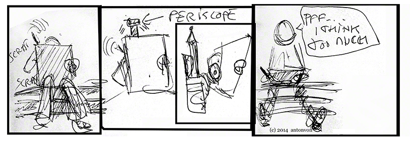
        It might have to do with my watching the excellent documentary Stripped (about cartoonists, authors of “funnies”, web comics etc) but I ended up making a sort of four images strip (for you manga fans: a “4 koma”) I thought I’d share it here, it’s autobiographical obviously:
wpid-8bdsketchbook-2014-08-8-18-37.jpg

        I do think too much and draw better when I reach “the zone” when “it” draws, reread Herigel’s classic little book on zen archery for more on this feeling. I can but fight this by drawing a lot, far more than before. This week I must have draw several hundred thumbnails, most of them of no value, but almost all of them were on different topics or scenes, also it’s now becoming more natural to me to position my “camera” in a non “photo taken in the street” position. These two points are really big steps forwards for me, I’m not sure it make me better at composition but it makes me better at drawing and that is fantastic!
        For fun I included the little strip above on my assignment, Glenn laughed a lot and told me I *am* a cartoonist at heart and talked about my head drawing, constructing heads in the classic manner but doing exaggerated feature like Daumier. Is he trying to tell me something ? 😀 I’m going to go on doing some 4 komas just to see how I feel about it, and caricatures à la Daumier. Any drawing is good for me!
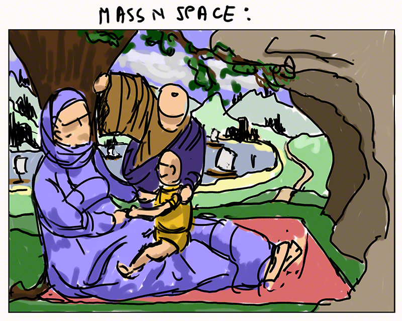
        Last week I promised you some togas, here they are as a ruff for the topic of the week: mass against space:
wpid-a-2014-08-8-18-37.jpg

        Yes yes, I know, it’s totally “Mary, baby Jesus and Joseph” in appearance, an odd subject for an old Buddhist like me, but they could be any family from the days of togas, they could even be the Baptist and his Mom and Dad LOL! See in this what you feel like seeing, that is fine with me! (got nothing against baby Jesus or his family!)
        More seriously I kept thinking how the old master had it easy with compo with all the togas and folds and clouds and rocks etc. I decided to try it myself.
        Is it easier? Hmmmmmm in a way: you have more choice, but deciding that the fold of Mom’s lap is going to have a certain shape so it leads the eye to Dad is…. difficult: can I get of with i? is it cloth wise believable? is it a good choice? will people notice – is it too subtle or not subtle enough?
        Composition is a complex game of choices and also of self confidence, knowing one’s audience, experience.It’s not just pointing a red arrow with a bubble saying in blinking letters “important thing over there!”
        To my surprise Glenn did not comment on the family or the folds of their togas. He found the tree a i hard to read and advised me to add roots to it so it reads better, my diagramming of space is ok with the carpet on the floor and scenery, but the rock on the side is not big enough to make this a “mass against space” image.
        Embarrassed smile…. I did the image thinking of the family plus tree as the mass, the rest being space, the rock being a repeat or reminder of the family mass. Another drawing that does read one way for me, another for others! Glenn advises me (same for the two other drawing below) to draw on paper next week, no cintiqing at all. OK, let’s see what it changes!
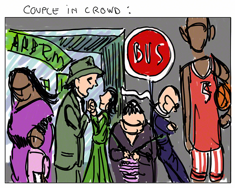
        My sinking titanic and the star couple being noticeable thanks to compo only…… I can’t stand that titanic thing any more! so I change completely the topic for the final of that “couple in crowd”. It’s suposed to be a final, it’s only a first try, a thumbnail, I’ll work on that later. here is the beast:

wpid-b-2014-08-8-18-37.jpg

        I was quite happy with the way I put in star position my couple (the guy has to be James Stewart -D) the work with the scarf, the window behind etc.
        Glenn pointed out two things: one small: the tall guy on the right has a head that is far too big, and most important: the old knitting lady looks like she in front of the others, forward really. I did not wan that, to me these people were all lining up at the bus stop but not I can see: the little guy on her right looks like he’s leaning against her and not the bus stop panel.
        Also the tangent between the shop window and the bus stop sign kill the depth of the image – image to be reworked on during the free week right before compo2 class!

        Last thing: the “comp” for my cubicle love scene, last week it was too still and vague, who was the scene about?
        This is my new take on it:

wpid-c-2014-08-8-18-37.jpg

        Glenn’s advice: much better but I can play more with position (they are all at equal distance from the others, yuk) I could have my red hair girl bend more one way, her colleagues be in more exaggerated positions.
        I’m being too subtle once more. Again Glenn asks me to work on paper and with pencil only – ok let’s do that and see!

        Next week is week 9 of the ten week course, let’s go for it: subtlety bye bye! (and cintiq good night)

        See you next week for more about my adventures in time, space and art!

Seventh week: hell is paved with images that do not “read”

        Where-ever you go – there you are, as Bukaroo Banzai often says.
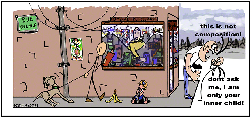
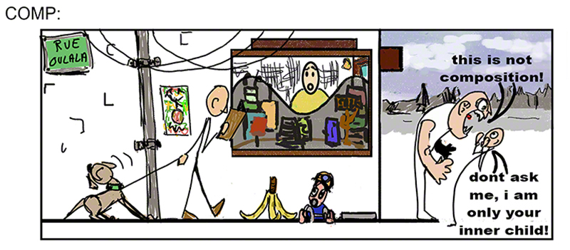
        This is the week in which I have to hand over my “final” version of my banana peel symphony – I polished it all, built the 3D (look Ma: perspective!!!) made the peel smaller and here is the result:

wpid-7bananafinal-2014-07-18-18-35.jpg

        Why “Rue Oulala”? Because I’m French and I love laughing at clichés (oulala is not something people say all the time, but perhaps it was in 1930 in the Maurice Chevalier days, my grand ma found it old fashioned)

        Glenn’s verdict: has it got a joke value outside of the class? difficult to say (my opinion: the banana joke has nothing funny, it’s so old, as for the bully and inner child, their presence is incomprehensible outside of the composition class) But, back to Glenn’s opinion the compo works. Great: I have an image that is meaningless outside of my class but its compo is good 😀 way to start a career! LOL
        Glenn pointed out that the sewer guy’s head looks funny, now that he has mentioned it I see it but I did not see it before: it should be the same size as the dog walker’s head and fill the helmet! Will work on that when I have 5 minutes!

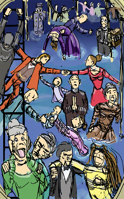
        Now back to the unreadable titanic (re: last week). I redid the image totally, trying to get a more readable image: faces, bigger “hero couple” taking the horizontal in a more obvious way. Here is the result:

wpid-7titanicnew-2014-07-18-18-35.jpg

        It’s a ruff (a very ruff) drawing, but it took me hours to rearrange the characters, and pages of thumbnails (more than the other images I do).
        Still the result it still confusing Glenn tells me: lots of action in there, who is the star couple? impossible to say! The compo doesn’t “point” to anyone. In fact i’d go so far as to say the compo doesn’t exist at all!. Back to square one, but i’ve learned a few more things here. I’m going to redo this totally!

        But what of the topic of the week? the topic of the week is the very important diagramming of space, making clear where everyone and everything is.
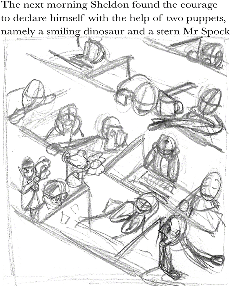
        I got a very clever idea: wanna diagram space? how about this setting:

wpid-7ruffdiagram-2014-07-18-18-35.jpg

        Now you cant beat that unless you have a floor made of checker board like plaques! LOL
        But where is the composition? what is the image pointing to in itself?
        Nothing, I now see. Glenn tried very hard to find some elements pointing to the red haired girl who is in the center zone, has free space around her….. but I did not include any in fact – I considered that the nerd in the cubicle on her left, with the Spock and dino puppets holding flowers was the main point, my idea was that the guy is declaring his flame through puppets…. does my compo lead the eye to him? Frankly no, I thought the panels’ lines would suffice, they do not, we are talking serious hard worked composition here, not compo for a quick funny cartoony drawing (and I’m insulting cartoonists here – some of them are masters of compo!)
        No problem: I’m going to redo this, still feeling that people wearing no togas, no draperies and the absence of rocks and trees that I can bend into whatever shape I want is not helping! (last week I said there would be togas this week – I was getting ahead of myself: togas next week (please remember i’m writing this after the fact – I’m LATE in my blogging!)
        The positive from the above work: composition is not clever setting, but a very complex work that takes a lot of work. Also I produce more and more drawings every day, never thought I could do so many, all different, testing ideas, rejecting them – you see one out of 50 of what I draw if not less. My imagination is going wild (it was already too wild before :-D) but now it’s wild on the paper: ideas come more quickly than ever,I feel that the pressure of so much work, so much self doubt and step by step improvements (plus deadlines!) has made the cork of the magic bottle pop out! I can draw or doodle for 4 hours straights with new ideas in each drawing (and then I go sleep 2 hours LOL).
        It’s moving in my head, I’m not there yet but I’m improving, and if Glenn says I’m on the right track then… no worries, more drawing less thinking!
        Next week: togas! (and James Stewart, but not in a toga!)
        cheers

Sixth week: our hero is totally lost and the Master says it’s good news!

Lost at sea, truly lost, as Alice would say, this is a difficult week; but things are starting to move in my head (I know cause I come from the future: I’m writing this from the vantage point of….. august and this week that I’m describing is in july! (insert mad scientist laughter here or, failing that, the Aracuane ’s song from Disney’s Très Compañeros!)

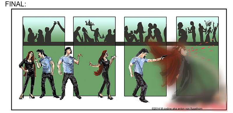
my final of last week’s killer sequence has change a lot, Glenn likes it except for the girl when she gets blasted, it’s hard to read and should be redone – I will when I can. He likes the counterpoint of all the actions that take place above the killing scene. Dont quite know where I got that idea from, it’s not quite composition, more “playing with elements of composition” but I guess it’s already something!
here it is:

wpid-6killerfinal-2014-07-11-18-14.jpg

my “comp” (the “almost there” stage) of my banana peel has improved too according to Glenn: the creation of the shop instead of the wall behind the action gives some more “arrows” pointing the eye toward the tragedy about to unfold (the shoulder line of the girl in the shop, the wave of the window shop decoration etc.) but it’s not clear says Glenn if it’s a poster or if it’s a shop… more 3D please seems to be the message he has for me!

this is the “thing in question”:
wpid-6compbanana-2014-07-11-18-14.jpg

        Which brings to mind a game I invented: try using naturally in a normal conversation the following sentence: “I think my banana peel is too close to the suer man”. I did use that sentence naturally, but can you 😀 my circumstances are not yours (insert another insane laughter – this is Vincent Price type laughter week)

        So the girl getting blasted did not read well even though it was easy to guess what was happening to her, and the shop in the banana disaster scene is not an easy read either.
        Funny, cause I read them very well, just as I read well my Hamlet two week ago. Is there a pattern emerging here?
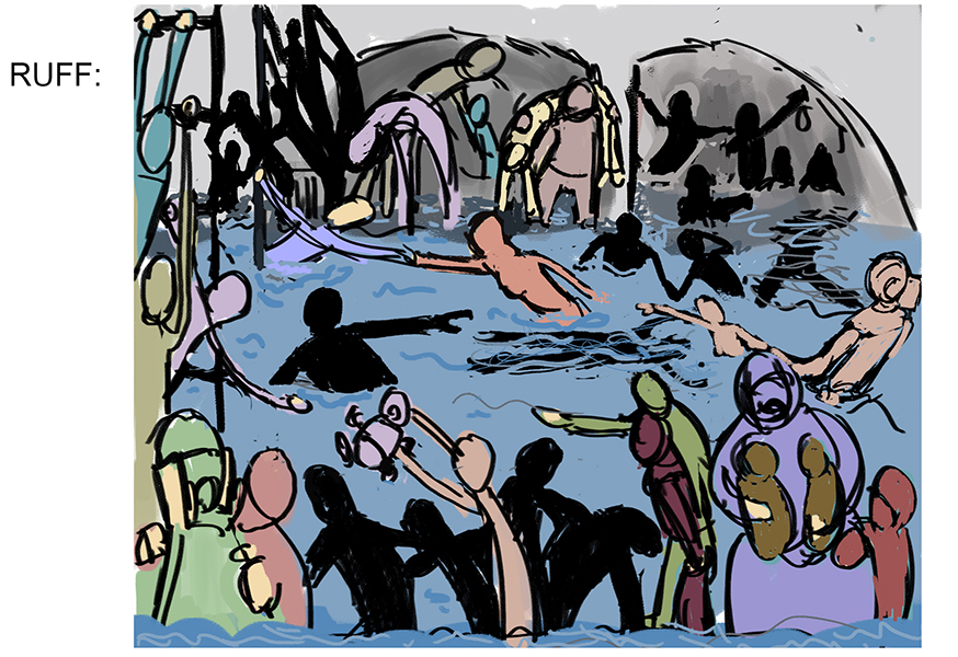
        The “topic” of the week being a couple stands out of a crowd thanks to composition I decided to do this (and I dont tell you what it is so you can see if you can read it of not)

wpid-6titanicruff-2014-07-11-18-14.jpg

        Now can you read (understand) the action? Glenn could not and read it as a sort of swimming pool thing, a confusing multi actions scene with nobody standing out clearly of it.
        This was, in my head and in my head only, the sinking of the titanic, 3rd class, 2 corpses float in the water, children are the priority, they must be saved, but panic is high and so is water!
        Fail! major fail! and I was certain it read loud and clear with our romantic couple arm extended towards each other in an horizontal if Bollywoodesque moment.
        Two lessons t be learn for me (three if you count the ego being bruised: I was happy with myself on that one):
        1/you the artist know what you are representing in an image, the viewer doesn’t, even with a tell tale title (which is cheap and old fashioned) they have no idea at all what they are watching – ok there is water and there are people, but outside of that it can be anything: the swimming pool, the titanic, what I did during my vacation, the martians invading the Aloha islands…. what you know is useless, it’s what is in your picture that people will see, they are not telepaths.
        2/ dont be subtle, well, not the super subtle kind of subtle. This guy is important? OK make that unescapable – and as this is a compo class, make that unescapable trough composition!
        If you look at the great masters of the past, they kept representing Jesus (the church being the big big client for art at the time), now their Jesus sometimes has a halo, plus a mystical glow, plus is wearing expensive colours that only the star of the painting will wear (blue aka lapis pazuli, at the time would cost more than gold!) and everybody is looking at him either to beat him or crucify him or to hear his wise words, all are towards him, even the animals. YET the great master would STILL use compo to make him stand out – the fold of the cloth of the guys around him, the hills behind, the clouds, everything manipulates your eyes towards Jesus. And the result? It’s SUBTLE, yes for all the “in your face” and “all the tricks of the trade” and the (bully’s voice:) “he’s the big guy in this painting O-K-?” it comes out as subtle!
        This is what I have learned this week.
        actually I realised al that a week after “this week”, but it’s “this week” that made me face it. And Glenn was right: I was on the right track, and my being lost was quite a good sign. It’s a must go through moment. There are many such moment when you learn a craft, and there is none so difficult and complex and rich….. and fun, than composition.
        I can now see all I have to learn, which is a lot! 😀 but I can also see in which direction Glenn is taking us 😀
        And i shall disagree with him for once: the old masters had it easy with the togas and draperies and halos – try their compo with tight t-shirts and jeans!

        This said, based on my past experience he’s very very probably right and the type of cloth makes no difference, I’m not not at the level when it doesn’t matter anymore 😀
        and by the way: for the past two nights I’ve dreamt entirely in pencilled thumbnails…. there are things happening in my brain.
        Thanks Glenn for the guidance and the patience!

        More next week…. with some togas for fun!

actually I’m late, this is typed on august the 3rd, and week 9 starts tomorrow, so I shall hopefully post “next week” aka “week 7” tomorow.
the reason for this: Glenn is so happy with the interest and progress of the class students that he’s created a compo 2 class that will start on the 25th of august. I plan on finishing my blog on compo 1 before that to avoid going actually mad!        


fifth week -Wherein our hero jokes and faces Zen philosophy in composition!

        As you will remember last week I was a bit… confused and feeling lost, composition is such a complex thing, but my comfusion is quite normal and shall pass Glenn told me.
        Oh and btw the topic of the week was: “something about to happen”
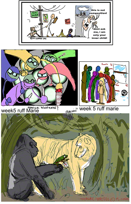
        OK, having deep in me this strange compulsion to be a smart ass I drew and posted a joke on the facebook group of the class. As I was not sure Glenn would have seen my smart joke on facebook I added it to my submission for the ruff of the week, topic “about to happen. I submitted the following, the joke is the first image as is obvious.
wpid-componco-2014-07-1-19-48.jpg

        I was not too happy without the other images except the alien surgeons. But Glenn found the alien surgeons confusing, the boy and the crowd (middle right) is more story telling than composition – and there is no compo whatsoever in the animal drawing at the bottom (I confess: I wanted to paint a silverback)
        Now, as I should have guess, he told me that the JOKE was – funny, thanks, Glen! – good compo, except it needed more work. I should have guessed this would be the one he chose for me to work on! 😀
Who’s a smart ass now? LOL

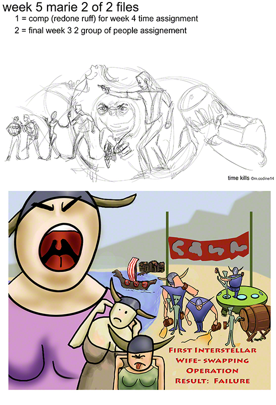
        The comp to hand in this week was about time passing in a single image, last week my ruff on that topic was a confusing messy rendition of Hamlet, I changed topic (but kept the idea of murder) totally, and for the final of the week I finalised my walkirie and UFO.
        The two images are here below:

wpid-walkirikille-2014-07-1-19-48.jpg

        About the walkirie: I feel a bit silly having done a cartoonish drawing for a compo class, but cartoon takes forever to make as I found out, and Glenn (who laughed again – thanks again LOL) said the compo in it was quite solid.
        Perhaps I should not fall into the snobbism trap of “only fine or incomprehensible art is serious” hey, I’m an Eisner fan AND a Repin fan! (and Rembrandt etc). I must accept that I can draw “funnies”.

        About the murder: Glenn graced me with 20minutes of analysis and remarks on it, never ever trying to influence me stylistically or giving me easy solutions. We spent some more time on it during the live chat (he drew live and that was great as always)
        In any case I came out of the crit and the chat feeling more clearly what I had to do, but also feeling free to be myself. (re: next week for the final, yeah final! cause the ruff was the messy hamlet, the comp this messy murder and the final for this is next week! time is out of joint of cursed spite that ever I was cursed to set it….. sorry sorry, I have a bad case of Hamletism! 😀

See you next week with some more action, romance, suspense, madness, irritation, amazement, and all the others things that go in storytelling and learning how to make a picture !

Fourth week – strange things are happening to me!

this week we have to work on:
ruff: several moments in time on the same image (no coping out by doing a comic strip thank you – I tried to talk about it and Glenn laughed)
comp: take last week’s ruff of two groups of people and make it more developped
final: third and last week on the “people taking very little place in space” and I wish I had had a few ore days but deadlines are deadlines!

        How do I feel? odd: on the one hand I’m still confused about composition and it’s link to story telling, I feel uneasy, not sure of myself there, but on the other hand I’m realising that drawing – ya know, that “thing” called drawing we all have to keep working at for years to come, me most of all – well, drawing is not really the problem in a piece of art, be it a cartoon or a comic or a fine art thingy.
        I’m just realising (and two of my class mates told me they felt the same) that being forced to work like crazy on composition, thinking final work, space in the picture, puts us in a “real” situation, no just because of the deadline, but because of the question or what to do with the blank page – so far I would always say: “on a blank page I make a nice drawing” well, no more! it’s got to tell a story, catch the eye, direct the viewer, manipulate him/her as Hitchcock used to say of his movies (he did his story boards himself and was a very good draughtmans and artist)

        I think a big change is happening, alll this unbeknown to me (but beknown to Glenn :-D) and while I strugle, and complain on facebook that I feel like Homer Simpsons DOH! in front of a page on which to thumbnails something far more important gets set in motion! As for composition, no worries, i’ll get it, after all, I have the best teacher on the planet and only composition teacher on the planet on my side!!!

        Let’s take a look at my work of the week and what Glenn said about it

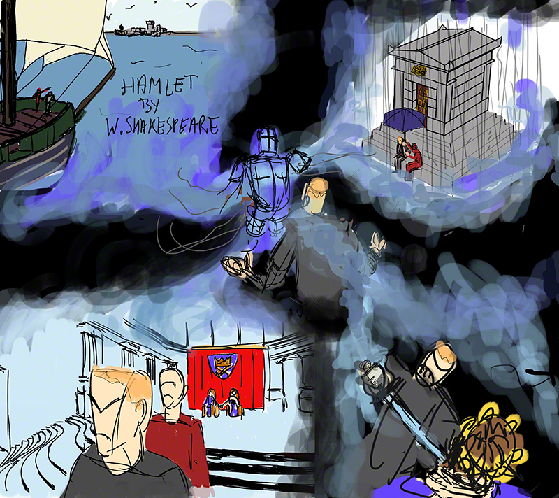
my ruff for several moments in one image:

wpid-hamlet-2014-06-26-21-11.jpg

        OK, I’m a Shakespeare fangirl so to me this reads totally well, but it seems people who have a “normal” relation to the Bard do not get anything of this image, the ghost in the middle is odd, the tomb on the top right doesn’t read, the lower left image is OK…… work to redo!

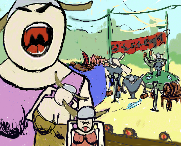
        My comp, still my rather insane walkirie versus ufo thing

wpid-walkir-2014-06-26-21-11.jpg

        Glenn laughed, and I think he liked it, and he suggested something great: make the mountain or whatever in the background lower on he walkirie’s side to better lead the eye.
        I would be proud of this one, only I really inspired myself (sort of copied) the “circus” cartoon composition by Daumier, well sort of 😀

The final of people taking very little space but space leading to them:

wpid-sketcheer-2014-06-26-21-11.jpg

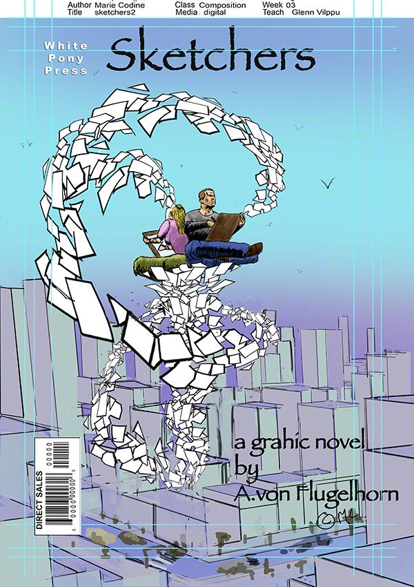
I’m very happy with this one, sorry I did not have time to do a cleaner city. Glenn gave two comments that are great: the city is….. very conventional, and I have to agree, and he suggested to add some drawings on the floating sheets to A/ make it clear our sketchers are drawing not typing or something, and B/ to show the distance between the sheets close to us and those distant (small drawing large drawing).
        A great idea i’m going to implement as soon as I have 5 minutes, this is one image I want to finish really well.

        Doh indeed but I’m producing more drawings than ever, and my “oh it’s awful this drawing is going to the bin, what a waste” phase is gone: there is more where that came from, getting drawings rejected is normal (by myself or others) no big deal – yes, I just wrote “no big deal” about drawing! doesn’t mean i’m good at it, just that I see it in a new perspective: drawing is a tool, art is what you build with it and other tools.

        More of these consideration next week, thanks for following, if you have any question contact me on facebook!
        now – go back to drawing!!!!

second week of compo class, the plot thickens a bit

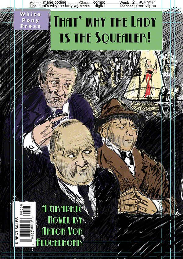
        You’ll remember than last week I submitted three possible covers for a graphic novel. Glenn found they all had the same problem: they represented three guys arguing but it was not clear (as it was in the brief that they were talking about some else.
        Considering I’m here to learn and not to cut corners I redid the cover completely using bits of the three previous versions, and adding new stuff, I hope the compo will now be clear enough for him to accept (he’s supposed to be the client who gave me the brief)
        Here it is, I also developed the colours as this is the second week on this project meaning that I was suppose to do a comp and not a ruff (rough, ok… 🙂

wpid-squealer5-2014-06-22-16-49.jpg

        Meanwhile at the ranch: this is week two, and while I had to work on step two of the ruff made during week one, I have now a NEW brief from my client (aka teacher): lots of space leading to the characters who don’t take much space themselves.
        This one drove me nuts, my fault: I first decided to do a painting or illustration this week, and for some reason I could not go past the doodle phase as if I could not draw anymore (if you’ve ever felt that, you’ll feel sorry for me and my pain).
        In the end, after the composition chat during which we (the students) asked Glenn tons of questions, I finally understood I was thinking too much and wasting time going in circles. OK so I threw way what I had done so far started again pretending once that I was doing a cover for a graphic novel – and that alone unstuck me, something in the fact of having a title, having to do well designed (or not too poorly designed) characters makes me work better.
        Here are my two subs, I can tell you the story inside each of those graphic novels, like for the first week one. I might have a graphic novel streak in me! Please don’t tell my mum, she thinks I’m drawing nude people in well lit but cold live drawing hideouts 😀

        Here we go for week 2’s ruffs:

wpid-sketchers-2014-06-22-16-49.jpg

wpid-weeknparis-2014-06-22-16-49.jpg

        Whichever Glenn chooses for developement I know I will, when I have the time, develop both.