This week I tried every evening to draw, sketch doodle mindlessly, while chatting with my family (that includes the dog “woof” and “shut up” being the meat of that dialogue.
It might have to do with my watching the excellent documentary Stripped (about cartoonists, authors of “funnies”, web comics etc) but I ended up making a sort of four images strip (for you manga fans: a “4 koma”) I thought I’d share it here, it’s autobiographical obviously:
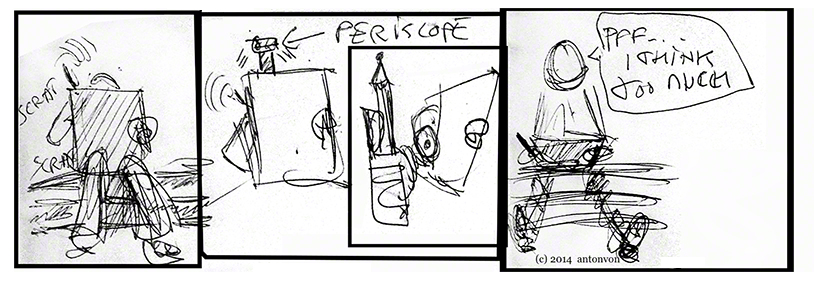
I do think too much and draw better when I reach “the zone” when “it” draws, reread Herigel’s classic little book on zen archery for more on this feeling. I can but fight this by drawing a lot, far more than before. This week I must have draw several hundred thumbnails, most of them of no value, but almost all of them were on different topics or scenes, also it’s now becoming more natural to me to position my “camera” in a non “photo taken in the street” position. These two points are really big steps forwards for me, I’m not sure it make me better at composition but it makes me better at drawing and that is fantastic!
For fun I included the little strip above on my assignment, Glenn laughed a lot and told me I *am* a cartoonist at heart and talked about my head drawing, constructing heads in the classic manner but doing exaggerated feature like Daumier. Is he trying to tell me something ? 😀 I’m going to go on doing some 4 komas just to see how I feel about it, and caricatures à la Daumier. Any drawing is good for me!
Last week I promised you some togas, here they are as a ruff for the topic of the week: mass against space:
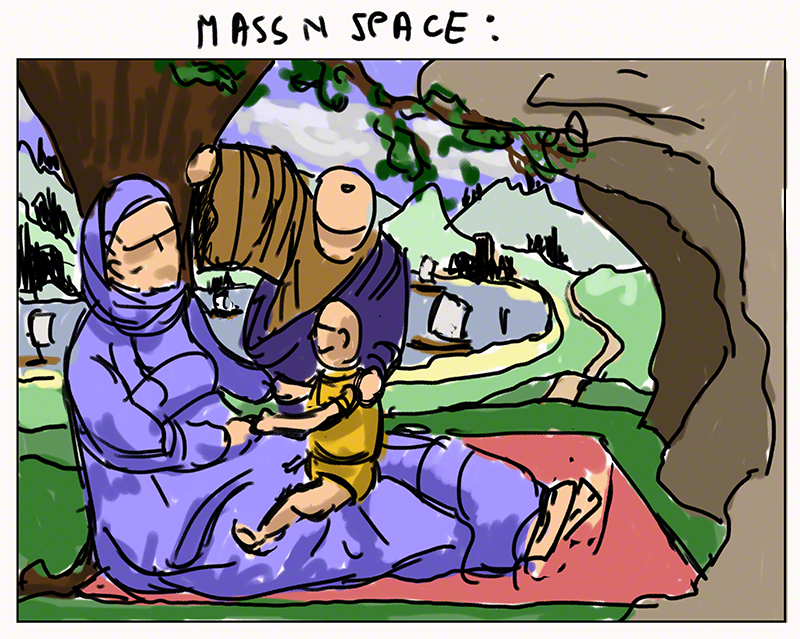
Yes yes, I know, it’s totally “Mary, baby Jesus and Joseph” in appearance, an odd subject for an old Buddhist like me, but they could be any family from the days of togas, they could even be the Baptist and his Mom and Dad LOL! See in this what you feel like seeing, that is fine with me! (got nothing against baby Jesus or his family!)
More seriously I kept thinking how the old master had it easy with compo with all the togas and folds and clouds and rocks etc. I decided to try it myself.
Is it easier? Hmmmmmm in a way: you have more choice, but deciding that the fold of Mom’s lap is going to have a certain shape so it leads the eye to Dad is…. difficult: can I get of with i? is it cloth wise believable? is it a good choice? will people notice – is it too subtle or not subtle enough?
Composition is a complex game of choices and also of self confidence, knowing one’s audience, experience.It’s not just pointing a red arrow with a bubble saying in blinking letters “important thing over there!”
To my surprise Glenn did not comment on the family or the folds of their togas. He found the tree a i hard to read and advised me to add roots to it so it reads better, my diagramming of space is ok with the carpet on the floor and scenery, but the rock on the side is not big enough to make this a “mass against space” image.
Embarrassed smile…. I did the image thinking of the family plus tree as the mass, the rest being space, the rock being a repeat or reminder of the family mass. Another drawing that does read one way for me, another for others! Glenn advises me (same for the two other drawing below) to draw on paper next week, no cintiqing at all. OK, let’s see what it changes!
My sinking titanic and the star couple being noticeable thanks to compo only…… I can’t stand that titanic thing any more! so I change completely the topic for the final of that “couple in crowd”. It’s suposed to be a final, it’s only a first try, a thumbnail, I’ll work on that later. here is the beast:
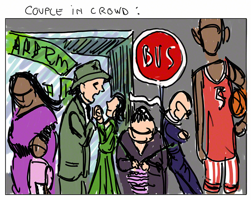
I was quite happy with the way I put in star position my couple (the guy has to be James Stewart -D) the work with the scarf, the window behind etc.
Glenn pointed out two things: one small: the tall guy on the right has a head that is far too big, and most important: the old knitting lady looks like she in front of the others, forward really. I did not wan that, to me these people were all lining up at the bus stop but not I can see: the little guy on her right looks like he’s leaning against her and not the bus stop panel.
Also the tangent between the shop window and the bus stop sign kill the depth of the image – image to be reworked on during the free week right before compo2 class!
Last thing: the “comp” for my cubicle love scene, last week it was too still and vague, who was the scene about?
This is my new take on it:
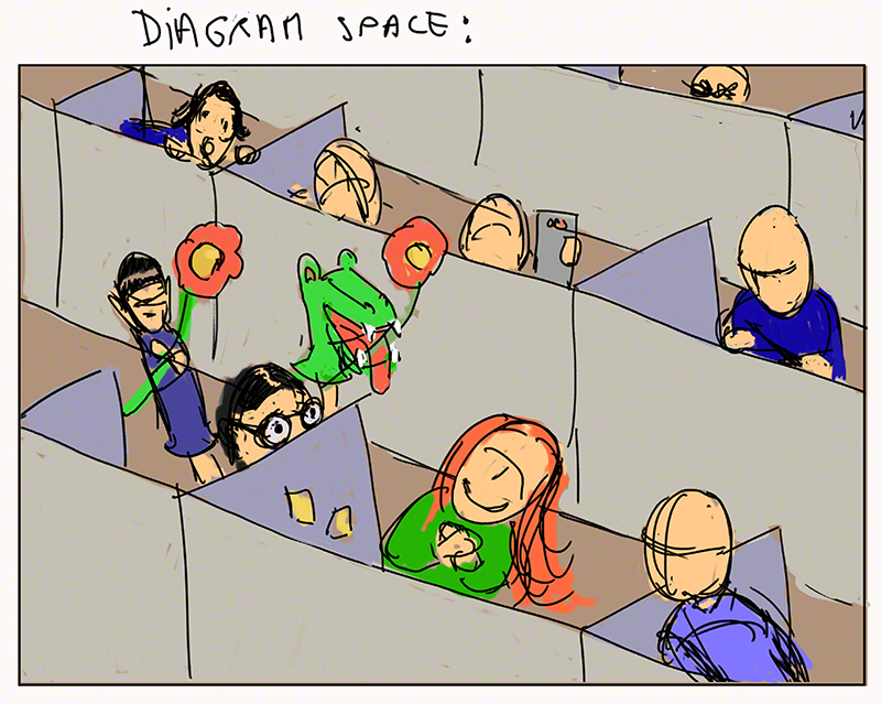
Glenn’s advice: much better but I can play more with position (they are all at equal distance from the others, yuk) I could have my red hair girl bend more one way, her colleagues be in more exaggerated positions.
I’m being too subtle once more. Again Glenn asks me to work on paper and with pencil only – ok let’s do that and see!
Next week is week 9 of the ten week course, let’s go for it: subtlety bye bye! (and cintiq good night)
See you next week for more about my adventures in time, space and art!