Lost at sea, truly lost, as Alice would say, this is a difficult week; but things are starting to move in my head (I know cause I come from the future: I’m writing this from the vantage point of….. august and this week that I’m describing is in july! (insert mad scientist laughter here or, failing that, the Aracuane ’s song from Disney’s Très Compañeros!)
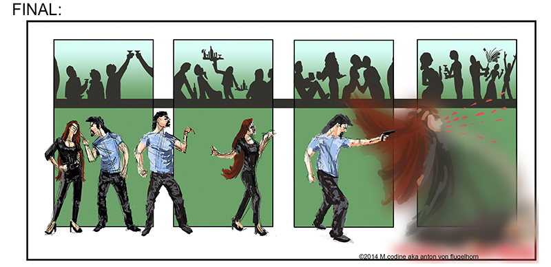
my final of last week’s killer sequence has change a lot, Glenn likes it except for the girl when she gets blasted, it’s hard to read and should be redone – I will when I can. He likes the counterpoint of all the actions that take place above the killing scene. Dont quite know where I got that idea from, it’s not quite composition, more “playing with elements of composition” but I guess it’s already something!
here it is:
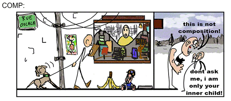
my “comp” (the “almost there” stage) of my banana peel has improved too according to Glenn: the creation of the shop instead of the wall behind the action gives some more “arrows” pointing the eye toward the tragedy about to unfold (the shoulder line of the girl in the shop, the wave of the window shop decoration etc.) but it’s not clear says Glenn if it’s a poster or if it’s a shop… more 3D please seems to be the message he has for me!
this is the “thing in question”:
Which brings to mind a game I invented: try using naturally in a normal conversation the following sentence: “I think my banana peel is too close to the suer man”. I did use that sentence naturally, but can you 😀 my circumstances are not yours (insert another insane laughter – this is Vincent Price type laughter week)
So the girl getting blasted did not read well even though it was easy to guess what was happening to her, and the shop in the banana disaster scene is not an easy read either.
Funny, cause I read them very well, just as I read well my Hamlet two week ago. Is there a pattern emerging here?
The “topic” of the week being a couple stands out of a crowd thanks to composition I decided to do this (and I dont tell you what it is so you can see if you can read it of not)
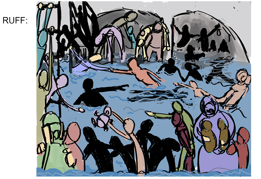
Now can you read (understand) the action? Glenn could not and read it as a sort of swimming pool thing, a confusing multi actions scene with nobody standing out clearly of it.
This was, in my head and in my head only, the sinking of the titanic, 3rd class, 2 corpses float in the water, children are the priority, they must be saved, but panic is high and so is water!
Fail! major fail! and I was certain it read loud and clear with our romantic couple arm extended towards each other in an horizontal if Bollywoodesque moment.
Two lessons t be learn for me (three if you count the ego being bruised: I was happy with myself on that one):
1/you the artist know what you are representing in an image, the viewer doesn’t, even with a tell tale title (which is cheap and old fashioned) they have no idea at all what they are watching – ok there is water and there are people, but outside of that it can be anything: the swimming pool, the titanic, what I did during my vacation, the martians invading the Aloha islands…. what you know is useless, it’s what is in your picture that people will see, they are not telepaths.
2/ dont be subtle, well, not the super subtle kind of subtle. This guy is important? OK make that unescapable – and as this is a compo class, make that unescapable trough composition!
If you look at the great masters of the past, they kept representing Jesus (the church being the big big client for art at the time), now their Jesus sometimes has a halo, plus a mystical glow, plus is wearing expensive colours that only the star of the painting will wear (blue aka lapis pazuli, at the time would cost more than gold!) and everybody is looking at him either to beat him or crucify him or to hear his wise words, all are towards him, even the animals. YET the great master would STILL use compo to make him stand out – the fold of the cloth of the guys around him, the hills behind, the clouds, everything manipulates your eyes towards Jesus. And the result? It’s SUBTLE, yes for all the “in your face” and “all the tricks of the trade” and the (bully’s voice:) “he’s the big guy in this painting O-K-?” it comes out as subtle!
This is what I have learned this week.
actually I realised al that a week after “this week”, but it’s “this week” that made me face it. And Glenn was right: I was on the right track, and my being lost was quite a good sign. It’s a must go through moment. There are many such moment when you learn a craft, and there is none so difficult and complex and rich….. and fun, than composition.
I can now see all I have to learn, which is a lot! 😀 but I can also see in which direction Glenn is taking us 😀
And i shall disagree with him for once: the old masters had it easy with the togas and draperies and halos – try their compo with tight t-shirts and jeans!
This said, based on my past experience he’s very very probably right and the type of cloth makes no difference, I’m not not at the level when it doesn’t matter anymore 😀
and by the way: for the past two nights I’ve dreamt entirely in pencilled thumbnails…. there are things happening in my brain.
Thanks Glenn for the guidance and the patience!
More next week…. with some togas for fun!
actually I’m late, this is typed on august the 3rd, and week 9 starts tomorrow, so I shall hopefully post “next week” aka “week 7” tomorow.
the reason for this: Glenn is so happy with the interest and progress of the class students that he’s created a compo 2 class that will start on the 25th of august. I plan on finishing my blog on compo 1 before that to avoid going actually mad!