compo 1 again week 2 raaaaaaha! Am I Homer Smpson?

compo 1 again week 2  raaaaaaha! Am I Homer Smpson?

yes another entry only two after the previous one – Iwas busy drawing and am late on my blog – well, not anymore 😀

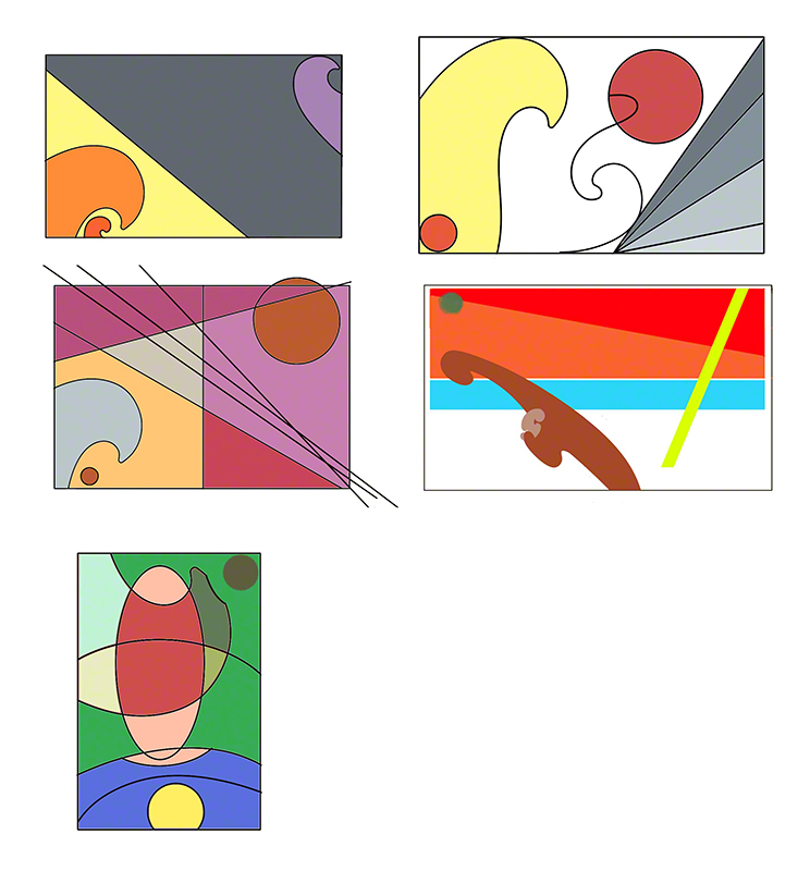
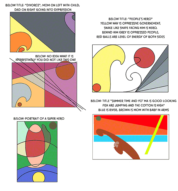
Week two, ok I redid the week one ruff (woof) and changed a lot or things as you’ll see, I also did the assignment for this week

Here are the “things”


diner


dessert


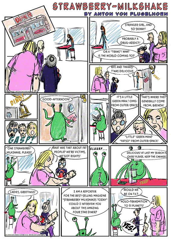
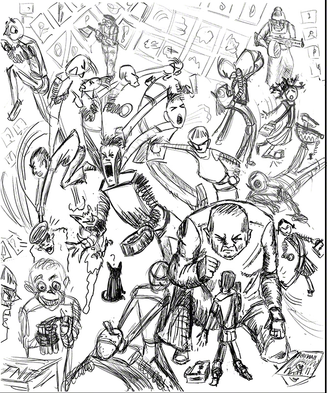
In the diner scene I try to do less action in one page, used the waiter’s walking from one table to the other to justify the angle change in camera position.

Two things: the guy at the table in the back, who pay and goes away is a punk, hence the grrrrrrr reaction on the crazy grannies. Nobody seems to see he is a punk, I should have made a closeup on him.

In any case it’s not clear that the grannies are talking about him or avoiding looking in his direction and….. it’s boring! the whole diner page is boring!

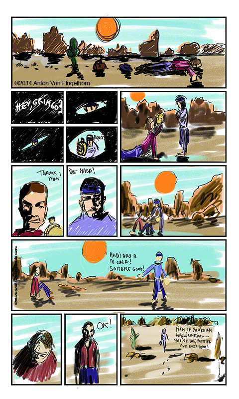
As for the western scene it lacks depth (no sense of that desert going far far away except perhaps in the last image) and it’s….. all together now: boring! plain camera angles, plain shots plain…… plain boring!

and you know what? that’s what Glenn told me and now…. I find those two pages boring!!!!!! I feel like I’m Homer Simpson: why did I not see it before?

answer: because Glenn has the experience to see and say things, and without him I would not have seen it ever! it’s called teacher-student relationship!

Now about (steal the expression from him) Glenn’s chewing me in the critics,  I’d like to point out that he’s known me for almost two years, knows that I have a thick skin and that i’m *begging* for harsh critic (plus I have a sense of humour that I sometimes turn against him just to push him to be harsher on me… yes I’m in a rush, I want to learn the maximum fast fast, and my ego…. what ego? I’m here for learning! I’m not michelangelo, of course not!)

Glenn is very positive with students, telling *always* the truth when something is good and when something is wrong with their work but in a positive manner, by that I mean: showing a way to correct the problem, that is one of his secrets: you show him a crappy drawing, he tells you what’s good, then points out the bad and tell you what you should work on. You work on it, and by the next week that problem is gone from your life and drawing! This makes you progress drawing-wise, and also gives you self-confidence and that feeling that it’s ok to make mistakes as we a here to learn, not to impress the teacher or other students,  and in any case, soon we wont make “that” mistake again.

That’s what make a great teacher and explains the devotion his students have for him (hero worship I’d call it!) once they have studied with him.

As for me I have such trust in him that even when I feel like Homer Simpson (re: above) I dont really mind: Glenn is there to point me in the right direction!

So next week, doh, redo week one and two plus week three (next week is week three). i’m going to go crazy and unboring (crazy should be easy for me LOL) we’ll see! see you soon!!!

compo 1 again (my second time) comic book version!

compo 1 again (my second time) comic book version!

Here we go again! And happily so: I’ve done all the classes that vilppuacademy.com offers several times (hey 50% off when you redo a class, how’s that for a friendly deal?).

Each time I’ve redone a class I’ve noticed two things:

A/ the lessons (at least those that were there the first time I did the class – Glenn keeps adding stuff to the academy all the time) say something different to me. It’s as if I had never heard them, I remember once I even wondered if I was listening to the right one (during my 3rd time doing Head drawing class). We learn a lot during a class, far more than we realise, and when we revisit the material we hear another level of info. Very strange feeling at first but great: we go on learning more, I guess that is because Glenn puts so much of his knowledge and experience in the video lessons.

B/ I noticed that I have new problem, a new level of problem so to speak, redoing a class, as if ok, first time got rid of the first layer, let’s attack the second one. And even during the normal and regular learning curve induced “I can’t draw anymore!” moment of despair, I never go back to before the first time I did the class. (and after such an horrible moment of plateau I make a huge step forward – a classic, normal, a good thing when it happens! change is disturbing!)

This time I decided to redo compo1 (and 2 later) but instead of doing it with illustrations I’ll do it with comicbook pages! (you can do illustrations, paintings, comics, storyboard anything, Glenn has done them all during his career anyway :-D)

Comic book pages are harder than illustrations (which I did during my first compo1) first of all it is composed of several drawing and not just one, each has to be well composed and to it is added the “camera movements” from one panel to the other, which is also part of composition.

Of course I started reading all books i could find on comics (those not meant for 4 year old kids :c) and books on story boarding which has a lot in common with comics (and many differences too).

Week one, here is what I did:

assignment compo1 week1 marie codine only document


Oops! there is one big big rule in story boarding and comics called the 180° rule that says: dont have your character jump from left to right unless we see the motion of the camera  going on their other side is clear.

Well, I read 500 pages about that and bam! first set of panels I do it twice!

I guess that is one of those mistakes you have to do yourself once so that you never do them again, knowing intellectually something is not knowing “physically” that thing (like an artisan knows its tools)

Glenn did not miss that and was not too enthusiastic about the rest of the page: standard set of panels, plain camera angles…. meh…. redo!

Of course he gave me some directions during the video critic and during the live chat (I did ask many question, apologies to my fellow chatters!)

Next week I’ll have to do week two assignment… plus redo this one, but no worries: during week threee I’ll work on the week three assignement and on week one and two (as ruff is they were so far bad or as final publishable pages if they were ok).

So I rush back to work.

Next week: let’s try and respect the so called 180° rule! and do good compo too.

compo2 week 10 everything is recycled (that’s the title of a book, right?)

if I were to sum up the hour and a half, fantastic demo that Glenn did as a course for this las week of compo 2, I would…. well, simplify things to a absurd level. Yet it’s not entirely false to say the assignment of the week is: (in my words, not Glenn’s!!) “take any old random sketches and see what you can compose with them”.

Oh boy! so we are to start with pre-existing, unrelated, not meant to be used with others, drawing and build something meaningful with them… as Big Tought would say “tricky….” but indeed an interesting puzzle, forget forgetting the story, forget thinking of all the composition elements, just manage with whatever you have!

I grabbed an old sketchbook of mine, I was about to scan it when I thankfully remembered I had already done so. These are all about a year old, done quickly in the street (partially with a 5 year old girl lying over my shoulder, putting her fingers everywhere on the paper “who is that, and this one? Can I borrow your pen?” “NO YOU CANT BORROW MY PEN!” of course I said it in a very gentle fashion but the idea of a 1908 made vintage pen in the enthusiastic hands (fists, let’s be honest) of a 5 years old made me cringe. 😀 Funny how kids are attracted to people drawing, always take spare paper and cheap colour pencils with you, it’s a trick that has saved me and my old ultra flex pen more than once! 😀

In any case I took about a month’s worth of street sketching and put it all in one file in photoshop. Of course I threw some away., rearranged them a thousand time, always trying to thing why do this or do that, what is this gesture leading towards, is it leading to another moving gesture hat guides the eye?(Glenn is a cunning teacher!) and added some rough and quick colour to the whole. Here is the result:

assignment fig 1 week10

Glenn, to my surprised liked it a lot even if he was surprised too by the panoramic/no scenery aspect of it.

According to him it works, one movement of an arm leads to another, there is a well define foreground midground background, clear groups and a direction to them and the laws of perspective (never easy with a crowd) are spot on.

So I finish this composition 2 advanced class happy, feeling Istill have tons to learn but I’m starting to get what my problem is: I see composition in my head as being far more complex and tricky that it is once you’ve “got” it.

For this reason I’m redoing composition one (and then 2 after that) knowing that the big advantage with courses by a real master like Glenn is that listening twice to the same words he says about something – you hear something else because you’ve changed by following his instructions the first time (plus he keep adding tons of new stuff to each class all of the time. Also god news: redoing a class means half price!  sweeeeet!

I’m going to go on doing this blog, knowing that my second go at compo1 will be very different because I’ve changed, learned a lot, and also i’m going to center my composition around things I need for my comic in the making (perhaps even entire pages of it, we’ll see)

so see you soon and please let me now if you have any request.

The new semester start november the 10th – join us! there are super payment plans (a great thing!) and please dont tell me “oh Im not good enough to work with Vilppu” – Glennis there to help his students, whatever their level, and he loves people with no or little experience in drawing cause that means he wont have to make them forget bad habits!

Hey, the classes are made to get you get better at drawing, the goal is not to impress Glenn (which would be difficult I think LOL)

so join us and see you real soon in this blog in any case

Anton

compo 2 week9 let’s dare modern art

I composition is not story telling in itself, it means you can make a composition with lines and dots (Picasso loved doing that), and then if you want you painting/drawing to be figurative you only have to fine justifications for that dot over there… hmmm, let’s say it’s a little cupid, and that long line … hmmmm could be a drapery, now where to I put the guy wearing the drapery….

I have no idea who worked like that, I guess it was a permanent change: moving the compo to fit the story and the reverse.

Glenn says you should work on both story telling and the composition at the same time. I have a tough time with that.

So this week with his permission I’ve decided to go non figurative, use only lines, french curves, color and see what happen.

Considering he told me last week I had a way of thinking that was too much litterary like and not music like enough I put some music on (Annie Lennox’s new album had just landed in my itunes so…:-D)

I quickly found out I could indeed see the need for balance, contrast, opossition, all that in my drawings, but I also realised that in my head stories were building up: each abstact drawing was telling a story.

Here they are:

assignment compo2 week 9 marie codine


not my usual style I know. lol.

I was a bit nervous about what Glenn would say. He liked the top right one a lot, found the top left one needed something more on the colour level, found the one below it ( the one with the bits sticking out of the frame incomprehensible or hopeless, but he did put it in a nicer way of course), the one on the bottom right interesting, but he felt the blue should be above the warm colors, as for the one at the bottom he  remarked among other thing that there was always something playful in my work.

Of course I’m making short his critics, they lasted half an hour and he drew a lot over my drawings to show me possibilities I had no explored, things that could be better, in short I learned a lot.

Now…… for the really funny part: he really did not find anything interesting or even worth of improving in my drawing with the bits that stick out of the frame right?

Ok, let’s now reveal what I personally saw in those drawing while making them:

assignment with titles copy


Yes you saw right: the “bad” one was the only one that meant nothing to me! I found it so interesting I sent him this version (hence the “you did not like it”.

According to Glenn this makes total sense: random lines that mean nothing to me will not work as a composition.

I’ve since then shown to friend artists these without telling them what they represented to me.

In a word: everybody sees something different, from hamburgers on the beach to angels, and very frankly I consider that their reading is A/the proof that there is something to read in my composition which means it’s ok compo and B/ their version of what is behind the drawing is just as legitimate as mine.

An interesting week, I’m learning here, and I took risks: abstract is very very difficult warned Glenn and I answered with a quote from Pema  Chodron “if you fail, you must fail well” my goal here is learning and I know I’ll learn more from a big fall on my face that from just tripping in the staircase.

So take risks people! remember you have one ennemi: the comfort zone!

see you in a few days, the ten week course has ended and i’ll post the tenth week “cadet’s log” in a few days. (with lots of figures which should put to rest any worry about my figure drawing you may have – I hope! lol)

I have signed up for composition 1 again, Glenn says it’s going to be a totally different course to me now (true: I’ve done “head drawing” three times, each time i learned something new something more.

And of course I will go on with this blog!

see you real soon!

compo2 week 8 let’s have a dream

Vand Dyke, Lempika, Boticelli… what a surprising title for the week’s lesson and yet, in a little over an hour and a half Glenn takes us through a trip of discovery: what have those apparently unrelated artists in common?

A fantastic lecture that really opened my eyes on many things: oppositions between objects, and what happens when you take a line from say a character, his forearm for example, and prolong the line… what does it become, where does it lead your eye? what can you do with it and all the rest to guide the viewer’s eyes through your work exactly the way you want…. and it works! scientists have constructed systems that follow to the millimetre the movement of the eye, they show you an image and can construct a map of what path you eye followed and how long he staid where – the old masters knew this intuitively.

The assignment of the week was: a single figure in an uncomplicated surrounding/background/thingywhatever (remember we are getting into modern art possibilities if we want to, and of course we MUST use color)

I decided to do two rough drawings (related to two of the main characters of my comicbook). I decided to challenge myself a bit more that usual and do one with the cintiq (same as drawing with pencil or pen, but on the computer, and the other also on the computer but…. with a mouse! OK, dont try this at home kids, I had painted with a computer mouse some ten years ago (it’s on my facebook wall, scroll down you’ll get it) well, at the time my wrist did hurt. Ten years older… it hurts a lot more!!!!! so dont do this, ok? (unless you are really very young, in which case does your mother know your are painting on the cmputer at this time of night instead of sleeping or oing your homework? lol)

Here are the two paintings, left: cintiq, right: mouse

dreams


Glenn comment was particularly interesting (even more than the usual I mean) The left one, done with the cintiq is more “refined”, yes he could see what I wanted to do with the lines of the arms, the shelves, the fallen books, the round panels repeating the round head shape. But it did not seem to satisfy him. I think he was expecting more of me .

About the clumsy drawing on the right (down entirely with a mouse…. I must be mad) he was far more interested: it’s more direct, less wishy washy and the many games I play with lines from and to the character work, the play on color which did not even appear in the other painting here work: look where the purple are, I did keep orange for very specific places on the image.

Mouse wins clearly, and I think I know why: I had to think more before doodling/noodling my drawing because you cant just do any old thing and see what it looks like when you are painting with a brick (which is what a computer mouse is!)

Some of my class mates are reaching very high levels of quality, and of finish in their work this week, their works look publishable, mine dont, but then I really feel I’m the less gifted one: I should thing “music” while drawing, and I keep thinking “story” or “litterature”.

Thank God Glenn is there and pushing me in the right direction while letting develop at my rhythm, my style (no my style is no the mouse drawing! “grrrr” to anybody who thought that :-D). I’m getting there slower than some of my friends, but I am building as solid as they are – does this make sense? slower architect but normal solid house!

see you next week for some unexpected….art on my part.

compo2 week 7 the worst pun ever, and it’s mine !

The video lecture this week was particularly fantastic.
I did not use to think er… well, not think anything at all about Cézanne, to be honest, but Glenn has in one hour dissected the man and his influence, how he was a bridge between two periods of art history.
Result: I’m now a fan of Cézanne.
The chat (2 hours of live videos and drawing via internet, lots of fun too) added to this feeling.
I sent two submissions, one the wave with some warm light in it:

wpid-compo2week7marie2of2-2014-10-16-23-08.jpg

Glenn remarked very accurately that if my goal was to make this into a fake ukyio-e I should use flat color and not complex changing colors that look like pastel or something modern like it.
        Point taken, this is 100% right.

Now, my second submission:
        I wanted to do something Cézanne-like, and in a style new to me, and using a very very limited palette (translate by: I wanted to make my life miserable). I tried my best and it’s not glorious, here is the result:

wpid-pun-2014-10-16-23-08.jpg

        Glenn pointed out the good points: the story is clear, but story telling has nothing to with composition (more about this next week), the objects on the floor and wall see to be posted there. It’s not working!
        I do feel like the token idiot of the class this week but i’m proud of one thing: I’ve given this piece a title that is the worse pun ever and I’m proud of it: Cézanne Street.
        Knowing that if you go on reading this blog it means you have a compassionate sense of humour 😀
        A difficult week, accepting that there is something my powerful mind cant grasp about composition (self-deprecating humour alert) but I’m going to ask Glenn some advice during the next chat and you’ll see what he has to say about it next week (teaser: he spends an hour helping me and showing the other students how they can learn from my mistakes)
        More next week, no pun included!

compo2 week 6 Bossa Nova and Nouvelle Vague!

“Bossa Nova” in Portugese (or Brazilian), “Nouvelle Vague” in French mean “new wave” It waz the “in” word in the sixties I’m told, new types of movies, new images, new art, new everything, falling like waves on a happy (or sometimes puzzled) public.

This week our topic is composition in post-impressionist land, Puvis de Chavannes (worth looking up if you don’t know him) to Bonnard (also worth knowing). In short we are adding 2D considerations and color (just that… and that…. cough cough) to all we have leaned so far.

I’ve been obsessed with Ukiyo-e (Japanese wood engravings) for a long time. To us they are master pieces, to the people of the Edo period they were like big trading cards, you’d collect portraits of your fav kabuki actor, funnies, landscapes, or your fav artist of course.

The one thing we never see when we see reproduction is the 3d aspect caused by the wood printing process: those people, houses, mountains have a way of sticking out of the paper that is magical.

In any case for a long time I’ve been taking pictures of pieces of wood, hoping to one day use one of them in photoshop while doing a ukiyo-e

I dont have to apologies to the masters for making a “fake” ukiyo-e, for it is not really a fake: Hiroshige would do ruffs, get an approval from his publisher, then do the drawing with a brush. The another artist, the carver, then carved a piece of wood to correspond exactly to his brush strokes (destroying the original as planned) and other artists would take care of the color, (one team per color) a bit like in old days animation, it was all for mass printing – I can mass print what I do in photoshop and there is no original on paper per se. Only the wood fibers are fake, but it took some clever tricks of me to get those right and I am have no reason to be ashamed of that! lol

        Here is my “new wave”, the Goddess protector of a fisherman’s village (you can see her temple in the back) saves a fisherman from drawing, all with compo in mind (in my mind not in the drowning fisherman’s mind, obviously)
        Here is the thing

wpid-wav-2014-10-12-20-29.jpg

To my ever lasting surprise and joy the first thing Glenn said in the critic of it was “waooo!”. He liked it! He reviewed the compo, commented on everything, gave indications about the placement of the fisherman and other details of importance (see next week) and had the excellent wonderful idea that: if this is happening in the early morning, I should use the warm light of the rising sun to contrast with the coolness of the blue of the water and scene in general.

It totally makes sense and I’m starting work at one!

Meanwhile, in my head class (which unbeknown to you I take alongside compo2) I have more serious work to do: I have to review my head structure, so I have decided that next semester (starting the 10th of november for those who with to join me) I’ll do head again (4th time, still so much to learn from Glenn!), I’ll also take compo1 for the second time (the first time, as shown in this blog I felt like Animal from the Muppets at a dinner party.) now I beginning to “get” it, but I want to “get” it in my bones, not just in the surface of my mind… so back to compo 1 for me (50% on repeated classes, but dont cry if you are new: they do payment plans, they know what young artists are going through).

Oh and I’ll ALSO do a third class, a brand new one: **sketching**, people in the street, buildings etc etc. Wanna be in the first sketching class ever ? it’s gonna be FUN!

See you next week with more wav and some more post impressionist stuff!

compo2 week5 why can’t I accept I’m improving?

compo2 week5 why can’t I accept I’m improving?

        Silly, ain’t it?
        Regularly I go through “raaah I cant draw anymore and I am getting worse” phases, and of course each time it’s a normal pause before level up and each time I forget it and fall for it and go “raaah I’m no good, my art is trash”.
        We all know that, it a good thing to have: it proves you are levelling up!
        What is more ridiculous and tough to deal with is positive or very positive critics especially coming from a real master (as opposed to from your mom!”
        This week I sent my two submisions, a redone dragon and book, and a redone fight of the century.
        Dragon first: here is the new version.
wpid-dragonagainnew-2014-10-4-20-38.jpg

        Made it into a book cover, makes more sense.
Glenn thought it was much better, except my character head at the top level are all equal distance apart which of course kills the composition (no I did not see it, I knew of that danger but was blind to it happening here).
        The dragon, now of the wyrm type (no wings or legs/arms) could show more of the depth of the image, just by being larger when closest to us, and thinner when far away, I should have exaggerated far more.
        OK not too bad for the Wyrm. But why my problem with accepting success, because of this:

wpid-finalbagarre-2014-10-4-20-38.jpg

Glenn loved it: nothing to say about the composition: it’s an explosion, every violent duo leading to the next (and apparently it’s funny too).
        I confess I was not prepared to hear an “ok it’s good, nothing to say, next”, I was still feeling very unsure about character placement (by duo obviously). I’m beginning to suspect I might be beginning to understand what composition is.
        I just received this from the vilppuacademy.com:

“The next session of online classes starts Nov. 10.
Classes offered are Drawing Essentials, Figure Drawing 1 & 2, Head Drawing, Composition and a brand new class on Sketching.Each week has 1 and a half – 2 hours of video instruction including an assignment which I will critique and a live online video chat weekly.Payment plans available. vilppuacademy.com”
I’m going to redo compo 1! anybody with me? Blog goes on of course – I’m curious to see what will happen to my art, and putting it into words here helps me see that more clearly.
I’m blessed to have the possibility to work with Glenn Vilppu, I’m in Paris, he’s in Los Angeles, and I know from friends who have moved to Los Angeles recently that I have more of his time than his onsite students. Online studying works wonderfully well: listen as many times to the lecture as you want, same for the critics, send questions, ask some more during the weekly video drawing talking chat, it’s all amazing.
        See you next week with something completely different as far as my submission goes!

Take it from a Buddist: violence is not easy!

        I think I should see a psychiatrist.
        When Glenn told us the topic of this week (and the next) was going to be “subjective frontals” the first idea that came to mind is: “but that is not safe to view at work!”, then he explain it meant the relation between two figures a bit like dominos facing each other and influencing each other, and the first idea that came to my mind was: a pub brawl, Irish style, “The Quiet Man” by John Huston style.
        I’ a Buddhist, not Buddha, I do my best, and as long as idea of violence occur to me only for drawing and not for action in the street, I’m ok with it……. but, how easy is it to draw violence even if it’s rough, comedic violence?
        I did like last week (like soccer fans say “dont change a winning team”) and worked with charcoal in sketchbook pro (gotta buy the new one btw). I quickly found out violence is perfect for working on gesture. It IS gesture and nothing more.
        Here is the result of my royal rumble (rubble?).

wpid-bagarre-2014-09-26-11-57.jpg
        What did Glenn say? Well I know the grandma with the gun made him laugh (she’s the spitting image of my real grandma who did NOT have a gun) so it’s a sort of inside joke for me). He found the cartooning interesting (I have a feeling he’s pushing me in that direction: comics and cartooning, I’m not going to resist much :-D)but the compo…. inexistent: I just put side by side little scenes, plus I could make some more gestural: look at the two guys arguing in the lower right corner: it would be stronger if one of them towered above the other.
        In short: worth redoing but to be redone indeed!
        OK, no problem, i have a few ideas now that I heard the critic he did of this I see things I did not notice before (typical) and so I can act. The advantages of having feedback from a master!

        The other assignment I worked on was the guy coming out of the book from last week with dragon and all. The goal was to make the dragon give a bit of depth to the image (and work on the values with that in mind too). Glenn had said something about why the dragon did not have wings.
        So wings I incorporated, he is the resut of the week:
wpid-dragonaile-2014-09-26-11-57.jpg

        The problem being that it does not read, Glenn was not sure what the wings were: a book, a spread of paper? and why did I do the whole dragon and tail in front of the whole thing? (I had, again not realised that before he said it)
        I think the problems with the wings wrapping around the book guy and the dragon is that the folds are wrong as well as the extremities of the wing parts. My fault: I should have looked at some John Howe dragons to see what could be done (and then I could have tried to do it! try!!)

        Another worth redoing but to be redone work. And again this is the perfect example of the invaluable use of critics: I did not see the wings did not read clearly, I did not see I had not used the dragon tail to define depth as I planned too, the value use is a bit better, ok. Let’s get to work, next time will be better. If I was doing all this on my own I could spend month taring at my drawing wondering what is wrong with it, or IF there is something wrong with it. With the critics i know and understand what to do – perhaps I wont make it right the next time, but I’m in the right direction and Glenn will correct me if I stray off the path!

        Next week: more violence, more grandmas, more dragons, more pencils! (not neceseraly in that order)
        

Padawan listens to Yoda and the Force gets strong!

Padawan listens to Yoda and the Force gets strong!

        Or for those of you allergic to Starwars analogies: I did what Glenn told me to do re: stop drawing it all with the same value and putting flat colours on it, and it works!

        Remember last week? flat, not readable – a depressing but quite exact critic of my work (go to last week if you dont remember, not after lunch, preferably for you).

        So I’ve decided to change weapon indeed: pencil! but not on paper, I am afraid when working on paper: ruining it all, pressing too hard etc, I abandoned photoshop for once and used sketchbook pro’s charcoal tool (could have done it in photoshop but I wanted a change of scenery.

        Result: infinitely much better says Glenn! the mad guy is ok as is, perhaps one of the galaxies could benefit being more turned to the side. As for the dragon book thing it doesn’t use all the values it could, also the hair of the girl going across the top of the page doesn’t read, and the dragon could be used to show the depth of the scene more.
        Here are the two things:

wpid-mad-2014-09-19-21-41.jpg

wpid-book-2014-09-19-21-41.jpg

        What do you think?
        The morale of the story as I see it is: (outside that Glenn keeps being right lol) you have to actively make a mistake to learn something – of course it helps a lot when someone points you in the right direction.
        As I wrote to an dear” friend who is just begining the journey at vilppuacademy.com:
        “you are going to go through a hell created by yourself, and that will teach you a bunch of things that you need to experience yourself to understand. Never mind the drawing resulting of your effort, it’s the process that matter. Glenn Vilppu, armed with his years of experience not only in teaching but in painting, animating, comics, storyboard you name it, will give you the next direction to work on in his video critic of your drawing, but remember: you have to walk your way to the summit, going there by helicopter wont make you a wise samurai (I watch too many Toshiro Mifune movies :-D) there are mistakes you need to make, mud zones filled with zombies you need to go through, and only thus will you progress in wisdom and the way of the sword/pen.”
        ‘The problem most people have is that they get out of mud zone number 1 and don’t know where to go next and go around in circles until they quite – and that was me when I studied alone, and that is everybody in the same situation. No point in losing time: let Glenn show you the direction of the next challenge you have to go through, and you’ll get to the top of the mountain without loosing your way!
        And always remember one thing: it may be painful at time, be lots of work, a headache sometimes, but most of all….. it’s fun! Because it always works, keep that in mind while you are in one of those unpleasant moments when you feel like you dont know how to draw anymore – it’s an illusion created by your brain that needs to integrate new stuff. Keep on drawing, feeling you are in the pits is great: it mean you are about to make a big progress.”
        In short: the comfort zone is the ennemi, and when you feel you have “lost it” don’t give up, cause you are about to make one big step forward!
        There is no learning while feeling comfortable and safe!
        More next week: pencils, dragons, and lots and lots of violence for some unexplainable reason!