I think I should see a psychiatrist.
When Glenn told us the topic of this week (and the next) was going to be “subjective frontals” the first idea that came to mind is: “but that is not safe to view at work!”, then he explain it meant the relation between two figures a bit like dominos facing each other and influencing each other, and the first idea that came to my mind was: a pub brawl, Irish style, “The Quiet Man” by John Huston style.
I’ a Buddhist, not Buddha, I do my best, and as long as idea of violence occur to me only for drawing and not for action in the street, I’m ok with it……. but, how easy is it to draw violence even if it’s rough, comedic violence?
I did like last week (like soccer fans say “dont change a winning team”) and worked with charcoal in sketchbook pro (gotta buy the new one btw). I quickly found out violence is perfect for working on gesture. It IS gesture and nothing more.
Here is the result of my royal rumble (rubble?).
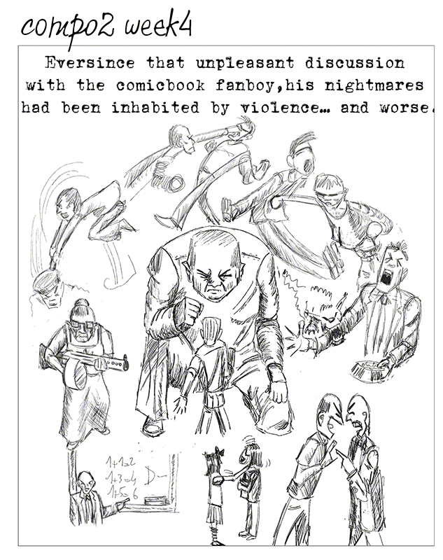
What did Glenn say? Well I know the grandma with the gun made him laugh (she’s the spitting image of my real grandma who did NOT have a gun) so it’s a sort of inside joke for me). He found the cartooning interesting (I have a feeling he’s pushing me in that direction: comics and cartooning, I’m not going to resist much :-D)but the compo…. inexistent: I just put side by side little scenes, plus I could make some more gestural: look at the two guys arguing in the lower right corner: it would be stronger if one of them towered above the other.
In short: worth redoing but to be redone indeed!
OK, no problem, i have a few ideas now that I heard the critic he did of this I see things I did not notice before (typical) and so I can act. The advantages of having feedback from a master!
The other assignment I worked on was the guy coming out of the book from last week with dragon and all. The goal was to make the dragon give a bit of depth to the image (and work on the values with that in mind too). Glenn had said something about why the dragon did not have wings.
So wings I incorporated, he is the resut of the week:
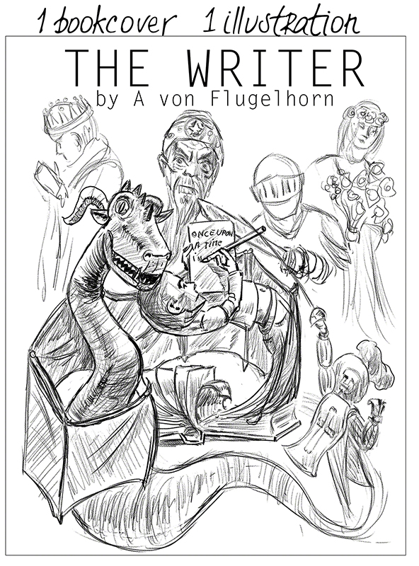
The problem being that it does not read, Glenn was not sure what the wings were: a book, a spread of paper? and why did I do the whole dragon and tail in front of the whole thing? (I had, again not realised that before he said it)
I think the problems with the wings wrapping around the book guy and the dragon is that the folds are wrong as well as the extremities of the wing parts. My fault: I should have looked at some John Howe dragons to see what could be done (and then I could have tried to do it! try!!)
Another worth redoing but to be redone work. And again this is the perfect example of the invaluable use of critics: I did not see the wings did not read clearly, I did not see I had not used the dragon tail to define depth as I planned too, the value use is a bit better, ok. Let’s get to work, next time will be better. If I was doing all this on my own I could spend month taring at my drawing wondering what is wrong with it, or IF there is something wrong with it. With the critics i know and understand what to do – perhaps I wont make it right the next time, but I’m in the right direction and Glenn will correct me if I stray off the path!
Next week: more violence, more grandmas, more dragons, more pencils! (not neceseraly in that order)