Nothing but ink stains (carefully done) on white paper
Have you ever seen those ads for Photoshop plugins that “turn your picture into a hand-drawn work of art”? (add a choir singing Hallelujah in the background and a “before / after” picture and pseudo-sketch made by the plugin).
Have you ever tried the demo version of any of those thingies? You probably did, like me, out of curiosity.
Two things are immediately obvious once you use it on a photo of yours: first of all, it doesn’t work the same as it did on *their* picture in the ad, and second, even my great-grand-mother (insert time machine use here), who never heard the word “computer”, would spot the resulting so called sketch as abnormal, she’d feel that something was wrong.
Why is this happening? Well, first of all, they obviously tried their plugins on many photos and showed the best one in the ad. But why that feeling that “this is wrong”, that there is something not human about the result, and for us who know about computers and Photoshop…. how is it that we can spot at once it’s a sketch done with a plugin?
Decisions.
When looking at a move model or photo or whatever, you get a tons of information: light, colour, tone, gesture, expression, perspective, shadows, shade, light quality, reflected light or absence of, anatomy, foreshortening… It can be too much, and as a matter of fact it is always too much, even the most hyper-realist have to choose, decide what to keep and what to throw away, what to use to express this or that – and by that I mean: Shall I use shadows to express the angry expression of the model, or shall I use the shadows to express the perspective of the model, angry and in a dynamic pose with foreshortening? Or shall I do that playing with the opposition between warm and cool colors?
As Glenn Vilppu says: drawing is the top activity when it comes to multiprocessing. Proof of that: drawing is an exhausting activity when you start, then like a muscle that gets stronger, you brain adapts (this is why you should draw a bit every day even 5 minutes, to create the connections in the brain).
Decisions. A computer, a plugin filter in Photoshop, however powerful, can’t look at a picture and choose what to keep what to throw away. OK, soon I guess a computer will be able to look at a picture and say if it’s a portrait or a scenery (it already does to some point with face recognition) and will apply the filter specially made for faces or scenery. But that’s it. No “hmmm, this old house looks nice in the sunlight, but if I made the shadows different to make it look like it’s sunset, it would look spooky and cool”. Nope a computer sees a house as it sees it, and makes the picture into a series of spots based on levels and other not-at-all-subjective data. And art is all about subjective – yes even hyper-realist art.
This week I wanted to try and use only black ink on the white paper (the paper looks yellow here, sorry but digimarc watermarks dont seem to work on white background so I colored the paper in photoshop, apologies).
I took a book about Repin (if you dont know that Russian painter, rush and google him and be in for a shock!) chose some paintings (complex colors and shadows, play of cold and warm colors in the midtones – lots of stuff happening there) and tried to simplify it to just black spots. I’m sure a computer could do that. But let me tell you: when a guy in a painting has his face fully in the light with just a bit of shade above the eyes and under the nose, the question arises: what am I supposed to do with the rest: leave it in white or paint it black? It’s a very very difficult game.
Here is the result of my efforts:
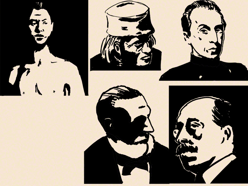
The first thing Glenn told me about this in my crit is that the small black shapes not linked to big ones (like the one on the top of the hat of the guy in the middle top) look messy, and make him think of the plugins I was laughing at five minutes ago. That’s a point I’m going to work on: big blocks of white and big blocks of black… ok, even more decisions, I’ll need some aspirin!
He also commented about the white around the head of the guy in the lower right. ok, he can have some reflected, like on the chin (though if he did not it would make a nice lost edge, the eye could guess where his black chin ends against the black background, I might even help with a little clue in my black or white). But the top of the head: why the black line, white line then black background? white against black is clear enough!
The second thing I learned from his critic and from the following live chat was that really, as long as you know the planes of the head inside-out, you can do whatever you want, you can add light where there would be none, and as long as the eye of the beholder can read the drawing, no-one is going to come and say (whining voice) there’s a light on the cheek that could not be there technically!”.
Rembrandt did it all the time in his paintings and got away with it, comic artists do it all the time (particularly inkers) and get away with it. I can get away with it if I dare do it.
Shall I dare? Shall you dare?
See you next week for more black stains on white paper, and if you need inspiration, read comics by Mike Mignola!
Draw every day and be safe!
Anton