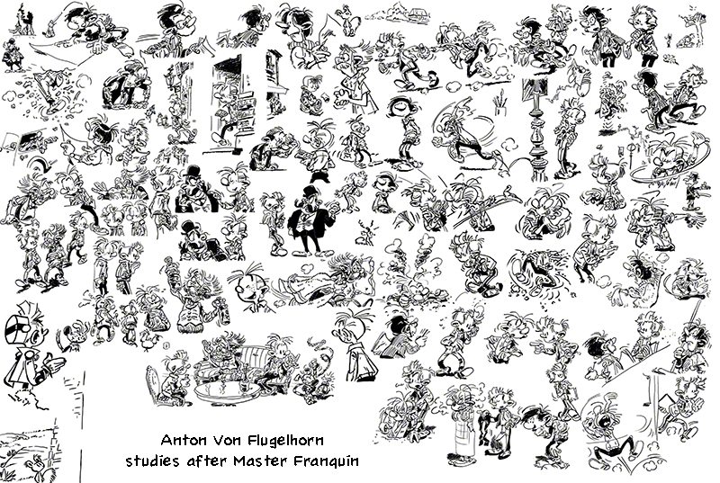
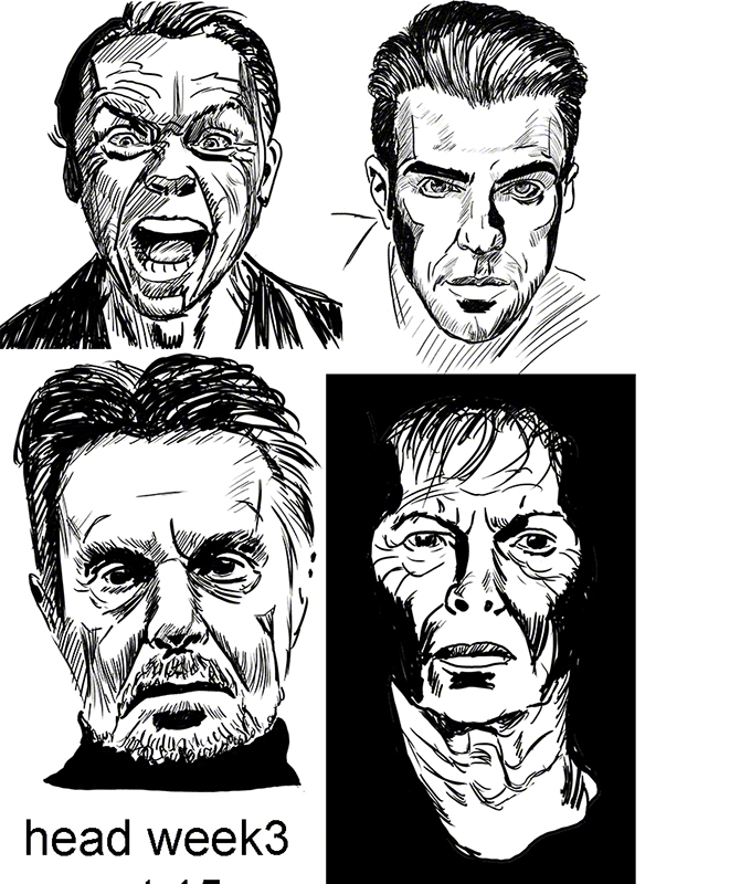
Head 3rd week, black ink by any other name…..
Black and white, ink and paper, nothing grey, nothing in between, just black and white, working and having fun together (could the person suddenly humming “ebony and ivory” please tune it down? Thank you: we are talking ink, not skin!)
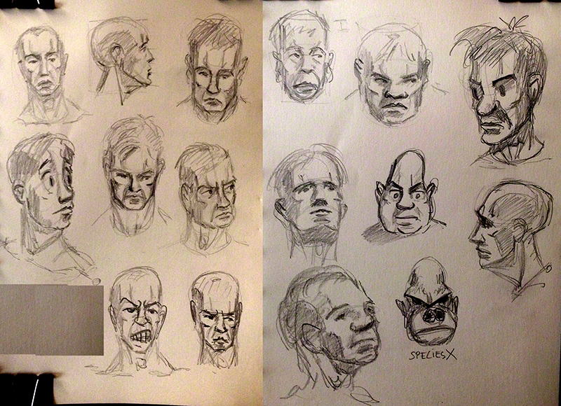
Following last week (read it now!) and Glenn’s excellent advice, I decided this week to concentrate on the modelling tone: what faces you is in light, what goes away is dark – I would add: the faster it goes away (the steeper the angle) the darker it is). Imagine if you will that you are looking at your model with only one light source: a head lamp you are wearing.
I took some random photos and ignored the lighting in them, looking instead for plane changes: the front of the nose, the sides of the nose, the underside of the nose etc.
On two of them I felt a bit daring and pushed the light, exaggerating it on one side, thus giving hopefully the impression that the light came from the side a bit. But again, not respecting the light that was in the photo (I dont post the photos here for copyright reasons but trust me, they were not lite like this!)
here is the thing of the week:
It took me a while looking for planes in the faces – and before you ask: yes I did a rough construction in pencil before going ink-crazy…. I erased the said pencil construction because….. because Michelangelo, Leonardo and Rafael erased theirs! I don’t see why I should show my secrets when they don’t show theirs – more seriously, a study of their originals shows the pencil was indeed there. And by the way: no I’m not talking about turtles here.
A question came to me: ok the forehead bit that is facing me perfectly is white, the bit of the ear that is not facing me at all is black, and the bits in shadows are black (they often happen to be going away from me so double reason to blacken them).
But what about the in-between bits? Take the guy at the bottom left (if you recognise him – my favourite actor – you win the right to brag about it) his cheeks…. if I blacken them where they go back it will make his face hard, if I don’t blacken them, his face will look flat at the cheek level.
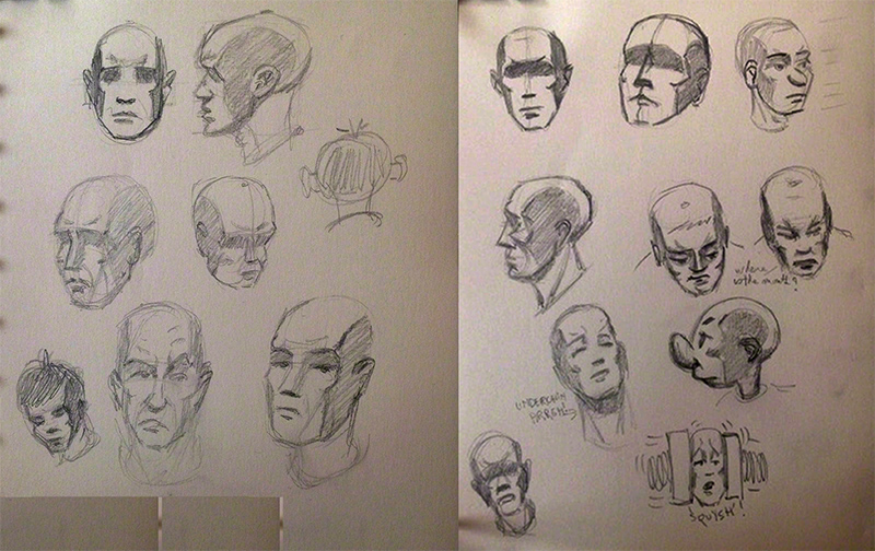
The usual problem of the comicbook inker! Crosshatching (little black lines side by side or crossing each other) can be considered as grey…. I want black and white.
I asked Glenn (in a note on my assignment) what to do (he has done comicbook inking – I think he’s done every job that’s related to drawing so his experience is immense).
His answer: yes black and white is possible! but for that you have to know your planes of the face so well you can see things that are not obvious to the non-artist in the face you are drawing.
Don’t draw an eye: draw the shadow of it. Where grey appears in real life, reconstruct the planes in your brain an go black and white.
And as for my assignment he critiqued the lack of coherence in most of the faces – the woman on the lower right side: if her right (to us) cheek is that dark, why is the side of her nose so light?
In short: know you planes of the head (of the skull too!!!) be able to draw them from imagination in any angle any lighting. Then simplify your model. The likeness will come easily, just a bit of exaggeration (not caricature but in that direction, even in super-realistic art) will do the trick.
I know what to do for next week, and i’m begining to understand something: all this Glenn explained in detail to me (he took his time in my critic and explained more during the two hours live chat, drawing on the topic) sketching IS thinking like this, not just for faces but also for buildings, trees, anything!
Ok, back to work now that I know in which direction to work.
And you guys: draw a lot and get a skull! either a medical student-grade plastic one from ebay (cheap) or a good ipad app allowing you to rotate skull and lights, and go for it! And if you find that hard – well do it again and again until it becomes easier, then move to your next weak point! it works, it’s rather fast, all it takes is will and a pencil!
see you next week!