Head week two: define “realistic”
You draw a realistic head, render it a bit, using the usual realistic methods of shading in order to show the planes.
OK so far so good.
But what happens if you try to apply these methods – or should I say techniques – to a cartoony or slightly cartoony head, such as could be found in a comic book (and as you’ll remember…. I hope :c lol…. I’m currently drawing a comic).
I can’t resist a challenge, and as I always say: If I must fail, then I want to fail real hard! “Do or do not do, there is no trying” as a green friend of mine says (no, not Kermit the frog!).
I tried several degrees of cartooning from “no cartooning” to “really zany” (I also did a few ugly drawings in these, but they are not part of the experiment, just the proof that I’m still able to do crappy drawings and will for a long time!)
On all of them I applied the same light rendering I would apply on a quickly done realistic head drawing, and I sent the result to Glenn. I knew he would spot at once what I was trying to do, and ignore the bad drawings – or tell me with one sentence how to repair them.
Here is the “thing” of the week:
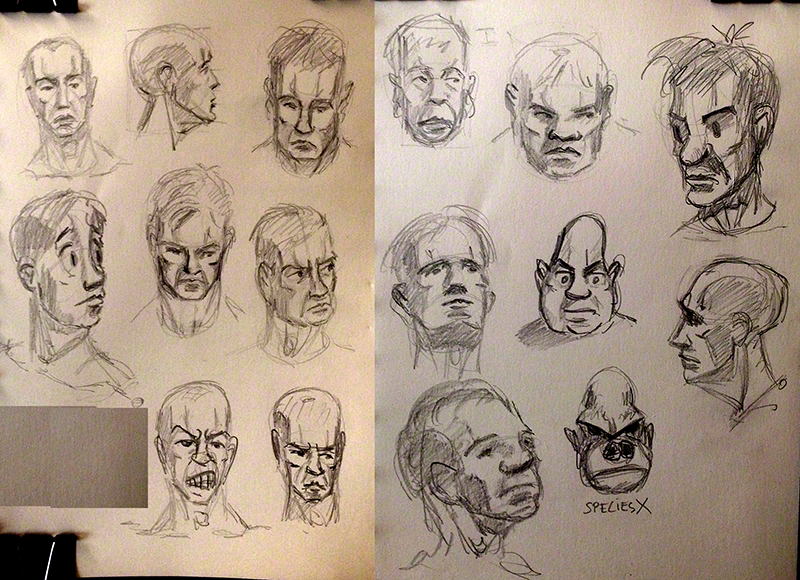
Glenn commented first on the guy in the top right corner (with the disk-like eyes), saying that this is a mix of 2d (the eyes are flat) and 3d (an attempt at it anyway) re: the tones used. As usual he was not judgmental at all, and even said that this could be a design style (it would need some more work obviously).
It’s true that that character looks strange (now that I look at it). Glenn then moved to the next guy (top row, middle, the one with the “I boxed a lot and was bad at protecting my nose” face). He amplified and simplified the planes, using tones to show a simple plane change each time, almost reducing the character to the minimum tones and lines – the result looked very much like a standard type of comics character.
Tone shows a change in direction in the planes. I think now I sort of know the planes of the head, the problem is showing them in a way that is compatible with comics, especially with cartoon comics.
And yes, you guessed it if you read my blog old entries: we are back to my search for the black-and-white no-grey style – not one I would use in my current comic (which is very French-Belgian in style – hey, I’m French and I grew up on those comics!) but for a future one I’m thinking about already: dark, no color, no grey, with a violent story – think Sin City.
Ok, I know what direction to work in, and that is the advantage of having a mentor who is respecting your personality, and helps you find your style (instead of trying to make you a “Mini Me” like many teachers out there tend to do).
So get ready to see the world in black and white next week!
I keep working on my current comic, I’m doing the storyboarding of it – camera placement, text fitting in the panels etc. and so far it works ok.
See you next week for more unrealistic realism (and the reverse… er, no, there is no reverse, sorry lol)
Draw draw draw!
A.