Black and white, dark and light…. even if the world is made of shades of grey, both physically and philosophically, light and dark are keys to giving depth to a drawing, we saw that last week already, and this week we are going to go more in depth (haha: pun!) on the topic.
If you’ve been reading this blog for a while you might remember that, during the composition class, I tried my hand at a totally black and white (very “Sin City” like) style of comics. I temporarily gave up on it, feeling I did not master the form (the drawing of object showing their 3D aspect) to draw in such a limited-tools style for pages and pages (plus, I found that zany cartoony comics come so easily to me that it would be a pity not to explore toon-like comic making).
I confess the topic of the week brought the idea of black/white comic back, but I did not dwell on it as I went out sketching. After all: this is a sketching class, you draw what you find in the street.
I started by doing a series (only one of them made it to the assignment, as you’ll see below) of colour marker sketches, playing with dark and light (not really black and white) and also my new friend “warm and cool”.
As I walked back home I chanced on someone taking pictures of kids (some relatives: they spoke to him while playing) having fun in the inner courtyard of a building. The hunter instinct woke up in me: bingo! This guy had not seen me, had his back on me, and was likely to stay there for a little while. He was mine!
The pattern of the prison-like bars, and the dark clothing were easy to exaggerate and make into black/paper-white patterns: the light in the street plus the light from the courtyard were violent enough that by half-closing my eyes I could “see” the image I wanted to draw.
Enough description, here is my assignment, I’ll tell about the third image (the people in the street) later.
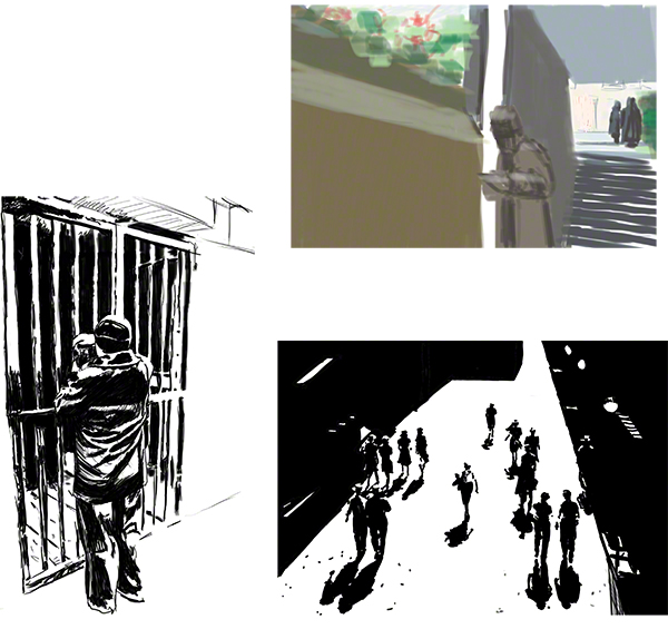
I had to “cheat” a bit (in love, war and art, all is fair) and actually took drawn “notes” (that’s what sketching is about) as to what the bars looked like, what the clothing could be reduced to, etc. Back home, I filled the black areas (which I had marked with an “x” in good comic and manga tradition – except normally it’s an assistant who fills with solid black the x zones – I’m my own assistant :c) and cleaned the drawing. So as it is now, it’s, to me at least, a little more than a sketch, a slightly more finished or sophisticated that a street sketch.
Before I tell about Glenn’s verdict, let’s talk about image 3, the crowd and their shadows.
No, in my neighbourhood men don’t war hats (except hipsters…) and women are rarely in tight business ensemble with skirt and lovely hat (not even female hipsters! Women have more common sense than men!). So why do people on this image obviously have hats and… look like they are out of the 50s?
I confess: I looked for another opportunity to draw in pure black and paper-white and found an archived image in the Library of Congress public stock (in shades of grey, your standard plain photo) that was easily turned by my wicked eye-squinting into an extreme image – plus the shadows were fun to play with: if the shadow touches the foot, then the foot if on the ground, if there is a space between the shadow of the foot and the foot itself, then the foot is not in contact with the ground… fun, fun!
But let’s step back a minute here: the girls are in skirts and pretty little hats, the men have old fashioned hats…. how do we know that on my image? Cause…. hey, look closely (click to make it bigger) the shapes of those people are totally abstract! Add to each person his or her shadow and look even more closely: it’s total abstraction! Yet, when you look at the drawing you see clearly men and women dressed in 50s style. And yet I only made stains on the paper (and this time I’m not talking figuratively: these shapes could be ink stains, accidentally made).
So how does the abstract shapes turn into, not only people, but people wearing specific types of clothing?
It happens in your brain, buddy! lol. You have see enough 50s movies, images, comics etc that the clothing is familiar to you (even if you try to escape “It’s A Wonderful Life” round christmas time you wont be able to: the movie is public domain, you are doomed to see Jimmy Steward and co in 1946 gear!).
Also, humans see humans everywhere (look at a power socket and try not to see a face there!).
The shadows are imperfect inverse images of the people – easily recognisable as ”almost people”. And when our brain sees an upside-down “almost person” under a person it thinks “shadow!”
I’m rather happy with myself on this one: I made something while taking into consideration the eye and brain and experience of the viewer.
OK, end of the minute of self-satisfaction. Let’s see what Glenn had to tell me:
Clearly the one image that interested him on this assignment was my colour marker one (he had seen me do the other style before and knew I’d try it again, I had warned him lol).
Before his critic video comments and draw-over, I did not think much of this colour marker sketch, but then Glenn pointed out the interesting points: large “boring” brown green plane on the left, a vertical white band, making the main character stand out, a complex set of steps contrasting well with the boring wall, two characters up the steps in the distance, who could remain unnoticed, if it weren’t for the green bush on their right that echoes the green above the boring wall (but in a desaturated way that says “this is far away from you”) and the touch of warm colour next to them that attracts your eye and makes you notice them.
If he had not analysed all this, I would frankly have thought very little of this sketch. That is why it’s so important to have the feedback of a master: he spots everything: the good, the bad, the ugly, the “how to improve”, the “what to go on” with.
As for next week, it’s going to be a nightmare: pencil only!
I hate pencil, I despise pencil (hey, pencils do despise me, the feeling has to be mutual) I never find a paper that seems to work, I don’t even know what I want from a paper, or from a pencil. I was taught at school when I was a kid that a 2B and an HB were the same thing, you only have to press harder with the HB (and damage the paper) I can’t draw lightly in pencil as a result. I might need a psychotherapy to come and make peace with pencils! (oooh expensive! lol)
So expect a self-deprecating blog next week!
Translated into plain english: I HAVE to work more often in pencil only!
Glenn has a bad influence on me: I’m beginning to like working on my weaknesses! 😀
See you next week, and keep drawing!