comp2 week 9 painting mice and character placement
Another busy week, my fault again.
I started by correcting my flying draughtsmen, repositioning the drone (putting it in front of the crane’s cable seemed to me a good way to add depth to the picture: “this is in front of that” = depth!
I also arranged the paper flows as told by Glenn and added a correction of my own: I took all the characters except the crane, the boy and dog, and made them bigger (ah, the joy of working in layers in photoshop: in traditional media I would have had to redo the whole painting/drawing). I wanted them to be more clear, ok probably most people won’t deduce that that yellow bulldozer (don’t ask me how he got on a building’s roof, I’m only the artist here!) is remote controlling the drone used by the painting mouse at the top right, but “I” know I wanted that ‘dozer to be clearer hence bigger. I also wanted the rat seen in profile erasing his drawing (next to our beret-wearing mouse) to be better seen – I was happy with his expression of dissatisfaction about his art (even his tail expresses that).
Here we go:

And yes I forgot to add the (R) after the Interstitial Comics name in the copyright branding … ooops, must get used to doing this!
This week, the composition lesson (last-but-one week!) was much centered around modern artists, Lempicka etc. A really fascinating course as, like most of my classmates, I looked at modern art with the same expression you might have while examining the content of your plate in a very very bad highway diner. Glenn analysed modern works and explained what the author meant to do, pointing out who had influenced him or her.
Now, some of us still don’t like modern art, some love it, but in both cases our opinion/feeling is based on analysis and observation, not ignorance, unfamiliarity and hearsay as it was before (for me anyway).
My current view: there is some very interesting stuff in modern art, lots to be learned (and stolen :-D) from it. I’m not sure I’d hang all of them in my flat – but then again I would not hang some classic paintings in my flat either (Poussin is a genius for composition but his subject matters and even colors bore me to death – you can send me flames on this thread, no problem).
We (the class… not “we the people”) got much richer artistically this week.
Being in a cartoon mood, having to think deeply about modern art, and having to go on exploring my strange mice world, I decided to have some fun. (who would have guessed?)
I’m beginning to have backstories for the characters come naturally in my head: their names, why they dress like that, etc, this universe is building itself quite naturally in my head – good fertile toon land, probably lol.
I decided to laugh a bit at both modern art and it’s audience and detactors (no risk for me was involved: Glenn said “I dont know where you come from” to me while watching one of my works…. it means he can’t kick me back home: he doesn’t know where my home is – only kidding of course).
I decided my beret-wearing (no, he’s not French) artist mouse was having an exhibition, and here is the result:
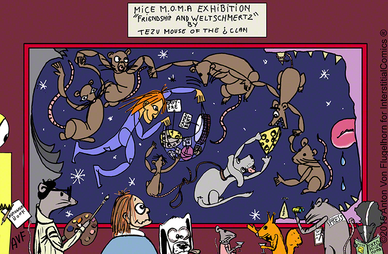
I’m not sure there is any need for comment here.
Glenn remarked on the fact that this was simple, clear, and really confirmed I had found my niche.
He also commented on the fact that, once more, I put the characters in the “audience” at equal distance from each other (this is a curse! I pay attention to it but I do it anyway!!) and that the yellow ‘dozer at left was only seen upon second “reading” of the picture – now THAT made me happy, as I had done it totally on purpose with that goal in mind (and I have a backstory for this yellow guy too!)
On an aside: several of my classmates commented on my finding my natural environement in a French-Belgian clear-line like style – ligne claire in French – a style formed under the influence of ukyo-e – japanese print – ligne claire most typical example is Hergé’s Tintin, but Asterix and other French-Belgian (so called because since half of Belgium speaks French and had super art schools it was often impossible to tell if a French language, ligne claire comic was french or Belgian, so “franco-belgian” became the name for them).
Now, being french, I grew up on Tintin, Asterix and the lot – ligne claire! I also grew up on Will Eisner whose old Spirit stories were republished in a magazine I read . To think I imagined him to be a young French or Belgian artist publishing these for the first time 😀 anyway, my mom still have the booklets I made out of the pages cut from the magazine – yes I kept the Spirits stories to read them again and again – they were so modern and crazy and inventive – but not ligne claire.
I always thought that I would never be able to draw in ligne claire style: too “out there”, no way to hide any imprecision or mistake, my plan was to never even try drawing like that – guess what came out when Glenn gently pushed me to follow my instinct (or subconscious mind?) It’s ligne claire that came out, I could not be more surprised!
I know I want to work on other styles, and you saw my attempts at dark heavy black Mignola or Sin City like styles – but these did not come naturally, I really had to struggle. And I plan to go on working on them, if only to improve my ligne claire (well… “almost” claire lol)
Next week is final week, let’s see what happens!
Back to work for me… and you’d better do the same!