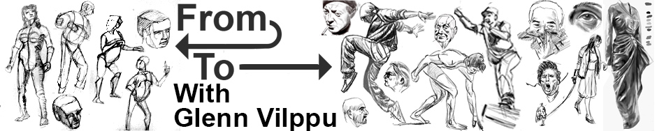
composition 2 second time week 1 and 2 for the price of one
Not good enough damn it not good enough! as captain Picard said in Startrek TNG.
If your remember well (and if you dont a reminder is coming up) during my second time doing composition one I had “found” my style: loony toony, very french-belgian comic in style (not a surprise as I’m french and grew up on them).
Glenn was super happy for me, he had given me hell during my first go at composition 1 and 2 (which was ok, I’m a big girl :-D) and it paid: during my second go at compo1 I decided to do only comic pages and came my style, easy, fun to do, far from perfect but it’s “me” as Glenn put it.
You’ll see a spread of that style below but read this first: I love writing comedy, nonsense, Monty Python like stuff and Franquin (google the man!!!) style.
But even any improvement in my “more classical drawing styles” would of course improve my cartooning (my hands and feets are yuk). So this semester I took (again) figure drawing one, deciding to draw only clothed females as I am not good with drapery and I have problems drawing girls that dont look like third rate drag queens (no insult meant to any drag queens, most of you are more feminine than I’ll ever be and are dream models for sketching!). Like many other heterosexual female artists I have problems drawing anything that is not muscular squared-jawed… ok, I prefer to draw men, so I absolutely must draw female. So there I signed for figure one and composition 2 (“again” for both)
I started drawing draped girls during the recess week before the new semester. I was not sure what I’d do for compo 2, and then I noticed: heavy black/heavy white, no other color…. one of my girls was black and white, no borders… think Hugo Pratt (Corto Maltese) Frank Miller (Sin City) or even Eisner though he always used washes.
Two colors, zero or one, like in machine language, what goes black what goes white…. I took some model pictures in full light, full color, your normal pic, and tried to imagine: reducing to two colors while maintaining the “readability” of the image.
Useless to say it took me hours for each and gave me a headache each time, this is a maddening exercise! But the 5th one was a little bit easier than the first…. hmmm perhaps there is something there! So I sent some of my “heavy black” drawings as I call them to Glenn along with the rearrangement of the compo1 week ten assignment.
So here is my schizophrenic assignment sheet of week one:
 ok, yeah I know there are “some greys” I could not decide for some zones if they should be white or black.
Glenn was very positive about both things (except the scenery in b&w in the middle that is unreadable) and told me to pursue that new style, it would improve my cartooning cause it would force me to have a better understanding of shapes.
At the moment, needless to say I cannot do this style from imagination, the cartoon-like one I can and very easily do. So let’s get to work.
Week two (hey I told ya: two weeks for the price of one! isn’t that a corny way of hiding i’m late by one week in my blog? lol)
I decided to see if I could do figures on a complex scenery and keep it all readable, make it something that is not a mess of black spots on white paper.
Broadway! Let’s do that, with the posters etc… except of course i’ve never been there, but I found a series of old colour daylight pics and got to work.
Hours! some bits took me hours. But let’s look at it so I can give you examples of how incredibly courageous I am in facing this ordeal (lol).
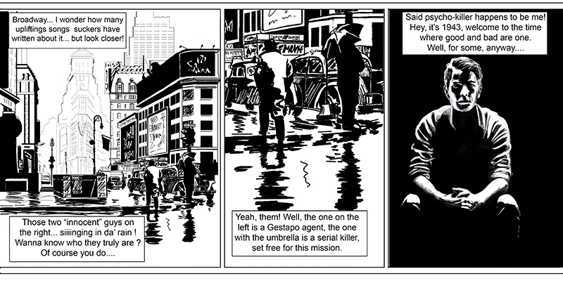
I went the cheap way: panel three is stolen from last week, panel two is a close up of panel one.
Panel one was my hell on earth for a week!
Look at the second panel, you’ll see a better example. Ok two silhouettes: the guy with the hat – how do I make sure the hat doesn’t get mixed up with the theatre posters in the distance? there is black over there too! also, no border for his right shoulder: white on white, but it’s ok cause you know it’s a human so you read him as having a shoulder. The edge of his right arm… now that took me some time: at first I made the windows of the cab white with thin black reflection, as “should” be, but who cares about “should”? I needed black to give that arm a contour, guess what? it works. But what doesn’t work and Glenn did not miss, are the white scratches-like things on the doors of the cab, too rough, don’t read. Also he told me the building in the distance (the V shaped one, is that an hotel of famous landmark?) could do with a bit more black or thicker lines.
The main thing is: forget about reality! fake it, cheat, but remain within the boundaries of the believable. For example did you notice that the light on the umbrella and on the man wearing coat are contradictory? Probably not, and that’s what you find in most “noir” comics: fake lights that you only notice if you are either an art teacher looking for errors or if the story is so boring that you start thinking while reading. It’s ok, it’s the way it’s done and has always been done…. and it’s freaking difficult! If it was all about copying reality it would be soooo cool, but it’s about reinventing it.
I type this in the middle of my third week and I am very dissatisfied with myself: ok it’s heavy black and readable and realistic… and realistic BORES me! I don’t mean I want cartoony stuff all the time, but some exaggeration, some caricature, amplification (Rembrandt did it so well: his portraits are NOT realistic, but you dont realise it when you look at them). I have to find….. something more. And right now it’s escaping me and I’m wasting my time throwing away brush work that looks like…. nothing! We’lI see what the near future brings, I’m sure Glenn will have the key to all of this for me, he already gave me a clue during the chat: more angle on men, less on women… hey, yeah that’s a good point for this style!
See you real soon!
Black is my favourite colour btw.
Anton