I added 2 updates in the few days before this one, so if you were not around, check them out to get what I’m talking about!!
Without claiming, like Eddie Izzard, does that “I have a common point with Leornardo da Vinci” (which, in his case is: like da Vinci he has designed a helicopter that doesn’t work – impressive I must say!) I would like to rejoice publicly that it SEEMS I finally begin to understand what this is all about! (“all” being composition and not helicopters that dont work).
Last week my work was boring, plain, meh, and any other expression that might express the fact that what I did was not exciting, did not cause curiosity or even amusement, and that the world would not see any difference if it did not exist, even on the micro level.
Well, it seems that I’ve taken a step forward: “enormous progress” dixit Glenn Vilppu – yeah! my helicopter doesn’t work any better that Leo’s: at long last my compo begins having some meaning and do it’s rightful job!
here are the things:

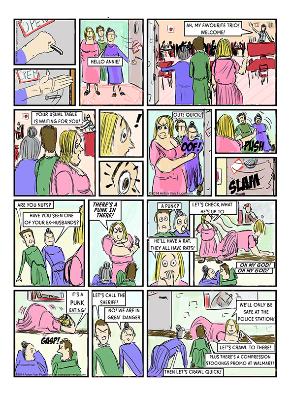

Ive added depth in the sea story, panels of an odd size or angle and or placement to give some interest to the page as a whole and reflect the state of mind of the character. in the desert scene the mountains behind lead the eye to the characters. The punk versus old fat ladies I redid completely, trying to make a movie out of it, you even get a panel in which there are two of the same character as she (the pink lady) ducks under the window to observe her nemesis.
Glenn liked it al! desert was in it’s last week of work so it’s over for that one, he thought it was a big improvement on the previous version.
The ladies versus punk made him laugh (the “rat” panel I think :-D) and he did not find anything to change in it (WTF!!!!! yeah!) I asked if I was suppose to rework on it – answer: no. As for the sea story he suggested perhaps a more pointy shape for the panel introducing the place, and perhaps a closeup on one of the dead guys but he did not seem adamant about it. (one man’s opinion he called it) he loved the angles, the depth, the page and compo.
Oh my Dog I’m progressing at long last! 3 comic pages, 3 “OK”s from Glenn, can’t tell how much I’m happy, seems all my hard work and studying storyboards finally paid. (‘comics’ structure are too dependent on their genre to be easy to study – you dont build a super hero page of the golden age the way you build a modern superhero or Maus or Sin City, I do study Eisner who is my idol but I dont feel like imitating him, just wish I could, his style is his, and any imitation would immediately be just that: a cheap imitation).
Next week I’m going to be very attentive: in the theatre business it is said that after a successful premiere the second night is the most dangerous.
And I’m exhausted, so I must keep my attention sharp and no fall back to old bad habits!
Wish me luck, next week the theme (I know cause this is my second time taking this class) is going to be “time”….. which proved to be a major problem in an illustration but should be a piece of cake in a comic…. meaning beware: here begins the Moria! (LOTR allusion, and if you dont know what LOTR means here another puzzle to occupy you till the next entry in this blog: that laser sword with the laser hilt is stupid!)
See you next week, must no let my guard down!