Compo1 again week 5 the electrifying tale of a button and an apple pie
Last week we dwelt with different point in time, this time we deal with an action about to be done. I would add: that is quite obviously going to be done, if or buts about it. The beautiful paintings of masters that Glenn showed and analysed for us are for the most part about Saints getting their heads cuts by bad guys and other charming things.
Let’s not forget that until the renaissance the Catholic church was the main all encompassing client for artists, the super Major of its days. I guess that after painting your 23 crucifixion you must be a bit fed up with the topic, and, even if you are a deeply religious artist you must die to paint something else, another scene from the life of Christ or from the life of a saint: like a saint having his insides torn out (like in Braveheart), killed with arrows, having his tongue pulled out…. yes I know, you stopped eating while reading this. In short most of the early renaissance paintings (my point of view) is about tortures, and after that about ancient greek Gods that never existed (ever heard of the inquisition?) but come with a lot of new stories: rape, battles, monsters, torture and…. ok just forget what I said: torture paintings sell, it seems. lol
The problem I’ve had with this temporal friendly topic should not be a problem: this time I’m doing a comic page, a sequential art (temporal!) so it should be easy-peasy. But doing a whole page about something that only happens in the last panels but that the reader sees coming from the very start is not easy: the danger is falling into clichés like:Wiley Coyote is about to cross the road, no cars, he carefully looks left, carefully looks right, no cars, he takes one little step and VROOOOOM a big truck coming out of nowhere flattens him. It’s fun because we see it coming but it’s been done so many times in animation and by people who are geniuses compared to me…. what was I to do?
Before answering this question (change of topic to maintain tension, made popular by Lucas in the first Starwars movie – yes I’m doing my homework about image and story!) let’s see what I did with the two works I kept on the drawing board from last week and the week before.
First my salute to Eisner “it’s the Ghost!” “yeah and by Anton Von Flugelhorn” shame me 😀 Glenn told me to use more alternances of clear and dark, and to put the figures not all as the same distance from each other (which is a drawing killer).
I came up with this:

Much better according to Glenn, clearer too in the body language but….. I did it again: most of my characters are at equal distances from each other. Insert curse words of your choice here. Glenn told me and….. I thought I was doing what he was saying while doing the contrary again!
Ok, I know what to do next time….. I hope.
My other “old” work to improve was my 4 panels soldier story. Glenn found it too flat, horizontal, hard to read.
Redid it all:
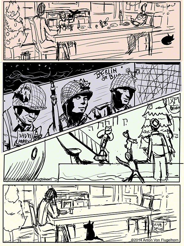
My table is now giving a sense of depth ti the image, the images are clearer but….. last image: the dog is under the table but his ears are in front of it, make up your mind Anton! I did not see that and of course Glenn did not miss it (he misses nothing!)
Another thing that worries him is the realistic developped quality of panel two compared to the rough (this is a rough) quality of the rest of the page.
The truth is: I started drawing the helmets and “saw” at once what the shadow would look like on the soldiers faces. But I did not consider the relation of that panel style to the rest of the page. Could have done it on purpose (in japanese manga you often get cartoony heros in the middle of a realistic scenery etc. But here it’s not a planned thing and frankly does not work. I know what to do next time!
Now, back to our first action (swipe-fadeout of the image in your mind, a trick remade popular by mr Kirshner in the second Starwars movie… did I’m mention I’m a total Trekkie? anyway…)
It’s about to happen and nothing will stop it.
For once let me tell you my plan, then show you the comic page then tell you what Glenn (like other people) who did not know what the story was read in this said comic page.
I decided to do a “I cant resist pressing that button precisely because there is a panel about it saying “dont press the button” I’m too curious”.
Now, here is what I did with it (sorry for the yellowish tone, my digimarc would not work on a white backgroud)

Is it funny? Does it make sense? I guess it might if you know it’s about a button but Glenn (and others, I tested scientifically this page on innocent subject) did not know that round thing in the wall was a button and the “closeup” of the button and panel about it mentioning that it is indeed a button is too small to be read or to be noticed (which is far more serious).
Glenn read the button as a pie that the guy put the finger in (a french person read it as a camembert the the guy put his finger in…. that still does not explain his being electrocuted. lol
The panel with the close up is the thing! (to paraphrase Hamlet – what is Shakespeare doing here? no idea) I have to make it unmissable, clear, probably make the button smaller (it *does* look like one big apple pie)
To sum up this week I’ve learned to always be on my toes: how is my panel working in relation to the others, ok I think I’m being clear about something, or putting people at different distances from each other, guess what: what I think I do and what I do are two different things! What is important is what happens in the mind of the reader, this means testing your page or your drawing on someone who knows nothing about it before hand.
A good week of learning!
We are on vacation in that week six assignments will be due on the 4th of january, see you then, and until then let it draw let it draw let it draw !
A.