Wow: people discussing someone else with an accent on differences between characters and composition, now that is interesting.
For some reason I thought at once of a graphic novel cover, and of physically different character: a roundish one, a triangular one and a rectangular one.
This brought to mind film noir – the big fat boss, the triangular body guard and the rectangular weird runt (ok – a part for dear dear Peter Lorre, there I’ve said it! LOL)
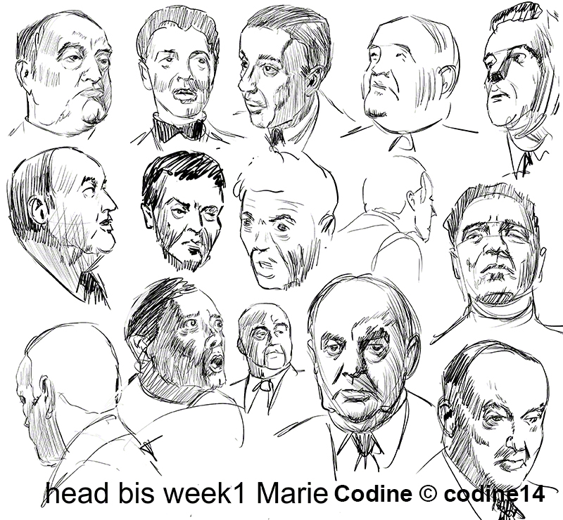
I started by doing some quick sketches while watching old movies (with my jack russell on my lap, she insisted watching the movie with me sigh)
Here are some of my sketches for the faces of my characters:
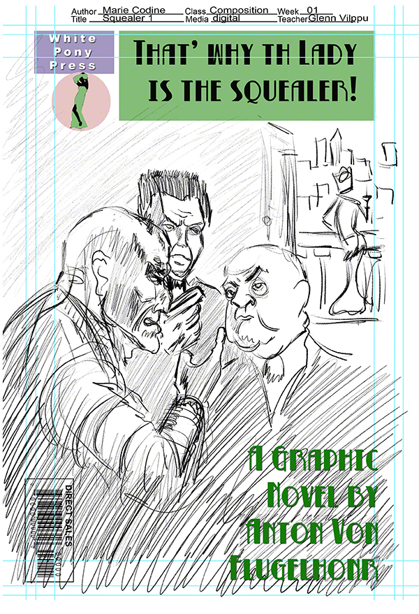
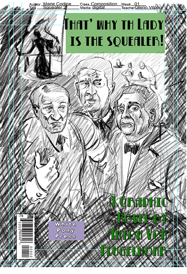
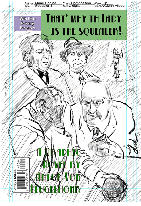
Now who are they talking about? They must disagree of the contrast wont be strong enough – what do people talk about in film noir? Dames of course! and Squealers! So I invented a graphic novel (my copyright) and came up with three ruff, each a bit different, different faces, different reactions.
Here are the three ruff, they are ging to be in b&w except for title stuff, I adapted the dark horse official submission format to A4 (I’m in europe) , the font is a free font Betty Noir by blambot.com (see them for info).
My frst impresssion; what takes time like crazy is putting ideas together in space, real drawing (not doodling stule) is nothing timewise. Interesting, shall we become faster at idea producing in space?
here are my 3 ruffs:
we shall see what glenn says in his critic and which one he chooses (hey he’s the client!) for me to develop even further.