Big Masses (and I’m not talking about a diet)
If there is one thing I learned last week, it’s that when you are drawing using only the blackest ink on the whitest paper, you need to have a perfect underlying construction, particularly if you are drawing a head.
Also, lonely little black spots are a distraction, better have ink masses, or spots linked to each other by the construction of the head.
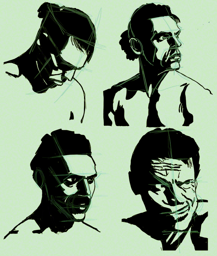
But first, here is what I did this week (things will be easier to explain if you have this in front of you)
Once more I apologise for the white paper being a funny color but digimarc refuses to watermark my work on white paper (big big failure there digimarc guys!).
I decided to do and overdo construction this week, and because I’m really not good at all at drawing lightly on paper (I’m a brute) I went digital – this allowing me first to have as many layers of construction as I want, and make them disappear if I want, and also to have one or two layers on top of the ink (else they would be hidden by the ink) so that Glenn can see my construction, what went right and what went wrong.
Now that I look at it I wonder: is this drawing or painting? Is this design? A valid question, the simplification plays with 2D as well as 3D illusion – this is (let’s pretend I’ve printed it for you) a sheet of paper, flat as can be, with stains on it, also flat. Yet you see a head. That means 3d but at the same time it’s very 2D, the roundness of the head, the front/side opposition is reduced to it’s minimum, this could be a graffiti done on a wall with a stencil.
In short: stylistically, it’s a strange place to be. And I love it. I’m looking for a very black/white graphic, no greys, no-frills style (for a comic with a story in the same style). I find it’s forcing me to review my construction, my shapes, my 3D – even if the result is going to be very 2D.
Let me share three personal keys to drawing a head, especially in perspective:
A/ In perspective, the eyes, bottom of nose, mouth and bottom of chin are parallel – sometimes converging a bit, but only if you are toying with fisheye effects, a head is too small to really show convergence clearly most of the time.
B/ The front of the face is not flat, whack your face against a wall (no, don’t!!!) and you’ll get a broken nose, plus big bruises on the middle of your forehead but nothing above the outer extremities of your eyebrows – this explains why, in profile, you see the nose so well, as well as the middle of the forehead: it’s further forward than the rest, including the eyes! Think about it and the placement of the eye in profile)
C/ If for fun or exercise your think of the head as a box, be sure where the angles are: temples? too large, be more precise! and what about the cheek level? be sure to get that right.
End of my smart-ass know-it-all moment. And let’s see what someone who really knows has to say about my work for the week: Glenn Vilppu’s crit!
Glenn was very happy with what I did, perhaps the guy making a grimace is too complex, I could simplify more (aspirin please!).
The three others suffer from the same two problems: the black describing the neck and top of torso don’t really describe anything real, there is no construction there (I confess, I did not construct those bits, I was head-obsessed – my fault), and the shadow under the nose or even around the mouth is not completely satisfactory: realistic perhaps, but not legible – sacrifice realism to get legibility. The chances that someone will reconstruct the lighting and make a friend pose in order to check if the light “really” does “that” are slim (and if someone does, he/she is probably mad, so who cares). Once more: if you know your construction inside-out, you know how far from the real you can go, and still look believable (while gaining clarity).
In short: I’ve learned this week to be even more analytical, and to apply the same treatment to all parts of what i’m drawing (lazy me!)
See you next week, and draw everyday!!!!
Stay safe too…
Anton.

