compo1 week 8 soldiers, flyboys and film noir
OK, after some deep thought (42! private joke for the happy few) and ponderings I’ve decided to go with the flow and go as wacky and toonish as I want.
Surprisingly it seems I have a ton of wackiness within me – or perhaps I should say “surprising for me” as my friends and family have long told me I was a Toon more than a human being.
The topic of the week being mass and space I decided to tell a story that has no story but is a bit insane (wait for real insanity next week :-D).
Here we go:
Glenn found the story telling to the point and good, but complained that my characters were too sketchy even for a ruff. It’s true I only thought of the expression, not of doing a clean drawing. In the same was my hand lettering is really “yuk!” and any font, even the infamous “comic sans” would improve the readability (my remark about comic sans, not Glenn’s LOL)
Another point: note to myself the bear….. please…. look at reference Bub!
Last week I tried to make a film noir like page with the light coming only from the top, but I placed the light and shadows all wrong on the faces of my characters relative to the light bulb. So I played around with a standard head in Zbrush, moved the light up and observed. I learned a lot and tried to do a new version more precise light wise:
Nice try, but as Glenn spotted at once the number of values on the faces is too high, I should simplify more, concentrating on the structure of the face, start with a dark ball for the head and add white progressively, not noodle greys like I did. Also the character that moves away is not lit properly. Ooops. I must try the black ball white paint exercise, should be fun and interesting. i would love to be able to draw a bit in the sin city/corto maltese style 😀
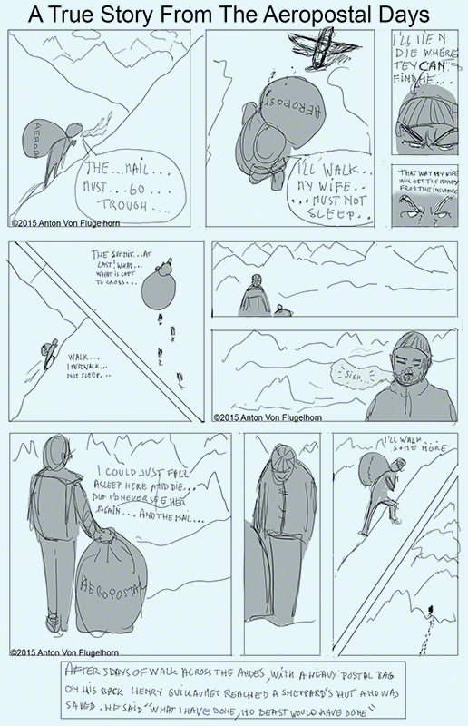
Mass and space, I did another page on the week’s topic, but again my character is not clean enough, same for lettering. more after the image:
Glenn spotted at once two problem: the man get to the summit and…. goes up again, when does he go down? also, in the last rectangle the split in two images bar left down right up looks like it’s part of the scenery and it’s not.
Not clear enough.
Redo
and let yourself be yourself.
Now….you know what? I think I will!
expect an update in a day or two!


